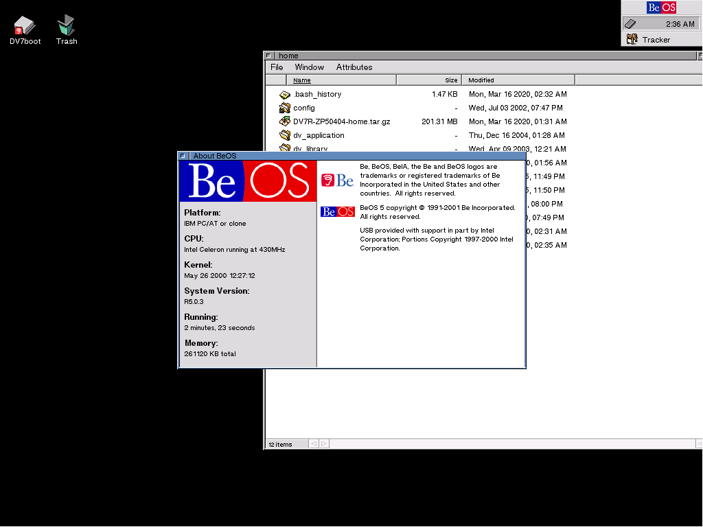
So to open with, as I’ve repeated in various articles, in the retro reviews of BeOS I’ve done, etc. I feel Haiku’s big focus (and strength) is the BeOS Desktop – it continues this tradition honorably, and to go all formal for a minute (but I am saying this for real): I really think it does this with excellence.
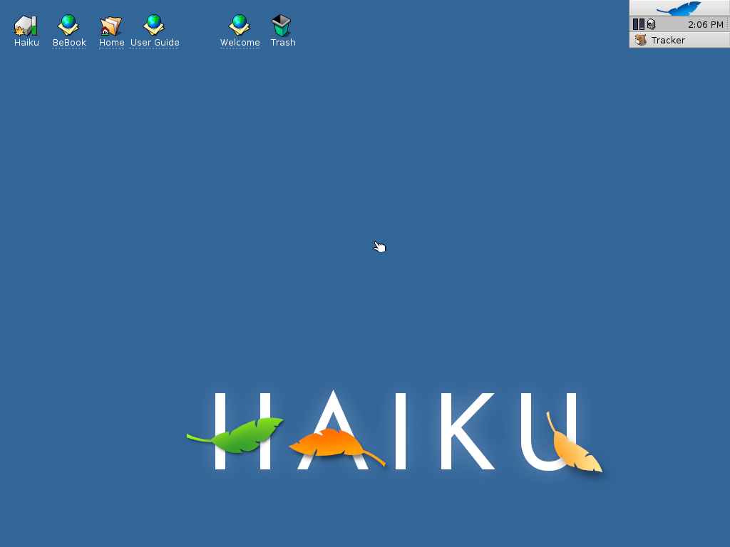
But… the platform that has been completely forgotten about it seems is BeIA… and if there was ever a time to re-imagine what Internet Appliances and a mobile BeOS would’ve been like if Be would’ve made it to 2020 (the 25th anniversary of BeOS) it’d be now. And 2021 (if I were to make this thing into a working alpha) would probably be around the 20th anniversary of the BeIA idea; Be went down in 2001).
While it’s true I use my desktop/notebook hardware (such as to make this concept, do Haiku on Mac, and write this post), I can also say tablets or phones are what I feel at home with and that several of my friends also use. Simply put, the desktop still can be useful but the classical desktop model is old school much in the same way CLI has faded. So, basically where Haiku is the ‘professional’ and traditionally focused system, this concept is focused on a more carefree, experimental approach.
Overview
Since Haiku is leaf/tree themed and this is the next gen of BeIA the concept has the internal nickname so far is “Sapling” (although it will have a better name when finished). This concept will be radically different than the ancient (but still useful) Desktop – basically mobile/IA driven. And here it is…
Accessibility
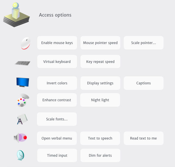
First, “universal access” as it is labelled on the Mac – the one thing BeOS really just doesn’t have are any serious accessibility options. And… honestly, Haiku has tried through packages to provide some solutions – but overall, out of the box, all there really is includes a Magnify tool, key/mouse options, and as of the latest Beta 2, font scaling/DPI support.
So… what if there was a central place to adjust accessibility options in addition to the old ones – stuff like text to speech (with a spoken user interface), high contrast/invert, captions, and a night light or dark mode? That’s basically what this first mockup is:
App cards
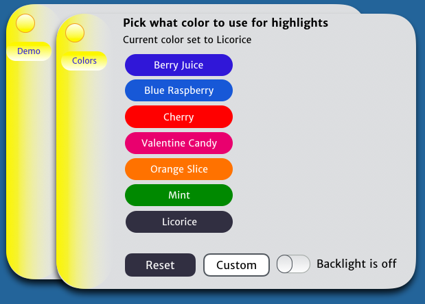
Long time Be fans will see unlike concepts of the past, the old tabbed windows are gone in this concept. I believe having tabbed windows were innovative in their day but are going ancient like the Deskbar has. Yeah, macOS uses them in 10.9 Mavericks and later (and I’d posted a tab concept proposal on it before)… but after deep thought, these really aren’t relevant to a modern mobile/“Internet appliance” system like a modern BeIA imagining – so cards would be the thing of choice here. My thinking on this is sort of inspired by Palm (where I think BeIA would’ve been headed) and similar ideas.
When you need them to, cards would switch from a single mode to a stack in a z-order (or in a neat stack if one wishes to view them that way). Also the reason the card button is round (not traditional square) is because it is not “close” or “quit”; it’s basically ‘dismiss’… and its purely optional. But… again, this heavily borrows from Palm/webOS and I’ve got designs that are a bit more original than this one  That said it’s kind of to give an idea of where I see a 2020 BeIA system…
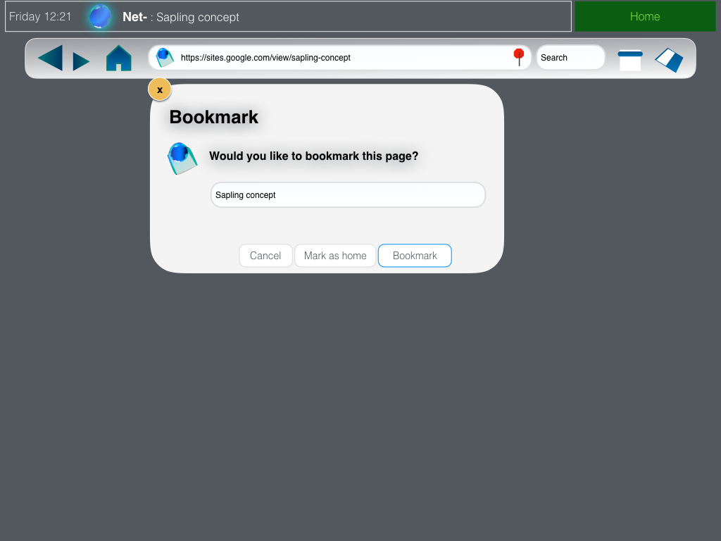
And while small apps or preflets can work great as cards, some apps just need to run unhindered, so minus the top bar, the rest of the screen can be given entirely to the applet (with the option to put Home in the left or right corners). This is a rough (unfinished) idea of what this may be like:
But it doesn’t just stop at applets… or me cancelling the old Deskbar in this design. Let’s go “to the heart of it” 
Thinking about the home screen
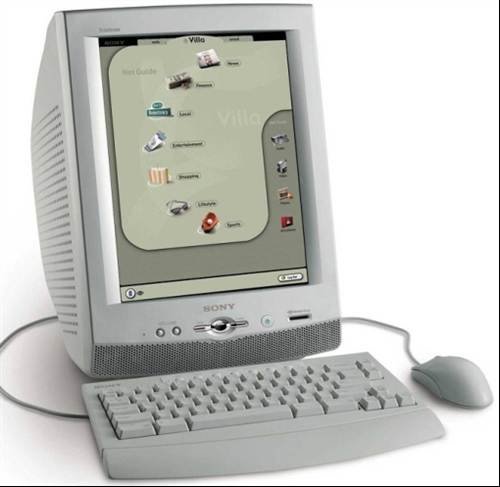
The home screen journey started with me looking at vintage pictures of BeIA, which at least on the Sony eVilla appeared to have this weird kiosk of bookmarks and a Gonx-like thingamajig (picture credit: Computer Weekly photo gallery; retrieved 27 June 2020. Link to URL here):
But – why hide away the true abilities of the OS? Why not try to make it easy to just get going with it? I did mess around with bringing a glorified Firefox Start Page back… but this just didn’t feel right…
So that led me to phase 2… and I think any struggling college dropout (yeah, that’d describe me…) could generate a clone of an iOS or Android launcher screen – which was tempting… enough that I did actually give that a go…
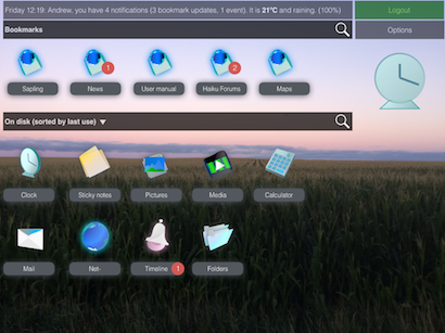
… but it wasn’t true to the Be spirit and there had to be a better way – a way to be a bit more true to its BeOS ancestor.
Inside four walls
So I thought of what’d be uniquely ‘Be’ on a tablet — or even a netbook or box somewhere. Because it is designed to be mobile/modern or as Be put it an ‘appliance’, the Desktop itself and the Deskbar has been phased out. In its place is a modular sidebar that’s unified with the shell itself – and in homage of retro tech from the Be era, it’s called the Diskette.  The clock info is right on the main button (which pulses and animates btw to let the user know its an active element), the historic tray has been replaced by a notification card (which shows info by default) and under this is an activity meter (loosely inspired by the Blinkenlight feature) and applets can be switched between easily (and force quit with one press of the red button).
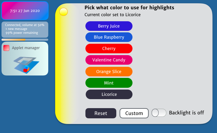
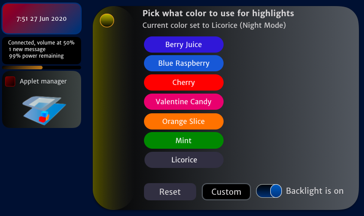
And like all modern OSes out there, it’d have a dark mode (as teased in Accessibility)…
But the other thing was if the Desktop is gone how’d one get to anything? For that, I decided to go with a retro mixture of a main menu (which ended up being in the form of a sidebar with large buttons) and then have what I’d nickname ‘walls’. And as shown here, there’s no more desktops and the spaces aren’t called ‘workspaces’  Instead the UI (honestly inspired a bit by Gnome 3) would exist inside the 4 walls of a cube and like the smaller applets or settings that don’t scale well to fullscreen, replicants would also be reborn as cards (which someone could decorate their walls with) – so think of something like this…
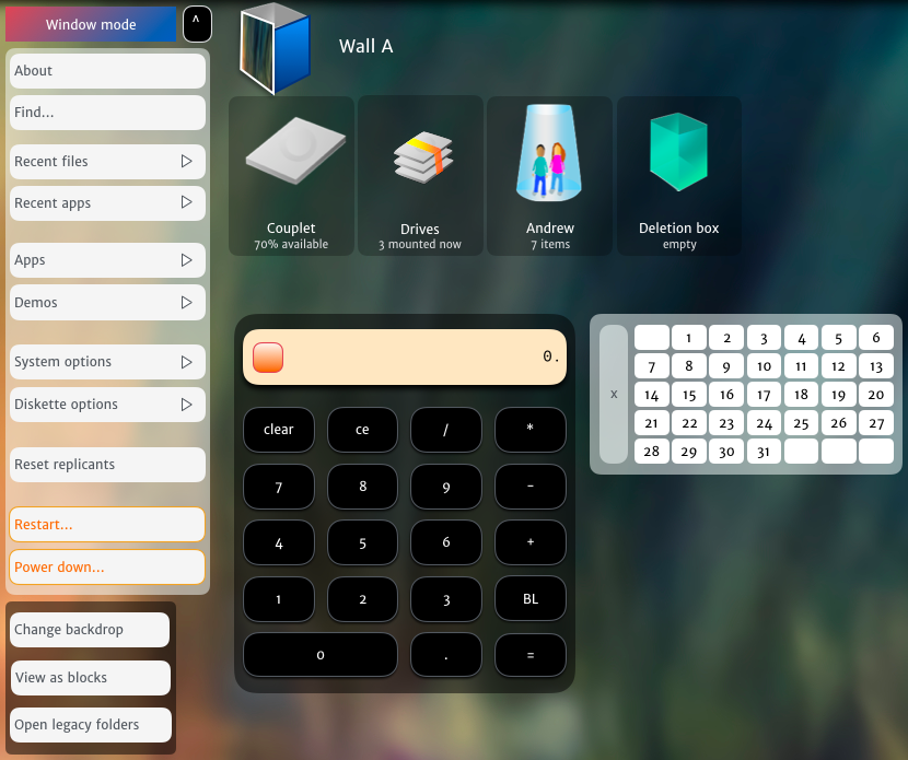
… which also would be in 3D (and in this way it’d be different than Gnome 3, Android, iPad, etc.) and offer something unique:
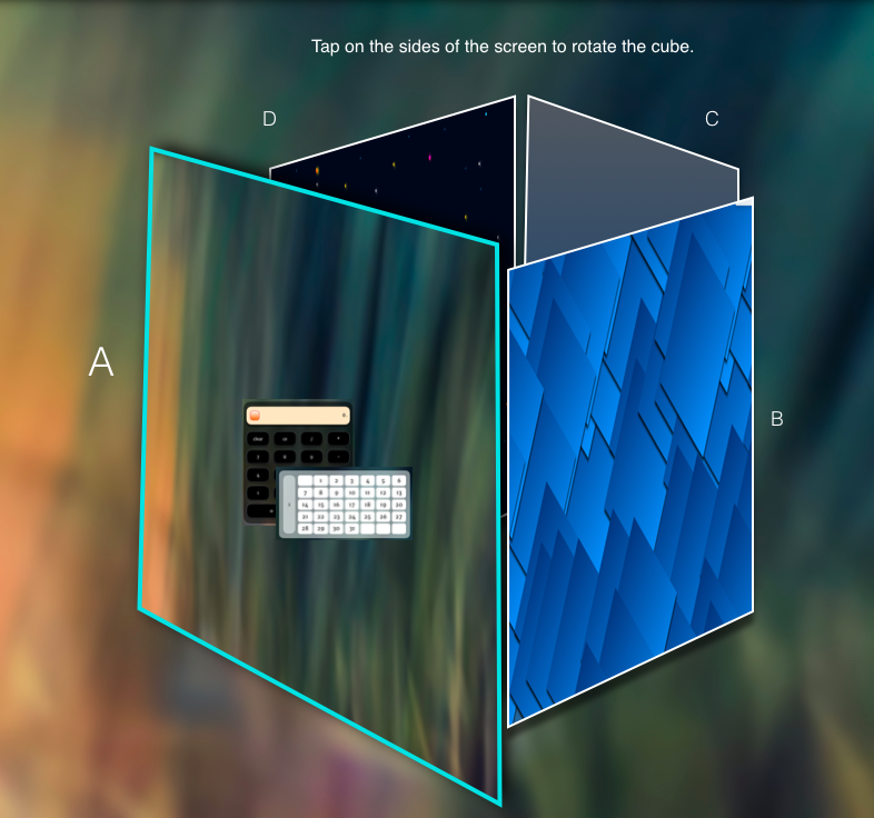
The system could be put in guest mode too, so things could get stripped down (an admin could assign applets or settings someone could access) — or of course it could also be a kiosk…
And of course, because they’re blocks, elements wouldn’t be static but would be able to show opacity, depth, and could highlight when activated…
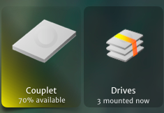
… or present convenient actions:
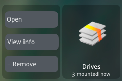
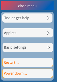
And speaking of actions, a tap or click on the level up button would be like holding down shift, option, or other modifiers on a Mac to shift the menus around (or for those who’ve been chained to Windows instead, think of the Win+X/admin menu) – so someone could ‘unlock’ options, and since the whole shell would be dynamic, any open replicants and app blocks could ‘level up’ too (like the disk and trash options):
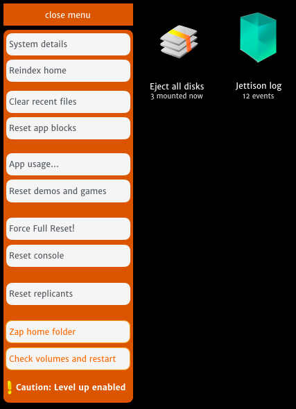
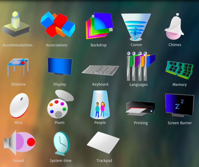
However, extra features aside (that I’d hope Haiku could add to like the ‘power menus’), I’m hoping people are getting the full idea in this. There’d be no ‘windows’, no traditional apps (i.e. no moving, resizing, menubars, radio buttons, check boxes, etc. like a desktop), and overall, around 80% of the desktop trimmings from the eras past wouldn’t be here… so even going to look for settings would be something more like this (and this gives you an idea of some of the icons as well):
… and one cool thing is messing about with translucency and glows makes stuff like this possible too:

Beyond the concepts of the past…
The idea behind this is to create a Be-inspired UI that if I could market it, I’d use the tag phrase “not its parent’s desktop” – my hope is this concept inspires people to imagine more of a 2020 look and feel. And I know this isn’t the first time there’s been mockups of stuff here (like the Glass Elevator stuff I’d read about in the forum before the Discourse revamp) but I’m hoping this will add to the dream UIs all the nerds have thought up for fun 
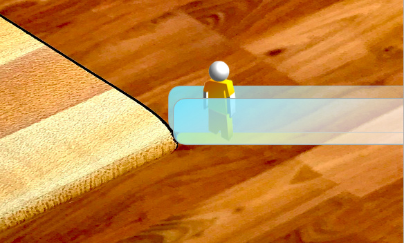
Also – pretty sure I’ve given this next topic a mention before, but Haiku could really use something like an avatar (Apple, Facebook, Google, Nintendo, Microsoft, and in addition to the ‘tech titans’, several smaller vendors have adopted this idea) so why not make one that resembles the Be guy?

… and this idea isn’t just about goofing with silly Lego like stick figures; I’ve been really thinking about where it could be useful. I like games like Pingus, Tux [Kart, Racer, etc] – especially because they give me the feels of innocent times, but really, Haiku is sorely missing games. And its also sorely missing anything in the VR space too. So why not start messing around with a few ideas for the fun of it and see where it goes? (This is just a mockup of the my generic Be avatar guy on a picture with some translucent shapes).
Thoughts?
Thanks for checking out my post  I just want to do this for fun and because I really like computers (to the point of obsession) and am hoping there’s room in the world for a mobile/BeIA focused system out there… mainly because I would like to make these reality sometime if people happen to like them (they’re only concepts atm – not real!)
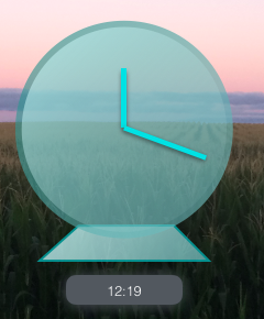
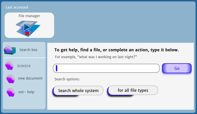
Also, I can say there is more stuff that’s not really done yet… I’ve only showed a piece of this concept here  A few random extras I’ll show here are a clock replicant and universal find…
Thanks everyone 

