So after doing my BeIA inspired concept in the “Imagining BeIA-like concept in 2020” in another thread, it made me realize the Desktop needed some concept love too 
So here’s some fun going the not IA way… 
On this concept desktop, the drive label is a meter and borrows from Mac OS X with info that can display under the icons on the Desktop; tinted boxes make the labels easier to see.
Like the BeIA concept, the Diskette here is a re-imagining of the Deskbar but I imagine this more as like a “Pro” or “Classic” version… and the difference is that this one can be dragged anywhere like the Deskbar can (the handle is on the bottom of it), runs desktop applets in an applet tray, has more traditional app tiles, and a menu that pops out. The clock replicant has transparency and floats over the desktop.
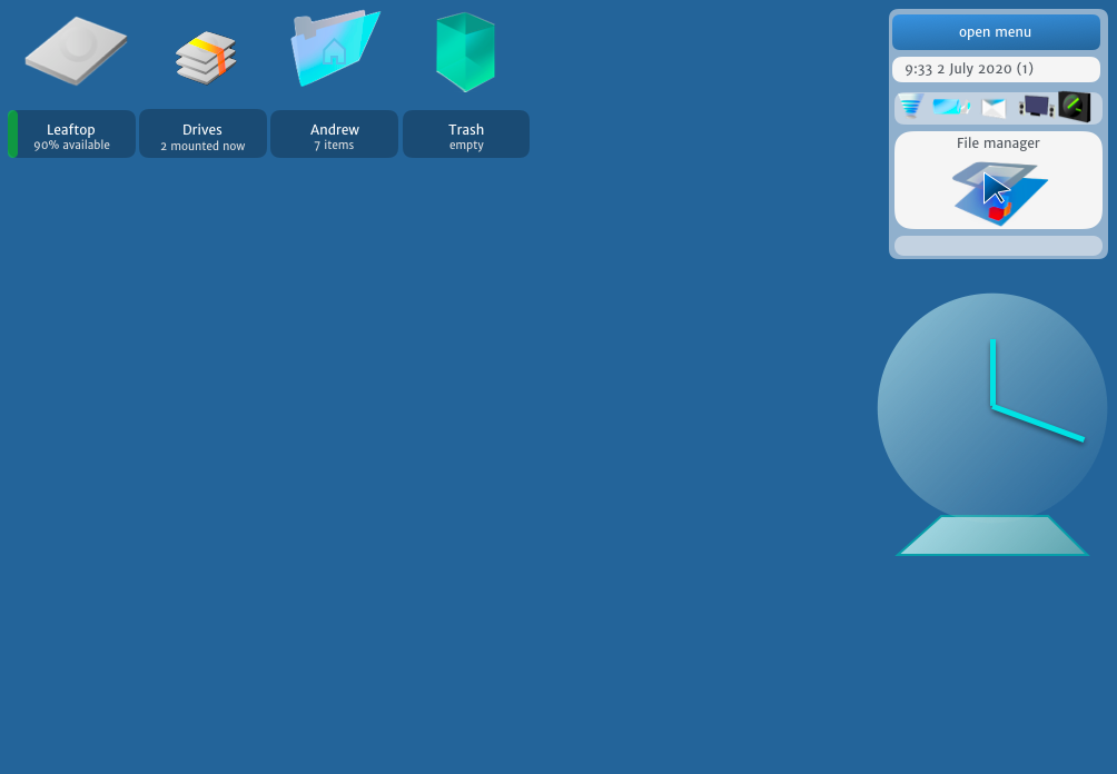
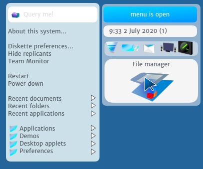
The menu has a universal find field built right in (with the text “Query me!” and the Mount menu is gone (why not let this be automatic?) and Team Monitor is added to easily see and quit teams. There’s also transparency here too:
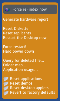
Like the BeIA concept, this has levels and since this is a desktop, it’d work like the Mac where holding down Option (or similar) would cause this to appear. Items then raise to force re-index, reset Diskette, replicants, the Desktop, force restart and power down, query for deleted files using system shadows, folder map, application usage (idea borrowed from iOS/Android), and reset apps, demos, applets, and revert to factory defaults (for all preflets).
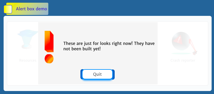
My favorite of the classic BeOS is Dano, so there’s a pulsing glow on the button with the pieces under it as kind of evolution from where it quit. I also imagine a compositor, so the alert icon takes on a more 3D appearance with a fade effect when dialogs appear over apps or windows.
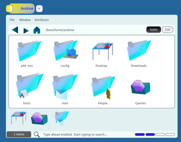
Next is a new Tracker – here I’ve imagined a lot of improvements. The outer edges material is made of glass, including the toolbar with a smaller forward arrow like Firefox and a home button. (And sorry the home icon isn’t quite right, btw) There’s also a path display but not editable to keep the design minimal and a convenient Icons/List button switch.
On the bottom is an area to pin folders to with Desktop, queries, and mail here. There’s also a more obvious search glass and “Type ahead enabled. Start typing to search…” for new users to know this exists and a quick zoom bar for quickly changing zoom levels or icon sizes.
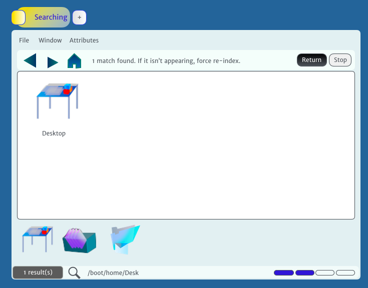
The filter process I’ve thought of making easier too with the file manager window becoming the query in progress… and this also means that typing paths like two dots for the last folder or /boot/home/Desktop would take someone to the Desktop:
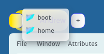
And instead of having breadcrumb navigation, clicking the active tab will show a drop down of folders similar to the Mac when command is held down:
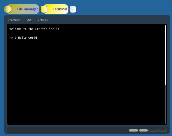
And of course in the last topic I posted (the BeIA concept) I’d replaced tabs with cards because on mobile/IA it’d be more modern and easier – but for desktops, its clear that BeOS was the king of tabs and probably would have updated how they work for 2020 making them easier to use (and this improves on a topic with a concept/idea showing tab improvements I’d posted here before).
Each app would have a + button next to the tab like a Web browser so its easy to start a new tab. From there, a list of applications or folders would be displayed, but if someone also wanted, they could use type-ahead filtering to get right to the app they needed.
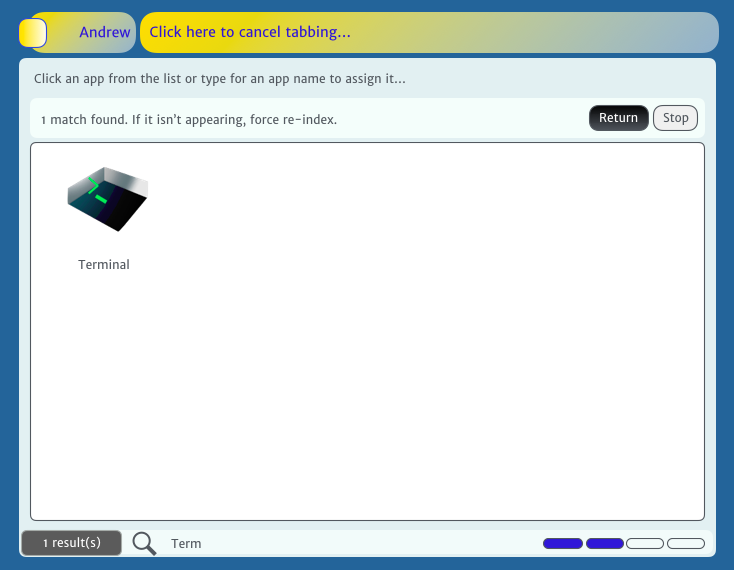
The system would then fade out the last tab and bring up the new one. This app demos a dark mode idea for Terminal and the same glass around the edges with a zoom control.
Last on my desktop concept list is Backgrounds which really feels like its from Mac OS 9 still so I thought of another idea, which is just to click a solid color to set it…
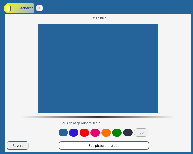
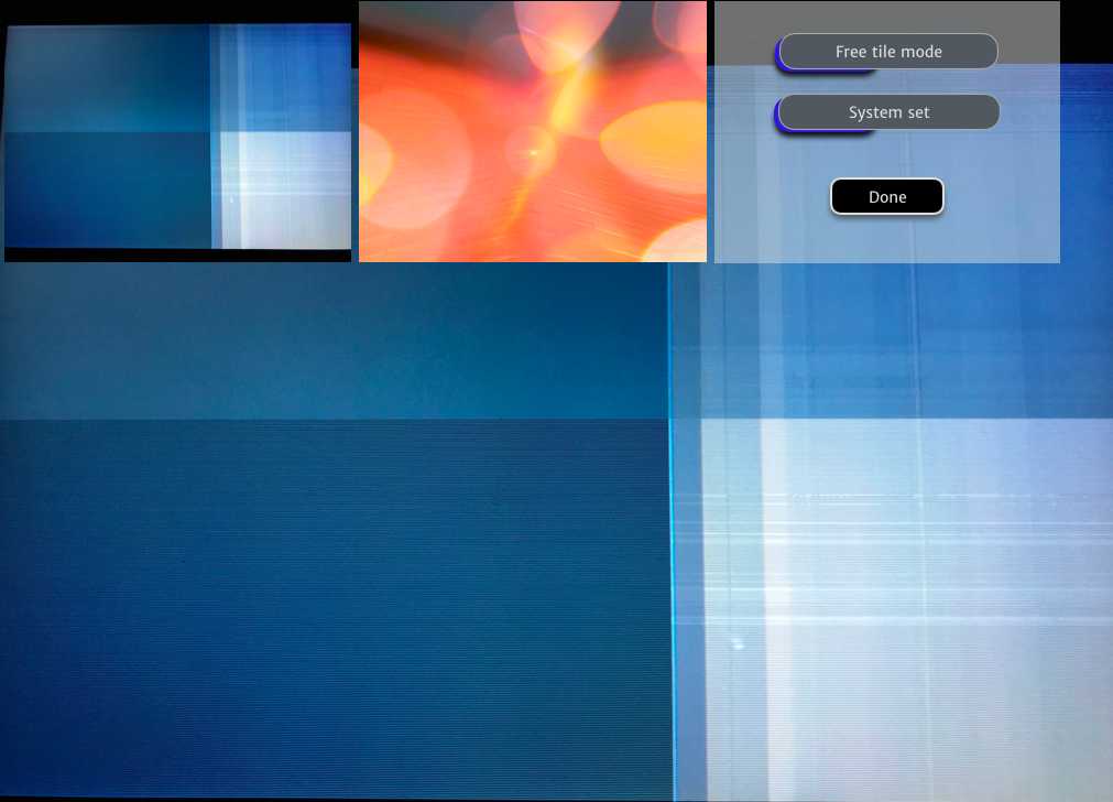
Or click “Set picture instead” to choose a background like this:
Thanks again, everyone That’s my desktop concepts to kind of go with the last thread… and all the concepts or mockups I have for now, but I’m hoping these inspire new ideas and hope people like them 