Tab considerations for R2/Glass Elevator

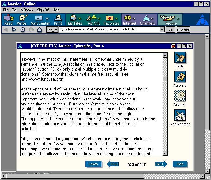
I’d long believed that the tab system in Haiku could be more intuitive for newer users, as after all, BeOS is who really pioneered the yellow tabs system-wide, which we now take for granted on desktop environments on various operating systems today.

And I post a well-known example of this for everyone below:

tab-haiku-home

But the problem is that this isn’t 1999 or 2001 anymore, and tab discovery is pretty much a universal thing now. So, what if each window made it a bit more obvious that tabs could be added to a window rather than needing to hold down a modifier to do it? Of course, there’d be an option under Preferences to change this to classic behavior, but it would still be there for those that preferred a Web browser like experience.

So, here’s my idea (done up really fast with some screen clippings and a few shapes, so please don’t bash the end result, which I know isn’t the greatest).

Each window would have a ‘+’ or plus button next to the existing title tabs to allow switching between them, again, like one would in a browser.

haiku-tab-plus

And in my imagination, if someone clicked the button, I’m thinking something similar to this would pop up (again, I know the artwork is really rough/unfinished, but all I’m trying to do is convey the spark of this idea):

haiku-tab-folders

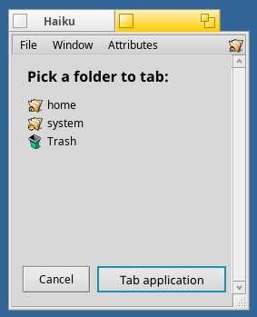
  • Clicking the folder would instantly tab it, or one could contextual drill-down on one of the folders to locate and tab a subfolder.
  • Clicking the close button on the tab (or Cancel) would close the tab and stop the operation.
  • Or, clicking “Tab application” would tell Haiku that you really want to tab two apps together.

And finally, if the ‘tab application’ button was pressed, something like this would pop up:

haiku-tab-apps

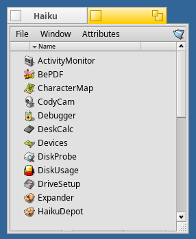
Again, close would cancel the tabbing operation, or clicking an app would instantly attach it to that window as a tab.

Haiku really does need to move forward when we get to where Release 2 starts (and I do know that’s a long ways off. There’s the upcoming Beta 2, maybe more, and of course, Release 1 itself). But since I haven’t found any Glass Elevator topics, I thought this would be a good start to get concept discussion(s) going again. :smile:

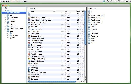
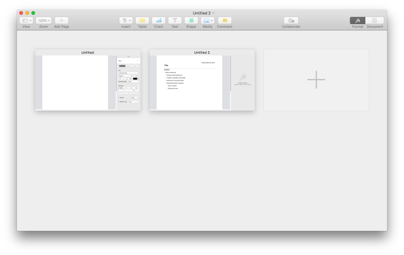
An example from the Mac…

As a visual example of what inspired me to write this post, here’s what the Mac does in Pages when “View All Tabs” is selected:

So I am hoping that one day Haiku will have a similar functionality and reclaim the place of Be of being the baron of tabs again. :slight_smile:

6 Likes

If your enhancements starts with “it will annoy people so let’s make it possible to disable it” there is something wrong about it :wink:

Doing this in Tracker is a little problematic because it normally is a spatial app, remembering the size and the position of windows for each directory. Opening a directory in a place constrained by another existing window would break this.

In general, I think it should be up to apps to manage this. Koder/Paladin is the leading example, probably Wonderbrush could be adjusted to do something similar. In Koder/Paladin, the apps are used in a way that just fit their workflow. I don’t think pushing the feature too hard on users (big “hey, we have tabs!” button) is necessarily desirable.

Other places where it could make sense is in OpenTerminal (wouldn’t it be great if the terminal was automatically stacked or tiled with the Tracker window you open it from, and, maybe, if cd in the terminal also made said Tracker window stay in sync and showed the Terminal current directory?), ShowImage (it could tile the Tracker window it is opened from with itself), etc.

In other words, I’m not sure the workflow should start with “hum, I think I need a new tab”. This is an UI implementation detail. Rather the workflow would be “I need to open this app/dir” and then “oh cool, it docked itself just where I needed it!”. Maybe that wouldn’t work, however. It needs maybe too much guessing at what the user is doing. But we can imagine some ways. For example in tracker, hold the window modifier + double click a folder => open the folder stacked with the current one. Or I could even imagine this replacing/complementing the “browser” mode in Tracker, as it would allow quick access to the parent directories there. I may even consider using it then! Right now I’m in the spacial tem :wink:

2 Likes

For the Terminal case, it would be far better and less intrusive to have an optional panel/pane in the terminal window that displayed the contents of the current working directory above/below/beside the terminal pane. And while the code to display the folder contents could/should be provided by a shared library from the Tracker to ensure the folder content is drawn consistent with how the Tracker does it, the view options chosen in the folder content panel should have absolutely no effect on the appearance of the window of that folder in the Tracker (if the Terminal wants to keep track of and preserve those view settings completely independently from the Tracker, that’s the Terminal’s concern). Basically, it should simply be a GUI-enabled folder listing of the current folder to enhance the usefulness of the terminal.

Stacked Tabs would create serious problems that break the consistency (and therefore the usefulness) of the spatial interface. For example: having “cd” control what is displayed in a Tracker window creates the situation where you’re trying to shoe-horn the contents (including the icon layout) of the new folder into the display space (that is: the window) of the previous folder.

The only way that “cd” controlling Tracker windows wouldn’t break the spatial interface, would be to have Tracker simply open the window of whatever folder you “cd” into without stacking/tiling it to the terminal window. Why? Because stacking/tiling it to the terminal window would relocate and resize the folder’s window. But it gets worse: cd’ing into multiple folders would then cause multiple folder windows to all have the same size/location, negating the usefulness and entire purpose of a spatial interface. But even opening the folder windows without stacking/tiling is bad because it would quickly lead to unmanageable screen clutter.

The only purpose that tabs are truly useful for is letting the user select from a fixed, predefined set of categories of information to display/edit. For example: the stylsh gray tabs of a project window in the CodeWarrior IDE, or in preference dialogs to organize subsets of related settings to reduce clutter.

Anyway, that’s my 2 cents on tabs.

As an interim stop-gap for a tabbed file browser, someone could try to port a Qt based file manager (purists please don’t shoot me) that support tabbed browser windows… Any volunteers ? :slight_smile:

For example https://github.com/rodlie/qtfm

What if new Haiku users are able to realize that different Operating Systems may/will operate in different ways? Living is learning.

1 Like

I don’t like building an operating system on stop-gaps!
But I think we already have a port of Dolphin…

1 Like

I can’t find a port of Dolphin (at least on HaikuDepot GUI), but there is Krusader.

I have a compiled version of this File Manager: Synopson (Qt) running on Haiku - (I compiled it myself a long time ago before PM) … should be easy to port from the sources.

Happy to share the binary with anyone who wants it, depends on Qt4.

Spatial file management is clunky in the extreme, it maybe made sense up until the 90’s as conceptually it’s simpler but almost anyone with a PC knows how a file browser works these days… I’m not sure it’s even a good default to have nowadays. It wouldn’t hurt it Tracker had a Treeview as well.

Interestingly Winfile has seen some resurgence on Windows as it has gone open source… and people nostalgic for that interface can have it even on Windows 10 now.

I could see spatial navegation being more usable for older people that don’t frequently use their computer, my grandparents for instance, the don’t really do computers in general so anything that makes the computer more spatial or skeuomorphic is probably helpful for them (they were big fans of AOL’s mail back in the day).

Once they didn’t have AOL anymore my granparents basically quit using thier computer… I find it kind of amazing that Chrome or Firefox hasn’t just cloned this interface as an addon, and captured the audience of people that have this interface basically burned into thier brain

Hey, PulkoMandy isn’t that old… :stuck_out_tongue:

Many people like a spatial Tracker, I do. Most Haiku devs, I assume, do too, so that probably won’t go away soon. Others can use single window navigation as a step in the “right” direction.

Also, file management is a perfect area for a 3rd party app. If people like tree views etc., there should be some dev among them that can code it up. Assign the folder MIME type to that app and, pronto, navigate the filesystem with it.
If it turns out to be brilliant it may influence Tracker’s future.

2 Likes

Yes, don’t tell me how I should use my computer please. I run other OS (rmostly at work) and I hate their file managers for not having a spatial mode. Windows 10 even makes it harder to just open a second file manager window to have two directories open at the same time. So I tend to reuse existing windows, which means I lose whatever was open there, and I keep reopening the same folder again and again. It’s not possible to have some directories use icon mode and others list mode, so I have to switch manually all the time.

Spatial mode fits me better and is here to stay in Haiku.

Thât being said, we understand it is a personal choice, and that’s why there is a single window mode. It did not get as much love from the people who want to use it, apparently…

And btw, my parents gotinto computer with win 3.1 and much prefer browsing using a tree view, they would get lost with spatial mode and complain that they end up with way too many windows open.

5 Likes

That’s because it was tied to America only (or mostly), so the east side of the map didnt use it. It wouldn’t be a greater market than… lets say replicate Netscape 2.0 or so. I heard about AOL since loooong time, yet yours is the first screenshot i have seen, iirc.

Waiting for that option to became a reality. First change I do on Haiku ui is turn one window navigation plus location bar.

I understand that several windows mode may be good for others, just not for me :stuck_out_tongue:

W10 doesnt really help with any task you want to do. I’m forced to use it at work for developer apps, and even then i cannot go to coffe break or lunch time without saving everything just in case it "has to auto update & reboot ".

1 Like

Exactly my point… you’re being quite hypocritical. You are going on the defensive there for absolutely no reason… I’m talking about making the UI more personal for R2, clearly R1 has very well defined goals we shouldn’t really stray from too much.

I could care less if others users spatial mode I will likely never do so. But it’s fine if it is there as an option for people that find it makes sense to them. I might actually use it if there were a direct method of opening folders, and yes I know about browsing to folders via popup menu… I think the problem is the walking through doorways one, where it breaks your train of thought to switch UIs.

Lol yeah AOL is so deeply ingrained in the USA that there are still people that pay for their services. Though it is a shell of what it was.

I have a way that suits me perfectly and you are attacking it by saying it works “only for old people”. Then you complain that I’m defensive.

I’m not trying to force you to use it. Just don’t expect me to improve the navigator mode. I will happily review patches, but that’s all you can expect from me.

The option is not going away, we know both choices are equally valid and there isn’t one right and one wrong way.

1 Like

There is no attack… that is just how I have perceived spatial file management from my point of view. Frankly I still don’t see how anyone could use it in a complex environment effectively but to each their own. I never said anything to the effect of removing it… I understand the reasoning behind why it exist and why Mac OS classic used it for that matter… .

Good grief … you can’t seem to have a conversation without feeling attacked.

People are very good at remembering things spatially. A “memory palace” and other memory tricks for memorizing a deck of cards, for example, work so well because of this. I was not always a fan of the Tracker spacial interface, but it does take advantage of that human trait, at least to some extent. You can leave a Tracker window open to a certain folder, on a certain workspace, in a certain position, and it will stay there as long as you want, across reboots, until you close it or some major computer crash. If used properly, that can be very handy. It can become muscle memory, which is something that I think is vastly underutilized in computers.

Once the browser interface became familiar that became a standard interface style, and many file management interfaces went that direction. We also have that mode in Tracker, but I don’t know if it really is all that great. I find using Mac OS Finder and Windows Explorer pretty unpleasant. As pulkomandy says, opening another Explorer window is stupidly difficult in Windows 8 and above. I had to install Spectacle, a window management tool, in Mac OS X to make it so I can put a couple Finder windows next to each other to make moving things around easier. I still have to do drag and drop which doesn’t work right half the time, and leaves my wrist aching after a while.

When I was on Windows more often in the past, I used xplorer2 a lot. It is a tabbed, dual-pane file explorer. I am pretty sure there were a few BeOS dual-pane file managers. Tracker could maybe simulate that with stack and tile, and it might be interesting if someone implemented that in Tracker. There could even be menu items, with shortcuts for something like “Copy selected items to the left” because the current window knows there is a window tiled to its left and it can interact with it. Or similar with stacked windows tabs: “Move selected items to tab 2”.

I think overall we have plenty of ways to make Tracker better. But obviously alternative file managers are welcome too.

2 Likes

I wonder if that could be done as an addon or as part of the stack and tile API, the copy to left part that is. That could be useful elsewhere such as for merging patches etc… you could just open two text editors tile them and use them as a merge tool etc…

Also note Spatial file management inside the window itself does make sense to me, I just find the action of drilling down to where I want to be unintuitive. Using the drill down popup means you have to know where you are going… unlike a browser file manger where you can sort of wander through the FS to get to where you are going.

I use single-window with-navigator Tracker as my default. So we exist, anyway :slight_smile:

4 Likes

Perhaps then we just need some way that in Spatial mode, one can navigate through folders without opening new windows, “temporarily” (hold down a key?) and then everyone would be happy.

Perhaps, however it wouldn’t be very discoverable. If this keybinding existed perhaps it could just flip the mode, so if in spatial mode it navigates and if in navigator mode it opens spatially.

i think the spatial and single window navigator modes are almost mutually exclusive though… I’m certainly not unhappy with Tracker in navegator mode as it is today… there are some cool things that could perhaps be done though.

Or not. That key is OPT and has been for ages (can’t remember if it goes even back to original BeOS Tracker). :slight_smile:

2 Likes