There are also “unofficial” square logos with just the “H” and its green leaf, that’ve been used sometimes where space is constraint. Maybe we should decide to use one and have Haiku Inc. trademark that too.
I think I like the left one better. But the right one has the nice Haiku icon thing going…
Not yet. Another area for the enthusiastic Haiku user to blaze the trail.
Just start a new thread and post them there, indicating how you are licensing them. Backgrounds are a little tricky these days, there are so many aspect ratios to consider. maybe subtle tiling backgrounds would be the best bet. But all contributions are welcomed.
Wouldn’t a mascot depend on the kummunity derivatives (forks). Just as Linux derivatives have a suffix of “ix” or “ux”, wouldn’t Haiku derivatives have “ku” as the suffix?
Desku - An office-focused Haiku
Diagnosku - A diagnostic Haiku spin
Audioku - a music-focused Haiku
Eduku - An educational Haiku
Penku - A pentesting Haiku
Superku - A Haiku for supercomputers
Shame-on-ku - A Haiku for porn-surfing
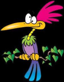
Given the “ku” suffix, wouldn’t the typical derivative then become affectionately known as “ku-ku”. And a suitable mascot would becomes obvious:
a ku-ku bird:
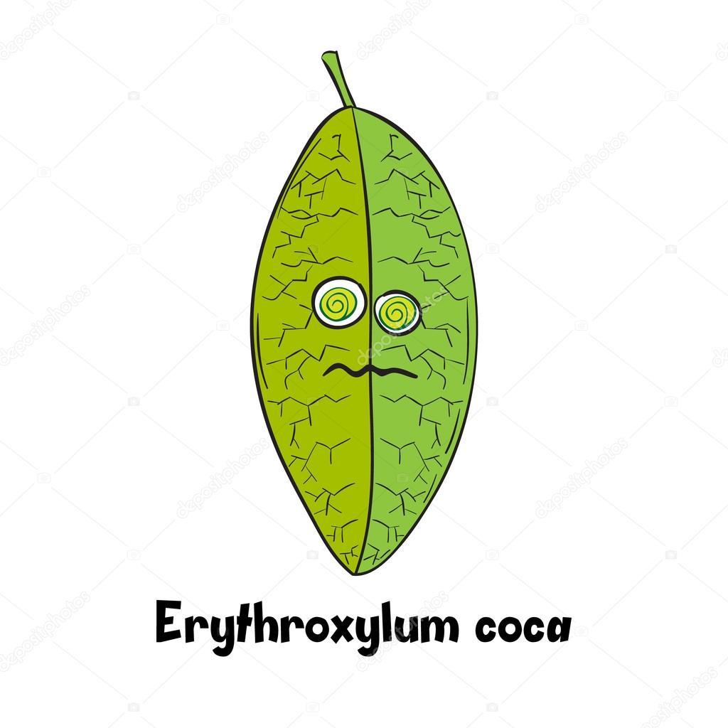
or, better still, a ku-ku leaf, which would be guaranteed to attract many new developers - along with some sizable donations too:
All are very ugly mascot except the racoon … Tux start the ugly mascot fashion haiku have a poetry name dont use a ugly draw it is a contrast with the name …
I think a mascot is a great Idea. I am working on starting with a year Keweenaw Peninsula Computer Company (KPCC). May be I will make one for it which would be used with the PC that we sell.
It is difficult to make such a public announcement if we expect people to work for free. In most cases they expect to get paid for their work. Now it may be possible to find someone interested enough by the project to contribute to it, but I would start by looking inside our existing community first.
Also, the general agreement last time this was discussed is that we like our existing brand identitity with the Haiku logo and don’t plan to change that or add a mascot or other things. New flyers and a refreshed website design would be great, however. We have tried to get some designs from Google Code-In (which unlike GSoC allows non-coding tasks), but we were not satisfied enough with the results.
Some ideas of being in another country and seeing some oak leaves, which reminds me of the pointed leaf of Haiku … The same day we find a Japanese garden in a pond with some Koi fish swimming around, from the speech of the tourist guide about the meaning of Koi Fish for the Japanese:
Perseverance
Japanese koi carp Firstly, the koi signifies perseverance, due to the fish’s tendency to swim upstream, never stop moving, and resist simply “going with the flow.” This symbolism represents how a person can remain strong in the face of adversity, never give up, and develop strength of character, purpose and ultimate success through perseverance.
Strength
The koi is a common symbol of strength and steadfastness in the face of adversity, and the much-admired trait of remaining strong when faced with poor odds. The imagery of koi swimming upriver is often used to symbolize the overcoming of obstacles, and ultimate victory in the face of adversity.
So I think that to represent the perseverance that the development of Haiku has had over the years, to go against current being faithful to its principles and precepts from the beginning. Apart from being in tune with the theme of Japanese poetry, and seen from above a swimming fish could look like a leaf like the original logo, also makes reference to the UNIX origins and the close relationship that Haiku has with OpenBSD.
Because the Haiku Team, even with not a production-ready system, not have a good marketing team behind it. And maybe will be a presure relief, with all the work behind the scenes with the Beta comming out soon, that all the marketing stuff would be managed with only ONE (1) Haiku .Inc or Haiku’s DevCoreTeam to lead that effort and let the community do the rest.
Maybe another Call for Action like was the contest for Logos, Wallpapers, IconSets, haiku-os.org portal web design closer to a major release in the past (like Beta 1 is). Even the recent google code-in video tutorials is crucial for a younger youtube generation that if dont found it on youtube, it dont exist.
That push on the community will bring closer all those casual and new Haiku users that aren’t kernel/apps developers but seems to know web design, graphic design, UX design, Illustrators, Musicians, Video Producers, [Multimedia OS, anyone?] etc… all that audience of early adopters for a “retro looking” modern OS that were mean build for that particular audience.
I guess beyond all that people that work on Haiku regulary and daily, all that BeOS’s OldDays Entuthiast, even that folks that only take a peak on a casual VM image of a Nightly now and then, just for check the progress and come to this forums every day or week… They are all the captive audience for progress and good news that will bring their help to the Haiku Project with no more interest that fullfill their and our goal from the day 0: