https://discuss.haiku-os.org/images/haiku_logo_white.svg
why the logo Display only haiku and not haiku os, because this is the name of the project.
https://discuss.haiku-os.org/images/haiku_logo_white.svg
why the logo Display only haiku and not haiku os, because this is the name of the project.
‘Haiku’ and ‘Haiku OS’ are synonyms.
We even can vote for that, but result can not change the facts, you can not vote or command for that – it is a fact or not. This just are.
– why you does not accept this?
Interesting, project called “Haiku”, but its product can be called “Haiku OS”.
Certainly there is a name, but as to an ‘identifiable’ logo, I’m unaware of such a thing.
Haiku, as an OS would benefit from having some well designed, eye catching LOGO that well incapsulates the character & merits of the system. If we’re talking about the ‘falling leaves’ idea, not sure how striking that is & or how workable.
Consider the BEOS eye & ear ‘Media OS’ icon I have as my avatar as an example of something immediately identifiable.
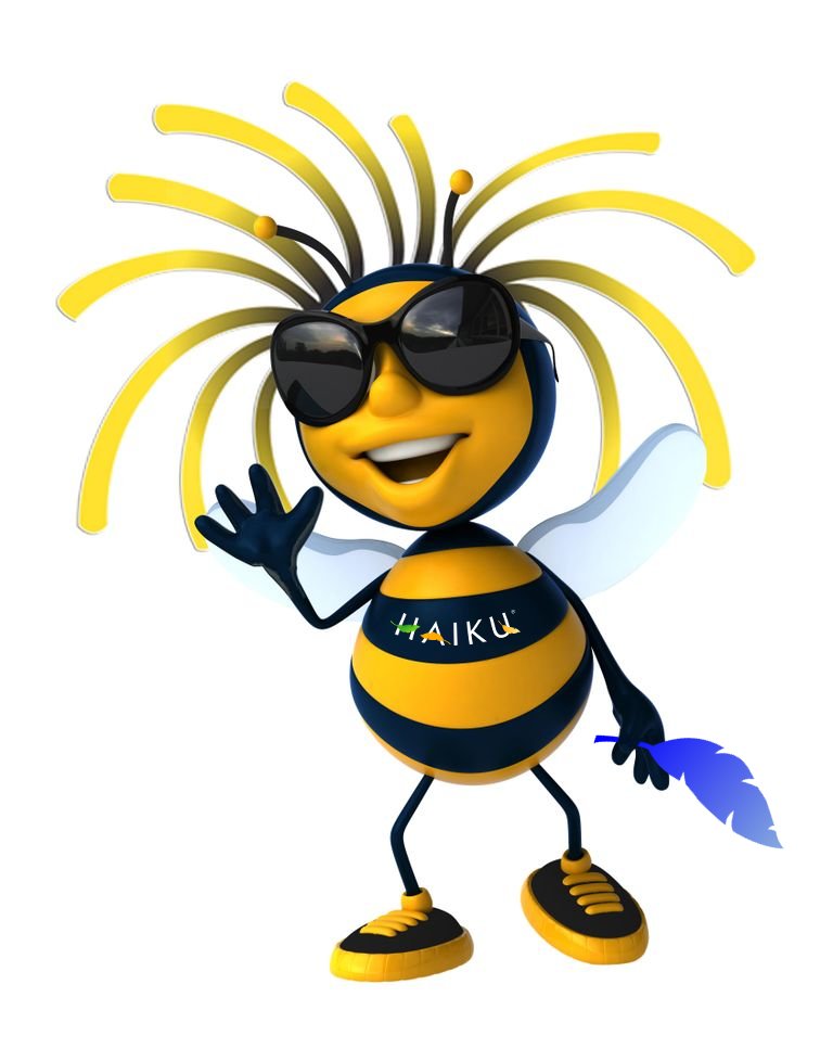
Yes it is the bee for sure…
busy and endurable working to get work done… one by one…
I have no desire to have an eternal back and forth, so I stick out of this discussion. In Germany one says: You are right and I have my peace.
Are you sure that bee was the mascot of beos?
I have been around for so long and can not remember it. Be had a distinctive logo. It was short, the B in blue and the e in red. Zeta had then later a mosquito, but a bee?
Can of course also be wrong in this regard.
Maybe he was thinking of this 
though I don’t really see a ‘bee’ there…
Good morning Haiku Community!
Please, PEACE.
more like this
If I am not wrong remembering it was a mosquito at that time but has the look of a bee for sure!
Both make sense…
That’s the Bee/Moskito at the end! Do you get me?
In light of this discussion, I believe the Bike Shed should be the Haiku Mascot. /sarcasm.

I am uncertain if the story about how Be Inc. picked “Be” as corporation name was ever told/written.
One can speculate that, since be comes after apple in most children’s aids to learn the English alphabet, this may have been so that one could envision Be becoming the Next Apple!
The symbol in the red square looks as much as en ear/eye mash-up as a swarm of bees - again conveying ambiguity as to its true meaning. The ear/eye mash-up likely points out to the emphasis on the multimedia capabilities in promotional material.
I think that Haiku, while inspired by BeOS, should not be burdened by such an ambiguous legacy.
According to the Wikipedia article:
According to several sources including Macworld UK, the company name “Be” had its origin in a conversation between Gassée and Be co-founder Steve Sakoman. Gassée originally thought the company should be called “United Technoids Inc.”, but Sakoman disagreed and said he would start looking through the dictionary for a better name. A few days later, when Gassée asked if he had made any progress, Sakoman replied that he had got tired and stopped at “B.” Gassée said, “Be is nice. End of story.”
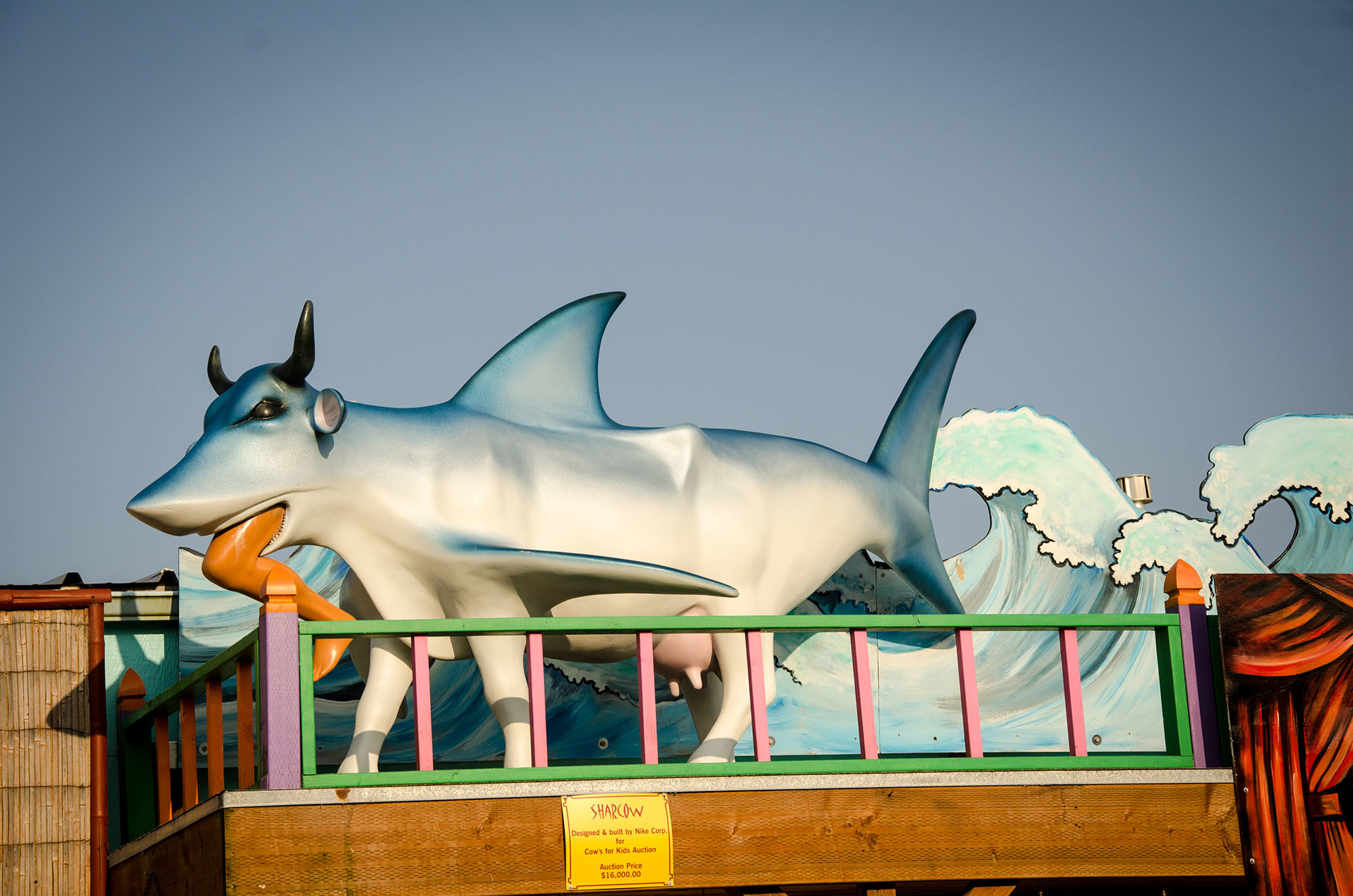
I don’t see how no one else has upvoted it, because shark cow is definitely the best suggestion by far. May I suggest, Walter the shark cow? 
Ohh, lovely…!
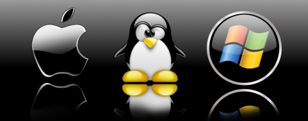
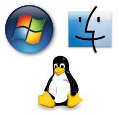
As an outsider who has spent all of 5 t0 6 hours with Haiku, I would like to throw my opinion into the ring. I have read quite a bit about the history of computing and I think it is very important to have, not a mascot per se, but a logo. The big three (Windows, Mac OS, and Linux) all have logos that people can use to distinguish them at a glance. If you are from China and don’t know a word of English, you could still walk into a Tesco and tell at a glance if the computer mouse they are selling can run on Windows, Mac OS, or Linux based on the logos. This can also be called brand recognition. Below are two examples to illustrate my point. In short, Haiku needs a logo that can be easily recognized at a glance regardless of language spoken. Thank you for your time
P.S. Is there a place to upload backgrounds (not logos or mascots). I’m not very good, but I’m willing to take a crack at it.
I like the haiku logo