I know I had started discussing this in another thread, but since most of those ideas have been softly rejected, I thought it probably would be better to focus on the Quick Tour, although I’ll leave a few ‘follow up’ notes below.
Quick Tour done!
Last week, I had promised to do a quick tour for Haiku. It is completely free for the Haiku developer team to take it, add it to git, use it, change it, whatever they would like to do with it, so long as I get credit for first authoring this per the MIT license. My hope is that some form of this can hopefully make it into the Beta if the team likes it. There’s a lot that would need to happen to it to meet Haiku standards, so this is merely a demo.
(And hopefully, a pop-up notification can be shown on first run so the users find the finished version (maybe detect then delete a hidden file on r/w media to determine this).
But anyway, the files (just HTML help) should be able to open from anywhere. I’ve added a link to my Dropbox here (be sure to read below first):
Read me first!
This is a rough draft. What that means is that it is not feature-complete by any means or really finished. It is a proof of concept. The idea is to simply demo what the quick tour is to the Haiku team, so they can get the initial idea of what I’m proposing, and the Haiku team can change it, provide feedback, etc. It’s not perfect and it’s not release material, but my hope the initial alpha of this ‘quick tour’ it makes sense to the team.
Thanks, all.
A few follow-up notes from the previous thread…
First things first: I’ve said it before and before, and will say it just once more – please add an accent color to the widgets to replace gray. Blue or not, there needs to be a splash of something. The various grays makes the first impression of Haiku feel aged, like OpenStep.
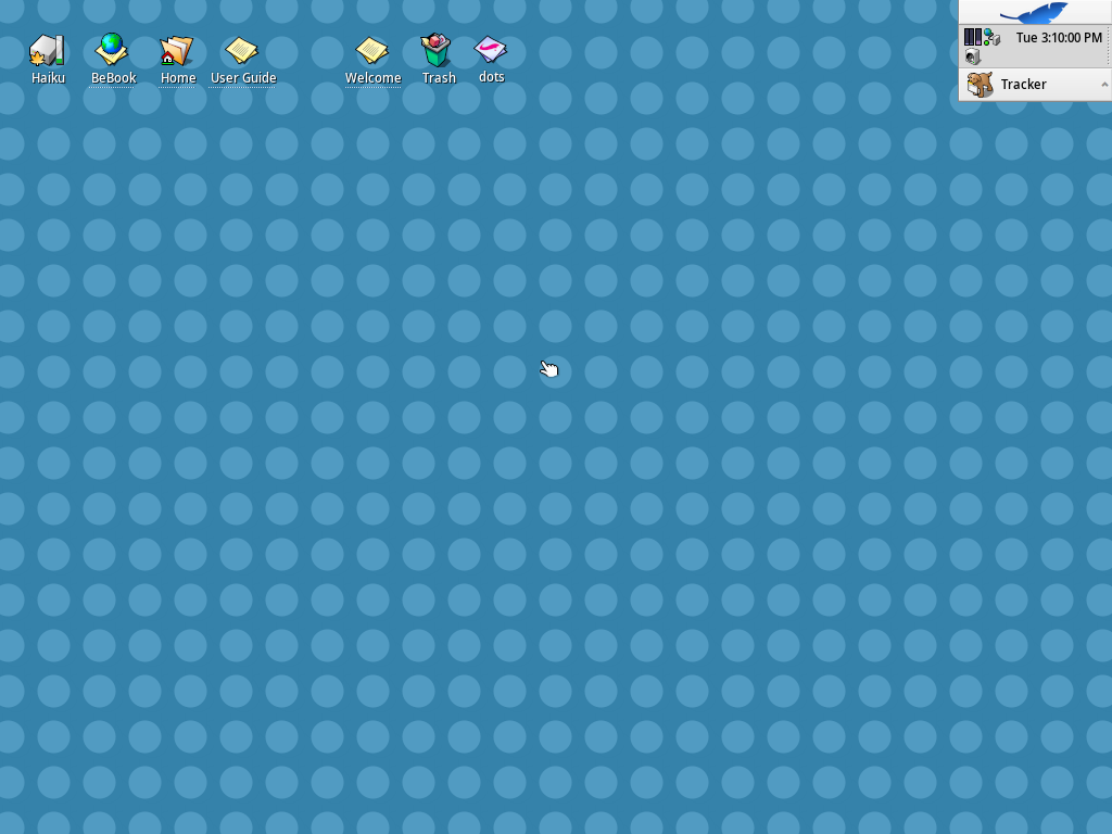
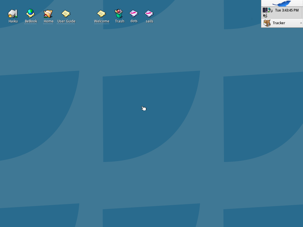
Okay, the real reason I add this section. As for tiling, I freely admit to it: Tiling desktop backgrounds for Haiku just would not fit Haiku’s feel, unless someone has a way to (nicely) tile leaves. I haven’t found a good way to do that, and experimented with various shapes. Personally, I don’t mind tiled effects, like Mac OS 9 used to play with, but that’s just me. And I realize this really wouldn’t be a good fit for the Haiku feel for Beta; here’s a few examples of this experimentation (while the pics last; they may disappear due to forum glitches)…


