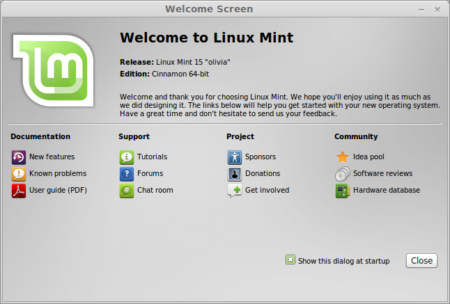
You mean something like a “Quick Tour”, linked from the Desktop, right beside the link to the User Guide…? ![]()
You have the quick tour and userguide as link on the Desktop, humdinger told you.
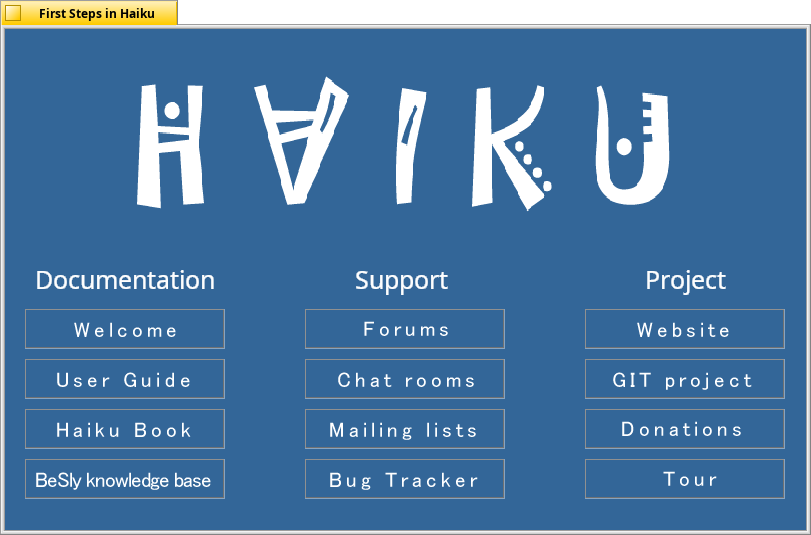
If you mean a graphical tour to learn like on Linux distributions, try my “Fist Steps” example from https://software.besly.de
Yes, but even MORE visible. The kind of in-your-face visible. That’s the point i’m trying to make: it’d be nice if the Quick Tour guide (or in the future, a Welcome page/dialog) auto opens the 1st time a fresh Haiku installation boots.
Will check it out. I was thinking in something similar, like this:

In any case I don’t mean to derail the topic so I’ll better stop here ![]()
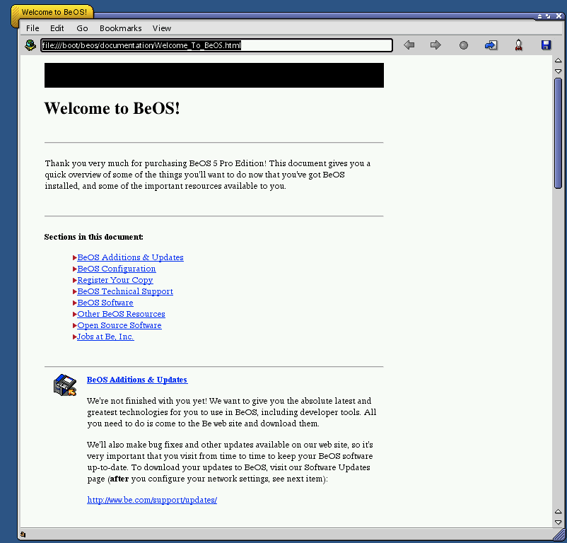
As a total software geek, I’ve downloaded and messed around with the old BeOS versions for fun, and BeOS used to do this apparently (this is Dano):

… so I don’t know why Haiku can’t do this too
Have you tried to press the Home icon in the toolbar? 
The “Quick Tour” and the “User Guide” (shortcuts are on the Haiku desktop) are the Haiku equivalents of the BeOS documentation.
Quick Tour needs to be integrated better as a welcome screen after first installation. It should ideally open automatically in a small container window with native back/forward buttons.
Or Tipster can be included with the system in this regard. It can start automatically at every boot, with the option to disable it/not show it again.
Anyway, it’s getting off topic.
Could one of the moderators please split the portion of this topic talking about Quick Tour/Help to a new topic? Thanks!
I liked GNOME 3.38 welcome tour : https://help.gnome.org/misc/release-notes/3.38/figures/welcome-tour.png
Maybe something similar for Haiku can be useful. But the current user guide and welcome tour linked on the desktop are great.
A tour with interaction of the user? This is a good way. I add something like this into my haiku first steps.
Perhaps we should have the first boot open the Quick Tour automatically? It seems most first-time users just overlook it.
Excellent idea. It would be even better if we could get it to display the system language automatically.
I would prefer more centered and bigger icons for them instead, haikudepot already gives a popup on first launch… don’t want to see that become a trend honestly, I don’t think it is that good a UI.
I think it is good as it is. Normally people should see the two documents on the screen.
A gui as user orientation like my example ‘first steps’ or in linux could be a good solution.
If people don’t click the quick tour when there is an icon on the desktop, I assume they would close the annoying window that opens when they fist start the OS as well. They just don’t want to read the docs.
Also one thing to remember: our UX “research” so far is people doing live reviews on youtube. when you do this, you don’t want to bore the viewers to death by “hey let’s spend hours scrolling through user manuals!”. And probably if you’re runnign a youtube channel like this, you are the kind of person who think they know a bit better than others and you’re trying to share your knowledge.
It’s quite possible the situation will be quite different for people who are not so tech-oriented and/or don’t have a screen recorder running while they try Haiku.
Just something to take into consideration. When we have real-life open source conferences again, there often are UX research sessions where we could do similar tests in a different setting. We should probably try some of that, and not bias our views to make Haiku the most youtube-creator-friendly OS, instead of the most user-friendly OS.
Yes I totally agree here.
Some people are just to lazy to read or even to watch a help video guide or tutorial about how to use a app, even if there are a lot and good ones.
That explaines the bad and the good votings on some apps on the different app stores! Good apps got a bad rating becouse people complain how difficult it is to use the app. For them the GUI is not inovative.
On the other hand user reading and watching tutorials got a good experience with the app and so
the app is rated 5 stars.
For example read the comments for the IP Webcam app used by 3Deyes for his IP webcam project on PlayStore…
If you follow the instructions you find the app quite easy to use. If not you can get lost easily.
I like the small help buttons in this app, explaining an giving short tipps.
Same problem here:
(Installation/booting issue)
Even if Quick Tour is available as shortcut in the desktop it’s different experience to automatically show it to the user on first run and allow him/her to dismiss it. I think doing the latter is a better option (of course still keeping the shortcut).
IIRC, that’s what occurred on BeOS 5 upon first boot, a quick page with the essentials would load in NetPositive.
The Welcome page is set as start page of WebPositive by default.
How about we move the “Getting to know the system” further up and add big, friendly icons for the Quick Tour and the User Guide? Eyes and mouse pointers are drawn to icons more than text…
Then we can decide if we should popp up WebPositive showing that default home page on first boot.
