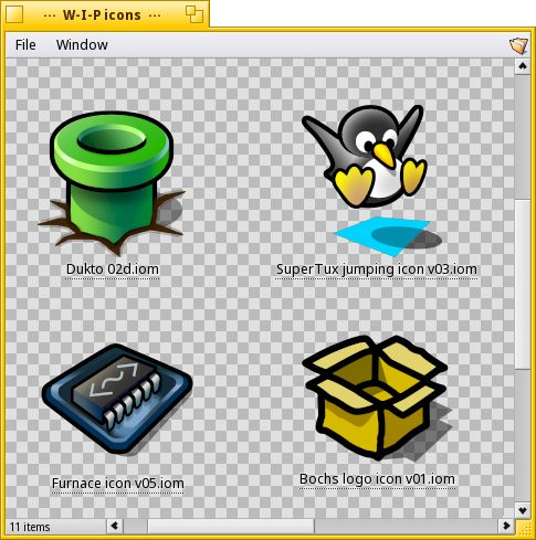
I’m going to put here some icons I made recently just for fun, perhaps someone can find them useful:
Hydrogen, a qt DAW recently surfaced in the telegram channel. http://0x0.st/oUIc.zip
I was working on and off on this one some time ago, but I letf it in hiatus because I wasn’t able to make the resulting hvif smaller than 2,3 Kb.
Time ago I read somewhere that the ideal hvif size is not much more than 1 Kb, so that it can be inserted inside an inode (whatever that is) so that it can be read in just one pass, or something like that. But I think that it was just important because of mechanical hard drives?
Nowadays with SSDs that’s not that critical, or is it?
Very nice!
You can try reducing the icon size by simplifying the paths, aligning the vertices on the grid, and reusing paths and shapes; your beautiful design could benefit from this in terms of size, probably it’s just too many details, so you could try removing some of them; but I guess staying under the kilobyte is more of a style exercise than a real need, so probably there is no need of what I wrote above
Ok, I think I’ll relax a bit then
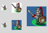
Too much time already spent on this one, trying to keep it faithful to the original sprite!
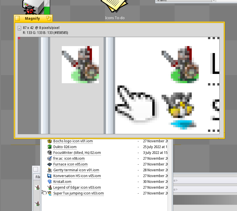
One thing i miss a lot in Icon-O-Matic is a column inside each palette that showed the “cost” in bytes of each path, shape or style, and the resulting total below the icon previews. That will be really useful when deciding if its best to do things one way or another, because, as it is now, one needs to export to hvif a lot of times just to keep checking the size in Tracker.
Yeah, really sad that it didn’t ended up ported as well, to me Haiku makes a perfect home for this classic games.
I think the problem is that it’s closed source, no matter who ported it, he wasn’t allowed to give out the source. But it would be nice to see the game on haiku. Hermes also cuts a good figure, for years
The original Great Giana Sisters was easy to beat. Giana Sisters Return is much more difficult. After I got to the desert levels on my MorphOS box I got sick of it and quit playing.
I uploaded to Haikuports a few more icons I had already finished.
Also that Furnace icon I showed two or three months ago
And given that dealing with github, commits, forks and all that makes my head hurt and to drag my feet like a sloth, because it is… not exactly my forte (gross understatement), I tried to get my feet wet and also created some (maybe incomplete?) resource files and made some (surely also incomplete?) changes to recipes, though I think nothing deal breaking.
I hope I can finally see my Dukto icon appear in the depot!
I visualize whoever will be reviewing my ridiculous commits pulling out his hair right now, because my ears are starting to ring like mad.
Well, fitting the icon in the “inode” (that’s where the file name, permissions, etc of the file are stored) does make things faster. For one single icon on a single file it may not be very noticeable, but if all app icons are large and don’t fit there, it results in a lot more disk reads than would be needed.
But besides that, I think this icon has a lot of details, which may not work so great at 32x32 or 16x16 sizes (IconOMatic shows you previews at those sizes). If I were to draw an icon like this I would probably do just the helmet, or just the sword and shield. But then, that’s just my opinion and I don’t draw this, so, do as you want, probably nobody will really worry about either the size or how the icon looks at 16x16px in the Deskbar anyway.
Well, I do worry about that
Don’t be afraid, I go to great lenghts to ensure that the icons look good at every size, saving frequently, making constant checks in Tracker at every size available, and doing good use of the wonderful Max/Min LODs capabilities in Icon-O-Matic.
I must admit, though, that I got a bit carried away with the details on this one, but this character has such an iconic and recognisable shape at small sizes that this convinced me to keep going this route instead of something more abstract.
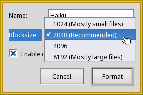
Yes, but when installing Haiku the formatting defaults to 2k, and most people wouln’t even think touching this, so I think is preferable to keep doing icons with this in mind.
It’s good to know, thoug, thanks
Oh BTW, what will be the icon data space available inside the inode for every one of this block sizes?
Is there a hard limit, or is it depending on the number of other things that need to be put there?
I have this nebulous concept that the limit is at around 1 to 1,5Kb, but can’t remember where I read this, the three articles I have bookmarked (“Icon guidelines”, “Why Haiku icons are so small” and “Icon facts”) don’t mention it clearly.
And, just out of curiosity, what happens when the icon data is too big to fit, where does it go?
I use http://0x0.st/o0V-.iom to start with my icons, it’s a circle perfectly aligned with the grid so it weights a little less than the standard one, plus it’s in translucent black that can be reused for the shadow style
Furthermore icons require to have enough room for the outline, one for LOD <=0.375 and one for LOD >0.375, so I suggest to fit the design into a 30*30 square.