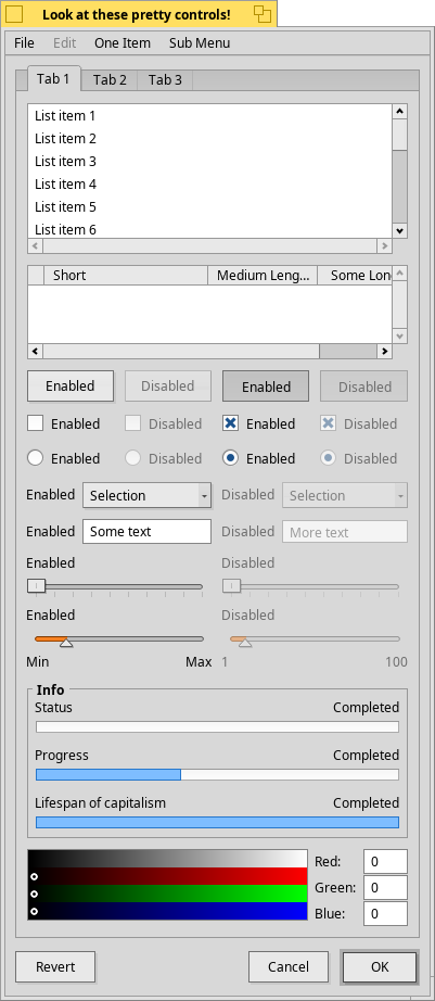
And a ‘flat’ design (without highlight and shades), surprize, looks not bad at all:
And not forget, we can tweek the colors!
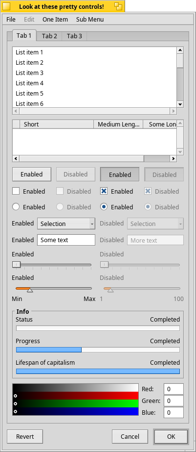
And a ‘flat’ design (without highlight and shades), surprize, looks not bad at all:
And not forget, we can tweek the colors!
Hmmm… can we have all three variants as options? can we?
I like them all.
I am not a designer to fairly judge those considerations, but being a professional WPF desktop application developer I would say that I personally don’t like the current UI trends at all (UWP, you hear me?). I prefer this good old gradient styling much more, and in my opinion Haiku does it just right. I also prefer UI elements to stay uniform, a.k.a. don’t make one left-top border of a button look too different from the right-bottom one and so on. What would really make it look old is light-top-dark-bottom scheme (Win 95 and it actually makes me remember TUI), but this is not the case with Haiku. Everybody seems to be liking fancy flat colorful buttons these days, but who knows when trends change again. Also some nice material for reading: http://babich.biz/buttons-in-ui-design-the-evolution-of-style-and-best-practices/
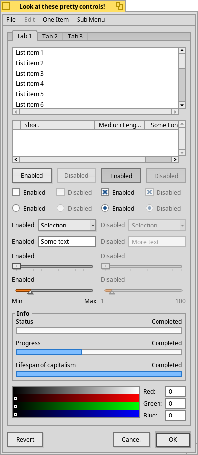
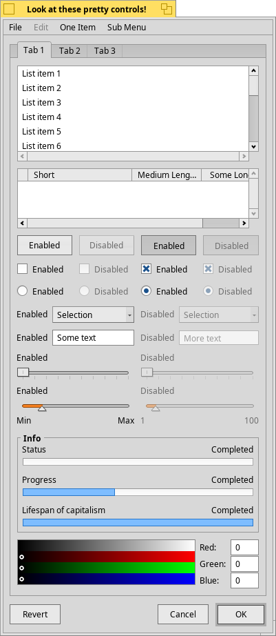
And another design ‘Flat Flying’, Flat with some shadows — with flying buttons (active), pulldown menus (active), menu, sliders, active tab:
Add one more to ‘options’!
Some conclusions
in ‘Look and Feel’ in Preference we can have such options
GUI controls: ‘Flat’ or ‘3D’
buttons, menu: ‘with shadows’ or 'without shadows’
3D buttons (and other some) surface: ‘bend’ or ‘not bend’ (‘classic’)
— or just different ‘styles’ or ‘theme mods’?
— how this can be achieved?
Since BControlLook is already a class in itself, you would need to write another one. Then the system would need some method to load it, but that shouldn’t be much work.
Anyway, Haiku is all about sane defaults, so these preferences do not belong in the system itself. I’d say let’s ship just one style (since any changes to BControlLook would need to be done to every shipped style) and the rest could be available in the repo as addons, developed independently.
BTW I really like ‘flat’ mockup.
Please don’t add these as settings, indeed. If we are to make changes, either we make them for everyone or as a 3rd party add-on.
I also think I prefer the current buttons. They are logical to me: there is a recessed area in the window pane, add the button inside it. This is how physical buttons in the real world work.
The flat design may look nice, but I think it decreases usability: now the buttons look a lot like textboxes. However it may be possible to find a compromise, maybe by keeping gradients but making them a little more subtle. Or maybe a flat design look should live its own life and hint at buttons in a different way, maybe different colors?
Just to understand better: the decorators, could modify this kind of aspect of the GUI (shadows, etc.)?
If that is the case, It could be managed as “decorators”, that also could be managed as independent packages. I guess this is the way thas PulkoMandy says.
you see there are a bug when you try to join windows in the flat beos theme? a total crash.
Can you elaborate on that?
I think that decorators, colors, styles (control’s styles) and themes (some combination of three mentioned before and optional wallpaper and even default deskbar position) must be independent separate settings-options.
Decorators are for window borders only, but there is similar support for swapping BControlLook which is in charge of drawing everything else. We just haven’t exposed a way to load an alternative one yet.
I can definitely see how the UI could appear old and outdated to a new user in this day and age. I personally find it sleek, modern, easy to use and efficient, especially compared to other “modern” graphical interfaces. Haiku receives an “aye” from me for waiting to focus on UI variation until R2 and beyond.
I am of the opinion new users should at least use the current interface and learn all of its intricacies before desiring and requesting changes. There is a lot that doesn’t immediately meet the eye. Peruse the user guide. What you currently see as old and outdated, may become sleek and modern as you get the feel for it. As an old user of Br5, the Haiku interface is greatly upgraded and updated since the old days. Thank you for implementing stack n tile. OMG Thank You! Thank You! Thank You!
Here’s my MacOSX Dock replica for Haiku: HiQDock Video
and see: https://discuss.haiku-os.org/t/hiqdock-new-dock-coming-soon/3691
Looks sweet… being that the style is very macOS like, my only (very small) complaint/observation is that it somewhat clashes with Haiku’s simplistic/no frills look-n-feel. Is it possible to customize the look-n-feel of the dock to feel more at home in Haiku?
Have you checked out DockBert?
Not in ages… I have been pretty much using LaunchBox over the last 5-6 years.