I do not believe you. I think you even will not notice this old pc in store as product for you (you will think this is some kind of vintage decoration or a joke), you never go to check on how good it’s inside specs.
…Actually this is what is happening to Haku. People see some old looking tech and they not interested further.
Not really, i like modern desktops, but i does not see the prio for it at the moment. If they really decide to make the desktop more modern, we lost again much time, because they need enentually many changes in the main source again (pgk management for years too). We are waiting for a beta release sience so many years that this could be break this process again.
And yes i am coming from amiga using and a desktop is ‘for myself’, a ground base to run other programs and should be fast, simple, minimum resouces taken, and not a high end colored playground.
I actually do like IBM/Lenovo designs (no matter how old) over HP ones (no matter how modern). But sure, I would not take a CRT display anymore, not because it looks ugly, but because it is old technology.
These lovely purple mousewheel and eject buttons <3
8 cores @ 4Ghz and 16Gb RAM vs 2 cores @ 2Ghz and 4GB RAM ?
Easy, I’ll take the first. Most probably the better looking GUI visible on the later can also works on the former. The hardware box would be under the desktop in both case, I don’t carehow it looks until it’s performant.
More seriously, any mockup of a more modern GUI for Haiku that would make sense without needing to recode large part of the source code are welcome. One big limitation we have for instance is that you can’t use translucent and color environment maping and all these UI sugar until we have switched to an hardware accelerated window compositor. Which can’t be done until we get hardware accelerated GPU supports.
Which is an heavy task, otherwise it will be done already since that much years…
Back to square one: no modern GUI without modern GPU support.
Can Haiku use the same tech for GUI elements as for it’s svg icons?
Can Haikus app server have only frame knowledge of where some GUI objects are or where they must be put and what they do, but how they look it is the buisness of video driver and some control styles addon, which can be some svg object. Making new theme in that way is a task for some artist. And only driver part is for programmer, and when GPU will be supported in Haiku, driver must have capability to render GUI elements and svg icons. Those GUI element and svg icons in the future can be made 3D, witch will be rendered in GPU. It is important, that basics of this type of technology must be implemented now, and evolve gradually. It is how I see situation. What you think?
The app_server already implements a high level protocol for drawing, which allows (in theory) to offload the drawing to whatever you want. In the usual case, we use a local software renderer implemented over the AGG library. But we can also send drawing commands over the network to the remote_app_server. We could extend this to a graphics card, to an intelligent printer which could do its own rendering, etc.
The icons are just a storage format. This is parsed by the application and sent to the app_server using the same protocol.
Doing a graphics theme in SVG or another grahpics format is more complex than it seems, however: the GUI changes depending on your font settings, and the drawing is actually made in very small pieces (a button border, a button background, etc) which are reused in various places, both in default widgets and in custom ones implemented by applications. As a result, it would be hard to do everything with static bitmaps.
That being said, if someone has a convincing proposal for a new UI theme, it should not be too hard to write the appropriate C++ code to get it “live”. So if we have a designer working on something, they can send their work as SVG or whatever other format they find suitable.
IIRC, all Haiku’s GUI controls are supposed to be virtually on the same plan, like on some electronics devices featuring flat buttons. Which explained why there is no shadow casting.
In this area, there is no “must be over” or not, look at all these flat UI designs. It’s a choice, and it’s debatable.
This said, I actually find your subtle suggestion looks indeed better than the current one. But such change should be made coherent everywhere first to see how it looks.
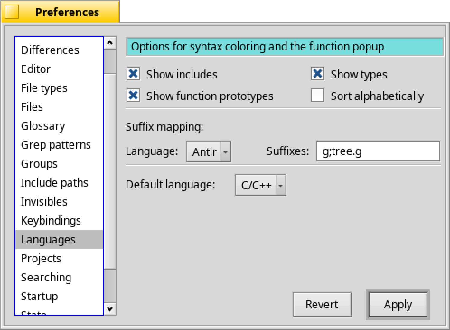
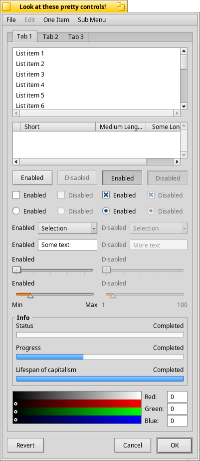
You will find in Haiku source code a LookTest app which have every system UI elements displayed in every state.
It’s under src/tests/kits/interface/look folder.
Adding fake sense of 3D while keeping grayed rectangular widgets seems like moving back to Windows 95+ UI though, instead of trying to reach the actual UI trend, which is flat UI, what people consider being modern today I fear.
Last but not least, iit’s not UI that should get modernized, but UX as a whole.
And there is contradictory in buttons and pulldown menus, because outer space of these showing as that these objects ar of lower plane, but objects by itself show as that they are in a high plane, notice shadows and highlights. Why it looks confusing an ilogical. And why new looks better and more friendly (logical, clear) (300% size):
In BeOS 5 these buttons are in a higher plane.
By the way I do not like flat design.
…Actually here can be first option box in GUI preference: ‘flat GUI’, GUI elements without shadows and highlights, as today’s trend requiere.
Also, there can be (but not necessary) option box ‘rounded buttons’, which I like too.
And this is enough for R1 GUI.
I may remember wrong, but from memory the change made compared to BeOS was in fact to drop the high plan.
Everything is on base plan or below it (and only these cast shadow then).
But maybe I’m wrong here.
Anyway. This sublte tweak can easily be coded in BControlLook.
The button and popup menu seems to stick more out indeed, while everything else seems to be either flat on the same or “pushed” a little bit in it (radio/check buttons, list, textfield.
While I’m not fan of plain flat design, I find that too much UI depth effet looks old now.
The active tab is kinda special here too because if doesn’t look above that much the background plan, but the unactive tabs seems behind it without being themselved below the background plan.
Anyway, like I said, while I’m all in favor to a way modern looking theme, I don’t think that small tweak like this wont improve enough the old or modern newcomers will feel when looking at Haiku UI.