So I was playing with new ControlLook and noticed this
As you can see, suggested button is now of the (active) window_tab colour. The problem is that the button text remains of control_text_colour and so you can’t ensure that it will be always readable. A solution, if possible, would be to also change the colour of the text of this button for window_tab_text colour.
Note that the top border colour looks a bit odd in that case but I guess that it is the result of fusioning tab and top border.
Hmmmm… i think that we cant manage the text color in the ControlLook, any expert knows if tis is posible?
I see … the selected color combination makes it obvious . I don’t know what to do in that case, what do you suggest? maybe remove the blend on the top edge? mmm …
Another small thing, here we can see that the slider can become very small. It would be good to define a (bigger) minimum size.
To be honest, for previous post, I changed window tab colour to make things obvious. Sure, it would be nice if each and every silly colour scheme could work. But, this is your code, your choices. People have to adapt to that design. IMHO, it doesn’t take more time than with another ControlLook to make something elegant; you just have to think your colour scheme slightly differently. I.e. since top edge is following tab colour, it is sufficient to indicate focus and you don’t need other borders to follow it too.
If there’s no way to fix the button text colour, only warn people about it.
I would simply add something like this to your description.
“Be aware that each ControlLook/Decorator is the result of different design choices. Therefore, to benefit of all features, your actual colour scheme may need to be adapted. If you’re not familiar with that kind of things, you can use one of the themes provided.”
It’s open source. If people really want something else, they can always propose patches or make their own.
See comparison of same action with different ControlLook ( No change of colour scheme or Decorator).
Haiku (Default): You can see currently selected button on the left surrounded by navigation colour, suggested button on the right has a bigger border of control_border colour.
Be: You can see that text in currently selected button is underlined by navigation colour, suggested button has a double border. @jscipione The shortened text on that button seems inappropriate. In this case, it should fit.
Flat (GitHub version): There’s no way to distinguish currently selected button, the suggested button is bigger and coloured by (active) window_tab colour.
Did I miss something? Was the bigger button intended to show current selection? In this case it doesn’t seem to work.
Otherwise, not seeing currently selected button isn’t a big deal if you’re mostly navigating with the mouse but, for people used to keyboard navigation it is a crucial information.
Perhaps another way to give this indication would be to add a dot of navigation colour in bottom right corner (or elsewhere) of the selected button.
You wouldn’t need a bigger button, that info being already given by the colour or/and the dot.
There are multiple different highlights, one for the button that is hivered by the mouse, one for the default button (enabled if you just press enter), and one for the keyboard focus (which you can change using tab and shift+tab). I don’t remember which is which, however.
Actually, The Flat ControlLook seems to handle them all correctly except keyboard focus (changed with Tab).
This is how I suggested to handle it.
In my opinion the colour is enough to differentiate the default button and having all buttons of the same format will make easier to position navigation dot.
Unfortunately since I don’t have coding skills, this only a mockup.
Just noticed this. When I use the Flat Control Look, the tabs go from being slightly rounded on the corner to squared off. Is this a design choice? Ór an error?
I would say that it is by design.
If you have read this thread from beginning, you may have noticed that originally @nhtello wanted to have window tabs slightly rounded in the decorator but, for some reasons, it didn’t happen. I guess that tabs in the ControlLook are not rounded either to keep some consistency.
If you are curious or, if someone is interested to help @nhtello to implement keyboard focus where it is missing, I created a suggestion thread with some mock ups on Flatstyle project page on GitHub where it won’t be lost.
Thanks very much @Starcrasher you help and comments are very apreciated! Im trying to find some time to work in this. At the moment i will missing for a while… if someone have time to make it happen, go go go!
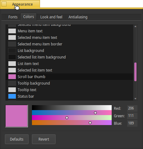
I think that you are using the default color scheme. In the default scheme the “scroll bar thumb” is the same or similar to the “panel background”. You need to change the color of the scroll bar thumb to make it more visible.
Yes, but ideally it should be already distinguishable with no additional configuration, surely a weak spot there. Scroll bar bed should definitely have a different design then in order to be able to make it out clearly.
I understand, but, the only way to do that is hardcoding the color or apply a gradient to the thumb… and the idea is that the user see exactly the color that he choose.
To be more clear, my main gripe is with the scroll bar itself, not the thumb. Maybe it’s the HiDPi display, but I am really having hard time trying to see where it is.

 . I don’t know what to do in that case, what do you suggest? maybe remove the blend on the top edge? mmm …