Nobody said that we need a flat look. But if any of the controls fail to meet sufficient contrast in dark mode that is a bug. Not a design decision.
Not that the color scheme you had is a good choice for good contrast, but still.
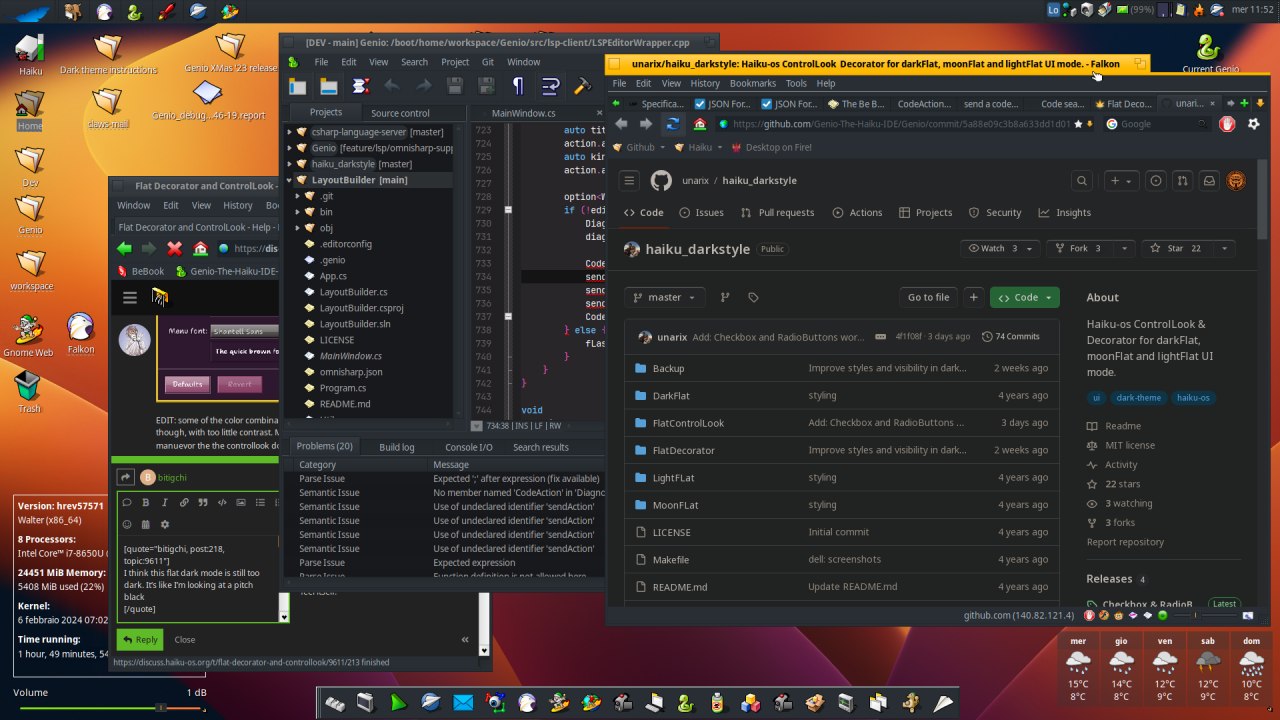
The problem with your Haiku theme is really low contrast. Since panels are darker in MacOS theme contrast is better. Fonts are even too bright in some places.
add to this that above Github.com uses their own proper dark theme. But falcon does not support this, so there is some addon that replaces the colors in wierd ways.
WebPositive does support the proper dark mode for webpages.
Yes, we can’t get a flat look from the default control look. That’s why there is a different control look for that now.
But still, that has nothing to do with a dark theme. We could change how the gradients are generated, to make them less steep. In fact there is already a “shine” color in the color preferences, that could be used for this, and so it could be adjusted from the color preferences. But the current look does not use it.
Hi to all! sorry for reviving this old thread, but I think this is the right place to post.
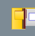
I have been experimenting with the decorator to get rounded borders (in the tab) and finally got it working… The trick was using _GetFootPrint to exclude regions of the window (and make them transparent).
So, we can do it… but do we actually like it? I don’t know if it’s just me, or if you guys get the same feeling that ‘something isn’t quite right’ here.. opinions welcome!
It looks better in on dark, perhaps shadows are helping a bit there but globally tabs corners need work. I wouldn’t round buttons inside the tab. The one to close the window is ok but the other is supposed to represent a small window and a bigger one ; rounding the small makes it look like a circle and you’re loosing the meaning.
I think the rounded buttons give the impression of “something is wrong”, overall the rounded corners of the tabs are nice.
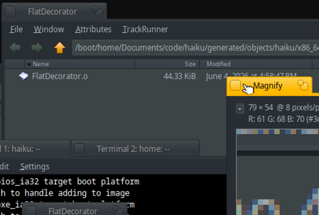
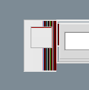
BTW Id take advantage of this, there is a bug in the current flat decorator - at least the one distributed in the extras - when using a left side tab, the result of the gradient is a bunch of lines of different colors.
Nooo, please don’t! But besides that i really like your explorations. Often minimal rounded edges with just 1-2 px are helping a lot. The classic straight look stays the same but it feels smoother.
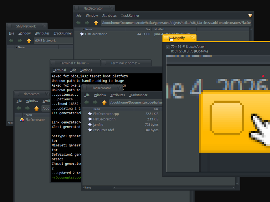
Hi everyone, I’m still working on fixing several bugs, but I’m stuck on this one: Does anyone know why Qt is drawing those pixels on the rounded corner? Is Qt passing the wrong background color? (I’ve tried different solutions from the controllook side, but no one of them work). It catch my attention that buttons don’t have this issue, but text boxes and radio buttons yes. Any idea on what else I could try are welcome, or maybe it’s an issue with the Qt port implementation that I won’t be able to fix from the decorator.
Did you notice a difference between Qt apps? I mean Qt6 apps and Qt5 using the compat lib.
You may ask @3dEyes who made most of the work on Qt port. Perhaps could he shed a light on that? IIRC, he also had a kind of todo list on Github with Qt port known problems to fix. It was few years ago and I don’t know if that’s still relevant though.
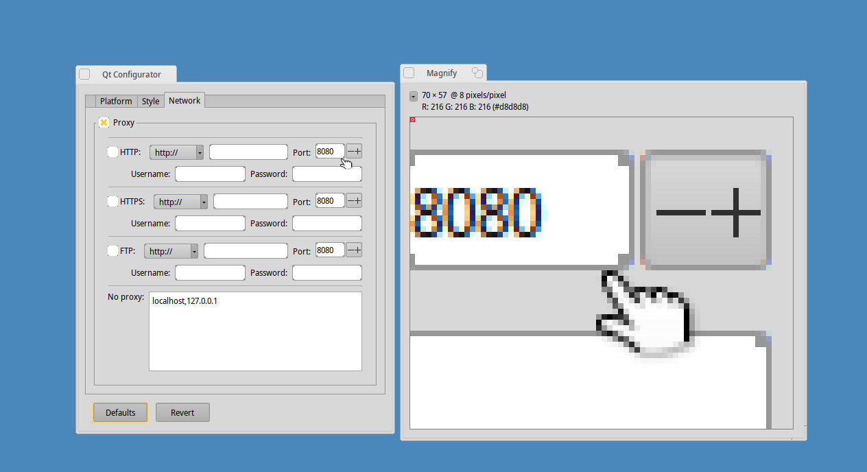
Please don’t post a lossy image (.jpeg) when asking about small pixel details. If you don’t know which format to pick, pick .png. You also can’t convert it back (it’s lossy), you need to redo the screenshot from scratch.