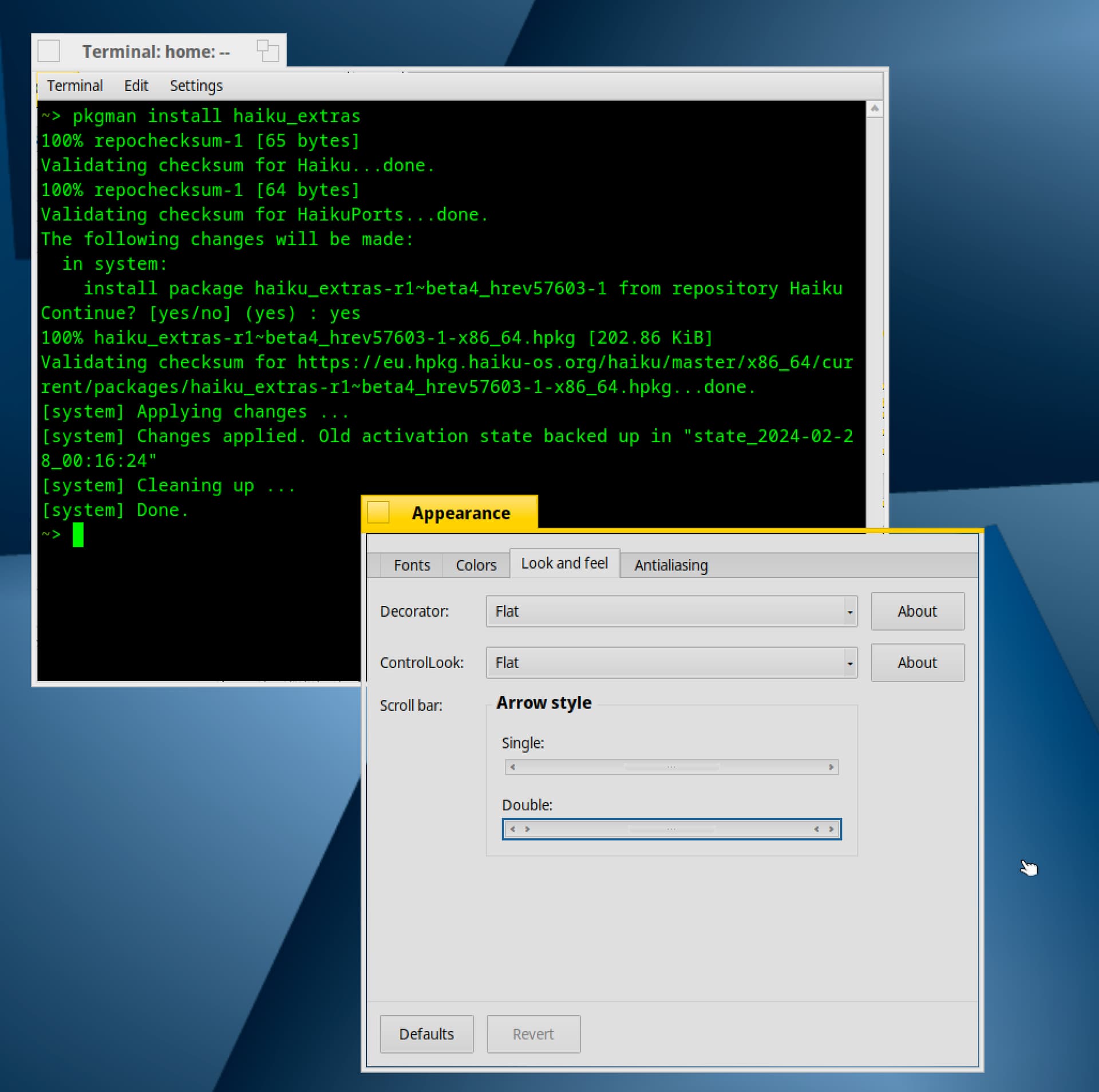
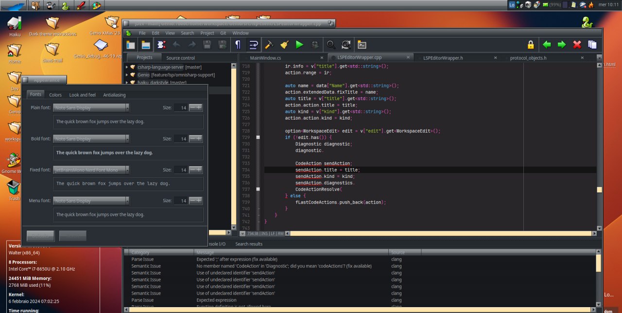
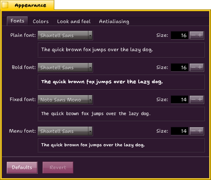
Alternative decorators and control looks don’t crash but lead to visual imperfections when you increase font size. Those are shipped in haiku_extras package so not installed by default. Once done with last Hi DPI troubles, I guess that it will not be complicated to port solutions from Haiku control look and decorator to the others.
Complete themes including colours schemes are another problem. I agree that people creating some should not redistribute them before work is starting for R1. I mean that Appearance app will be probably revisited to get rid of sliders, a dark colour scheme will probably be included and/or an accentuation colour be introduced. At this time, things should be more stable but we will also need to improve/replace ThemeManager for something safer. For the moment, we are a long way from that and it will certainly take few more betas to get there. We just need to be patient and let devs work. There are more urgent matters. We all love Haiku UI so I’m confident that things will come in due time.
It’s a bug introduced with HiDPI support. It depends of your font choices and sizes.
The idea is that widgets and borders, instead of having a fixed size, must grow with fonts size.
I love that about Haiku too that the control look is dynamic and clean I’m actually running this with larger fonts than the default on a Retina display so with the scaling by default, my guess is it’d be in HiDPI mode
I’m really confused by this sentiment, I’ve fixed severall applications in Haiku to work with the dark mode to slowly come to a point where I can “just” enable this in pref/appearence and it will work fine.
I don’t understand how the flat decorator or control looks have anything to do with dark mode. In many cases the controls become too flat to distinquish from the surrounding parts. (I’ve had it installed once and thought I broke the app_server clipping somehow)
So, where does the sentiment come from that it is for dark mode? It’s unrelated to it.
HaikuControlLook and HaikuDecorator support dark mode fine. There are some smaller issues but those can be fixed.
Somehow, nobody made any bug reports about what those issues could be.
Technically they are not related but according to my experience, my concept of “dark mode” does not fit well with the stock decorator and control look.
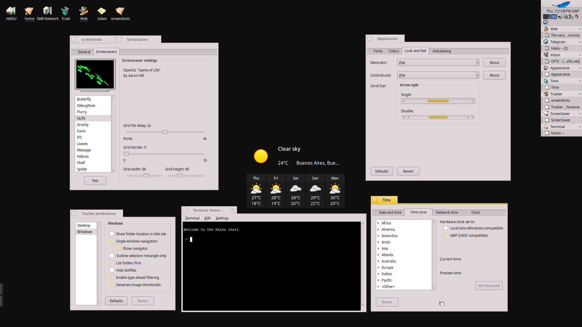
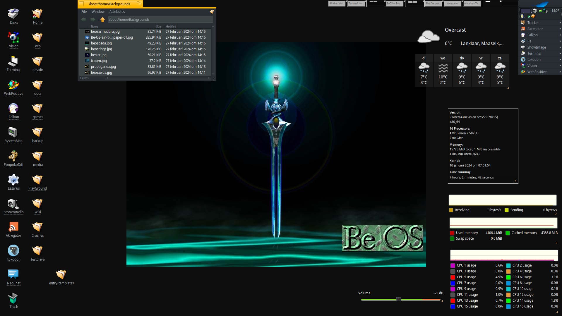
The main issue is with the gradients of colour, it is clearly visible in screenshot below.
The theme used is a modified version of MoonFlat (slightly cutomized to work best with Genio) that I use with Flat.
There might be a better combination but it would still look like XP/Vista, I’m afraid. If you have a theme to hand out, I’d be happy to try it.
It might be a matter of perception or personal taste but I do really think that the only suitable pair of control look and decorator for an effective and appealing dark mode is Flat.
Moreover, browsing with WebPositive or with Falkon with a GreaseMonkey “dark reader” script makes the transition from/to MacOS more seamless.
Re. the bugs: I did not come across any bug to report for the stock look and decorator. On the other hand, there is a well known bug with fonts bigger than 14pts in Flat (already discussed above by others).
What about the stuff you posted in the screenshot? The gradients were designed with light mode in mind, they clearly don’t work correctly for your chosen color combination.
In my current applied color scheme it is much better, but not “good” either. In any case if nobody reports bugs about the specific controls which cause these issues, but only keeps with the “the controllook is just unsuitable!” comments then I can’t really fix it now Can I? some Issues I will see myself and can fix and others I just can’t.
I recently added some new API’s to Haiku to check if colors are light or dark to make developing such patches easier.
EDIT: some of the color combinations in your screenshot are just chosen bad though, with too little contrast. Making the controls plain and removing room to manuevor the the controllook doesn’t really make it nicer
I think this flat dark mode is still too dark. It’s like I’m looking at a pitch black setting with those font colours, it looks like a stealth interface. And the amber/yellow tab glows like sun among them.
Actually, there’s one bug that prevents you to use a too dark colour for panels. It’s the status when you’re copying a file (indicating speed and amount) that is always black. AFAIK, the progress bar has been fixed but not that.
They don’t look like bugs to me, do they? It’s just about tweaking the theme to look as best as it could, maybe.
I don’t see how you could “fix” this. Haiku look and feel is designed in a way that is slightly skeumorphic. Less than BeOS but still and it becomes more evident with the a dark colour scheme because the transition of almost all the gradients is quite steep.
They don’t fit well, unfortunately, and we can’t get a flat-ish look with them.
That’s what the Flat look and feel tried to solve. And it did quite well, indeed. Except for the font size bug…
Nevertheless, It’s all about the way I want a dark theme to look like and the stock decorator/control look don’t support that idea very well.
I’m pretty satisfied with the “Flat” dark mode, instead.