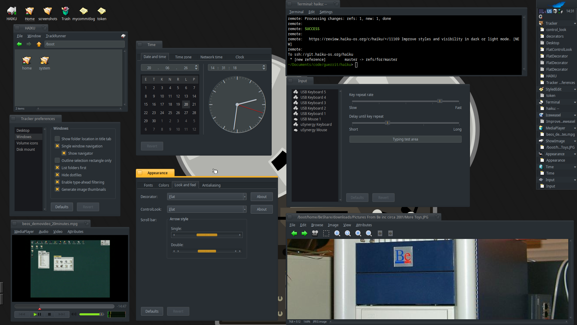
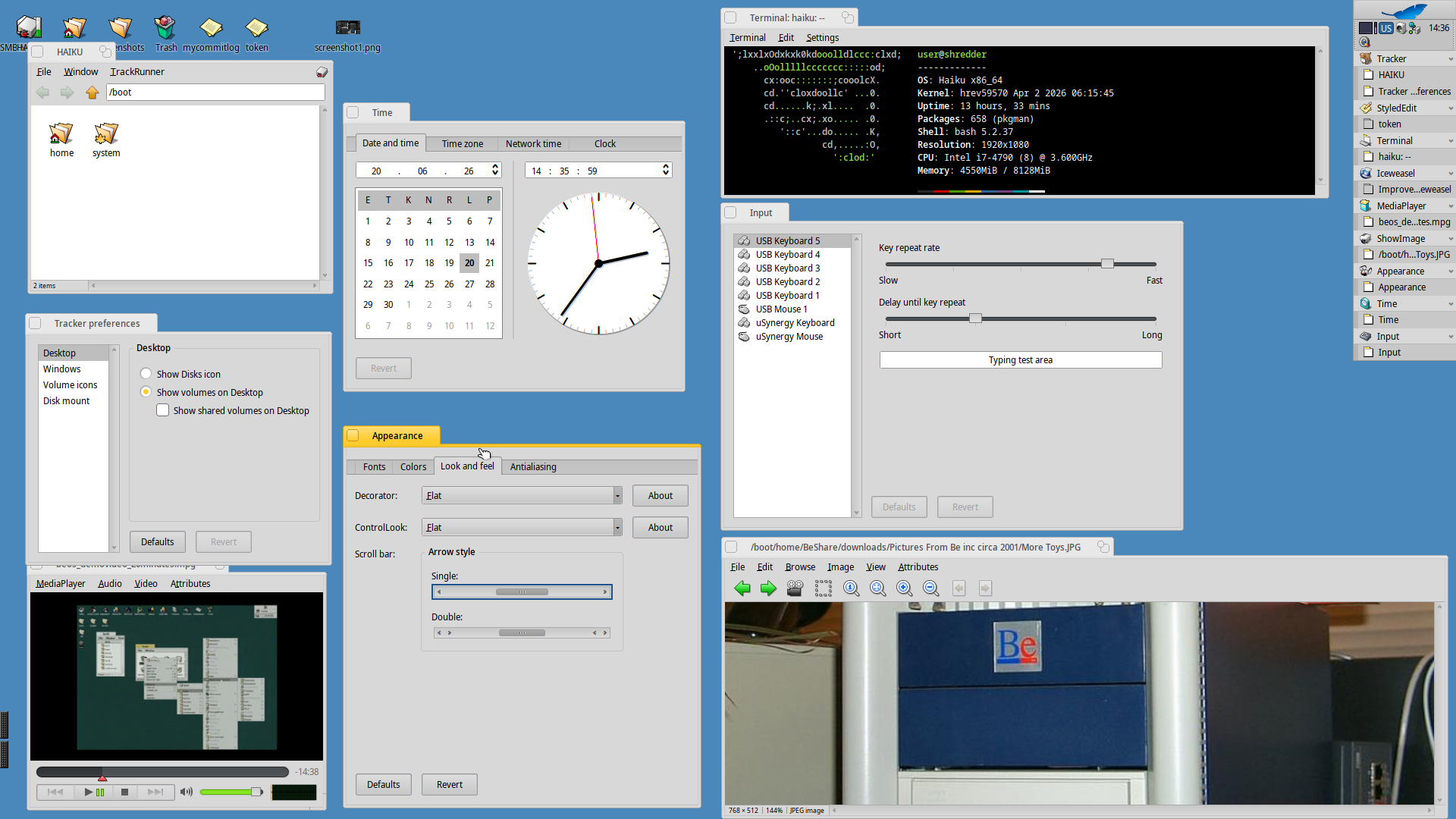
Here are the final results. Patchset submitted for review… let me know what you think.
ControLook:
* Add CheckBox and RadioButtons
* More contrast in scrollbars (for default light theme)
* Improve SlideBar for Dark and Light themes
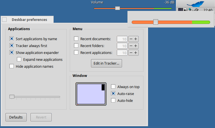
* Fix SlideBar inverted colors (in volume control / green & red)
* Minor change to the selected menu for better contrast
* Improve buttons and tabs contrast
* Rounded frames areas

Decorator:
* Improved identification in tab color when stacked and tiled
* Edge highlights when pressing Ctrl-Alt to resize the window
* Rounded tab + window borders
I have some comments of the light variant and some extra comments about the UI in general.
I can spot two different highlight-colors; yellow/orange on the active tab and the checked radio button, but blue on the active arrow style in the Appearance window. They signal the same thing (active/selected) so they should all be the same color. I would also consider highlighting the scroll bar handle of the selected scroll bar with color instead of a darker shade of grey. Grey should only be used in non active windows as to not distract, but since it is in an active window yellow/orange should be used.
I cannot see which color the current day in the Time window is when the window is active. It should be the same color as mentioned above. Same goes for all highlights when they are in an active window.
The marker for the current playback position in MediaPlayer should also utilize the same color.
Overall the margins are off, they are to wide and are mismatched in their different sizes. For example look at Tracker preferences where all side margins look the same except for the left one that is wider. I would also consider lining up the line of the Desktop section with the box to the left of it and have the Desktop-text float above the margin.
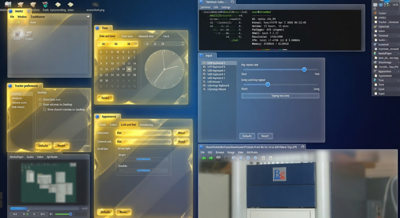
I made a mockup but image uploading do not work in any of my browsers.
Great work, i like it a lot.
I want just to recommend that the primary colours (especially the light green) should be dimmed in the dark theme. “Usually” in dark mode the saturation of vivid colours is a bit reduced compared to their values in light mode. Otherwise the light colours are to loud in context of the dark setting and can hurt the eye a bit.
Highlights: Haiku is extremely customizable in this point (which is great); it allows selecting different colors for several of its controls. In the dark theme, the scrollbar thumb color is set to yellow, while in the light theme, it is set to grey… what I mean is… this isn’t handled by the controllook itself; it respects whatever the user selected in the theme settings.
Time: That is true, but the thing is that changing that value also changes it for other controls, making it hard to find a color that fits well everywhere… plus, Haiku doesn’t have a global “accent” color. The yellow you see on the checkboxes and radio buttons is actually the tab_color, which I arbitrarily picked to draw some elements… we’ll see what the development team says about this in the patch I proposed, since it’s technically the tab color and not a dedicated accent color; they might consider it incorrect.
Margins: Yes, this happens in almost all applications, but the controllook cannot manage it. It’s determined by where the app developer placed the control, and the look cannot move it… it can only modify its appearance. Haiku needs a lot of work on all of this, which will eventually come to get the interface properly polished.
And yes, im going to work in the sliders… you guys got right.
Something is wrong with sliders in light mode. On dark mode, you can see the yellow indicator in the middle. On light mode, you should see a black or dark gray one but there’s nothing.
I like the new changes a lot, but one thing you’re not showing is how do highlighted buttons (the ones selected by default look). A while ago they were yellow, currently they’re grey with a yellow border around them.
A while back I made a bug report about some things about current Flat Control look that IMO don’t look right (Making sure you're not a bot!). Default button highlight aside, I was also reporting that the notch in sliders in light mode are not very visible, looking at your latest screenshot (@ the MediaPlayer volume slider) I think that’s still the case, it should pop out more. By contrast, it’s very visible in dark mode.
Also, currently some text disappears when using Flat Control look in light mode (with the default colors).
Hi Michael, thanks for your feedback! A short while ago, I made some modifications to fix several bugs, including the one you mentioned. I submitted a change to Haiku (https://review.haiku-os.org/c/haiku/+/11169), which the team is still reviewing with low priority, as the current focus is on releasing the new beta and fixing critical bugs. Once it’s integrated, you’ll just need to download the Haiku Extras package to use the new version.
I’ve stopped pushing changes to my personal repository because Haiku moves so fast that it’s very difficult to keep OS changes merged with a standalone repo. Plus, it can be quite risky for anyone running newer OS versions to try to execute binaries built from that code (it could lead to system crashes).
So, once the new version is available, if you run into any issues, the best approach would be to open a ticket on the official bugtracker so that I—or anyone else—can address it.