I liked the z-snake effect (but it could be a bit more subtle), but the slimy sludge on the elegant tabs totally screwed up the UI in a Trekkie-inspired but misguided way imho.
You can (more or less) already have a terminal replicant. Unfortunately at the moment it has some issues with colors and scrolling
1 Like
Desk bar menu is to reach the applications for the 90% of the time. I would welcome a redesign like the Windows 10 menu, which displays all the applications from the start, and has auxiliary icons for accessing shut down, restart etc. Once you remove the pinned items, it’s a very effective and tidy menu.
I wouldn´t say I agree with the “auxiliary icons” part. In Windows10, it became a lot more inconvenient to reach said icons with the keyboard. In Windows7 and others, one could just go blindly with a few keystrokes and reboot/shutdown a misbehaving machine. On 10, that it harder.
1 Like
It’s just my two cents worth, but I’d rather not see Haiku end up with a taskbar that is literally the same as Windows, macOS (and the many Linux desktops which go with either approach. The current arrangement might be a little janky at times, but it is somewhat unique.
Having a dock at the bottom would be okay, but going all the way across the screen doesn’t seem necessary. Might be better to just stick with the existing scheme and come up with an easier way to switch between windows of the current program in use.
2 Likes
I have nothing against people fiddling, but I’d like not to have to undo UI fiddling. I have to do very little to Haiku to get it the way I like it. I don’t think we should have major changes to the way it looks, especially things thag have been standard for BeOS and Haiku for decades.
If someone wants to come up with a way to theme the UI, that’s fine. I don’t think we should have some compromise between a half-dozen different ideas that different people will have. Nobody will be happy, because it won’t be what anyone has in mind, be it more like Linux, Windows, OS X, NeXT, or what have you.
Consistency is key. Let’s largely leave it the way it is. Adding a theme preference is fine by me. If we start theming it based on what the consensus of what is best now, that will easily change every few years when people get different ideas. The Haiku theme, inspired by BeOS, should stay the same unless there is a very specific, singularly changeable, change that we just can’t do without.n
Specific constructive criticism I have with screenshots.
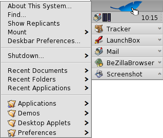
- With the menu bar across the top, I have to read across the whole screen to see what’s up. With everything in the top right, I can look in one spot and see everything.
- With that big flat panel with the bigger shutdown buttons, maybe it’ll save me a click, but it’s an eyesore anyway you make that, and hard to navigate with just the keyboard. If you look at the pic of current menu, it’s so easy to navigate.
- The applets and demos menus are great. Applets aren’t the same as apps, and demos aren’t something I want in with my regular applications. It’s the same reason I don’t want “preferences” under Applications. Keep them separate, I think.
My opinions on the UI aren’t from just being used to it either. If I’m used to anything it’s the Windows classic interface. When I first used Haiku over 10 years ago, it didn’t really take any learning. It’s simple, attractive, and easy to use. When I use some Linux DE, they have all these fun and customizable ways. I can hardly find a darn thing. Macs are great except when they start changing things around. Again, a case of changing fundamental UI concepts that have worked well for decades. Windows without even major version updates will change the interface around. Obnoxious as heck. I wouldn’t exactly say their UI is customizable though. Letting people customize the UI is great. Customizing to be a blend of 6 different ideas, making it nice for nobody isn’t great. Picking an idea and annoying 5/6 isn’t great either. Keeping a BeOS and Haiku tradition, while letting people do what they want to their own system, is a - mazing!
6 Likes
It seems to me that the proposed design is not at all suitable as a replacement solution for the current design. Compare their appearance: the new design looks like porridge, there are too many colors, and the eyes don’t know what to focus on first. The old design is simple and concise: there are no contradictions and conflicts when searching for the “main”.
Compare current:
And proposed:
3 Likes
Please compare the functionality, not the concept art rendering, it wouldn’t be like that in the final code anyway.
Sounds like a good candidate for the glass elevator project that in itself might need to be dusted off and reactivated.
It seems like the main change is the way it looks. The only two functionality changes I see are categories and a search bar. (Why two search bars?)
It looks like whatever interface I saw when I tested out puppy linux. It’s kinda bad, and doesn’t suit Haiku at all.
1: A search bar similar to Apple’s Spotlight isn’t a terrible idea, but maybe less obtrusive. Maybe Alt-Space for the quick search function, and keep Alt-F for filesystem search. The duplicative “launch” isn’t needed and can be confusing. I don’t think a bar being there all the time is needed either. Maybe just a deskbar icon, and people can use a shortcut for convenience.
2: Pre categorized applications is very subjective. What people consider Education and/or Science may change. There may be things that fit into both Graphics and Video and maybe Office/Productivity. I know Linux distros do this, but I’ve never found it to be helpful, and everyone has different needs for categories and ideas about what belongs where.
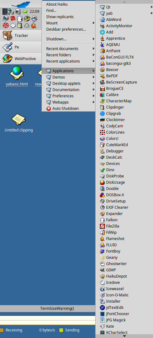
An alphabetical list is great. Two clicks is all I need. Applications → NetPositive
I do have some categorization going on by way of adding my own deskbar folders. That way I can organize my most used applications into folders that way. Everyone will want something different, but its current form is easy to customize that way. This new method just seems like clutter. If it works for some, great. But people who want it that way are probably good at customizing it on their own, and should feel free to do so.
I mean my opinion on that would be probably the same and that is it looks fine but I don’t think you need more than one search bar

There is a semi-functional prototype of my design (mount menu is still missing, icons sometimes aren’t loaded correctly), but it’s now fully navigable with keyboard
5 Likes
Until you start adding applications. Soon your alphabetical list extends waaayyy below the bottom of the screen and you spend a lot of time scrolling … and scrolling … and scrolling. My Applications list only makes it to KCharSelect before the scrolling starts. And I prune my app collection regularly.
This is why we need categories. Or an increase in scrolling speed. Or both.
And … NetPositive? Seriously? It’s been WebPositive for fifteen years now. ![]()
2 Likes
Scroll view with only 4 items can fit is much less usable compared to existing menu.
It looks like some Windows 11 clone that is not good idea.
2 Likes
Just an example. I use both ![]()
I’m not saying categories are bad. I do the same. But I don’t want things being put into categories for me based on tags in HaikuDepot. I’ll put the apps I want in their own deskbar folders, categorized, and if I need something else I’ll go down the list.
But for simpler use cases where I don’t have tons of applications, the current method is just great.
I prefer being able to open the Applications menu option in Tracker with icon mode preference as default much like BeOS supported.
Sure, you can do that now. I have links in ~/config/settings/non-packaged/deskbar/menu myself. But can we expect an regular user to go to that effort?
A regular user is what? Someone who does web browsing and writes documents? Why do they need categories anyway. Someone with the use case of lots of applications they need to sort, also are likely to have the desire to set them up the way they like them anyway, and will prefer to do that method. Who exactly is this change going to help? I’ll bet you it’ll help fewer people than it will hinder.
The people it will hinder will either want to set their stuff up manually, or not want to go through that process at all. So this seems like a specific desire of a specific few. Which is totally cool that someone wants to do that, but they can probably just do it to their own systems.
I believe Be had a preference to change the deskbar menus. Adding an option for people to change their menus would be cool to. That way people wanting a traditional Haiku experience don’t have the MacOS and Windows experience of the UI changing on them.
Hold shift to scroll faster a menu, page up and down do the same thing too
2 Likes
I actually agree with you on that. Let’s have the classic setup as the default and the categorized one as an option.
1 Like