Debatable. It’s a quick shortcut. I think I’ve always started the Deskbar preferences from that menu item… There are other shortcuts, e.g. the Time prefs from the context menu of the clock in the tray. I wouldn’t like to lose that either.
9 Likes
That’s often me, but not in this case: I rarely use anything there, maybe occasionally the preferences menu and sometimes the applications one (but I use LnLauncher for my frequently used apps, and sometimes #tart things from Terminal as that’s faster when I know them by name).
I think there is general agreement that DeskBar, and especially the menu, needs a rework. The question is then what to do with it, which I think Biloberis’ mockups explore in a good direction ![]()
2 Likes
So, flat design then.
Why are there two search bars? Also I’d suggest moving the system tray and time to the top. People are used to looking for time and status icons near screen corners and edges.
1 Like
Just as a random concept, is a deskbar that can read Retrobar files possible?
With this compatibility, we can import retrobar theme files as deskbar themes with styles we like.
The search bar in the appilcation menu is meant to be used as QuickLaunch (awesome little application that should be installed as defaut IMHO) : you type in the name of an installed application to start it. The second one in the main Dekbar is meant to launch the query. But you’re quite right, the optimal solution is to have only one search box (the main one) able to launch installed apps AND perform a query.
I am not sure to understand what you mean ? The main idea is to «extract» what’s inside the blue leaf menu to make it more discoverable (as some reviewers didn’t find it).
I totally agree ! I absolutely don’t want to loose the Haiku GUI feeling, and if that’s the impression you got then my mockups need more work.
1 Like
a lighter grey colour and more closer and only a little bit stylised icons would make the theme look better (am not saying to copy old theme)
1 Like
This already goes in a good direction. I think the 4th menu should be “System” and allow for reboot, shutdown and mounting devices instead of favorites.
The gui style is not my cup of tea, but that is not really a problem of the design i.e gui flow itself.
1 Like
I agree completely. 99% of the time you are looking for applications or preferences, and they are furthest away. It should almost be turned around completely. Also… Demos and desktop applets, IDK why they are at the top level, they could go under applications.
2 Likes
@blioberis Keep in mind that these kinds of journeys a lot of times will end in frustration. Everyone is always going to want something different.
- Collect community input, take everyone’s opinion with a grain of salt. Eliminate outliers.
- Notice patterns which you agree with.
- Decide on a direction you like and go for it.
3 Likes
I’d like to see the Z snake implemented in the Deskbar app as found in Zeta.
2 Likes
IIRC, the z-snake feature of Zeta was not specific to Deskbar of Tracker, it was for any menus with submenus, whatever the app.
For the uninitiated, what is the z-snake?
1 Like
When I get a chance I will upload pic from my Zeta OS PC displaying the Z-Snake in action.
1 Like
the Z-snake effect was originally part of BeOS “Dano”, the never released BeOS R5.1/6.
There is even a 14 year old ticket in Haiku’s Trac already;-)
https://dev.haiku-os.org/ticket/7924
2 Likes
you both realize that you can already set the haiku deksbar like that.
I like the Z-Snake because as you see it’s a visual aid by highlighting your current position. Makes it easy to relocate your eyes back to screen if you look away for a moment or two.
I used it in BeOS 5 and all versions of Zeta OS…very convenient.
2 Likes
The selected menu at each level is already highlighted, that is usually enough to see where you are. The Z-Snake sure looks cool, but I’m not sure it is that useful.
But looking cool is a good enough reason to have it ![]()
6 Likes
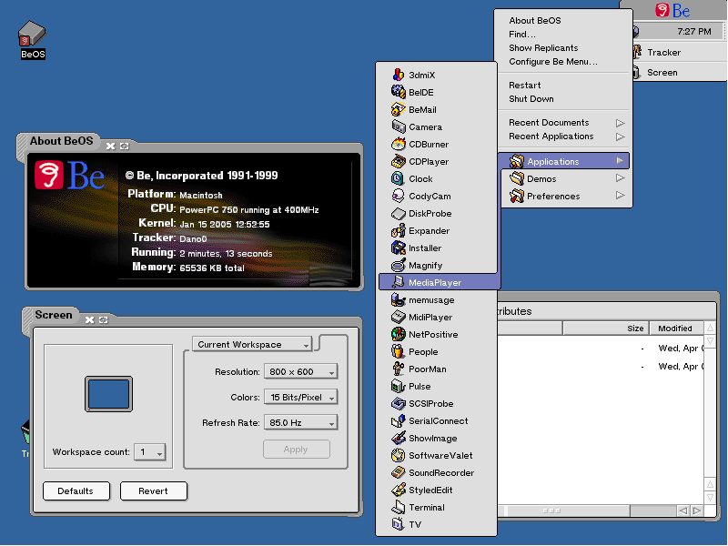
I’ve read over the years about the lack of love for the leaf menu, which I don’t really understand, but let’s try to analyze it.
about: should be left as is and not touched.
find: I don’t recall ever starting a query through the Deskbar; I usually do it via shortcut, but maybe that’s just me. See proposal 2.
show replicants: why would anyone want to disable this? Also, this choice affects the desktop, which is the main shelf for replicants. Maybe it would be better placed in the (Tracker) preferences?
mount: same as above, I’ve always mounted from the context menu on the desktop; I don’t think I’ve ever done it from the Deskbar. See proposal 1.
shutdown: too much movement required to shut down (click + move the mouse). See proposal 2.
recent: this is a feature I use a lot. If it were integrated with the logic of Einsteinium, which also shows the most used items, it would be perfect, even though they use two different logics. Currently, you can only open a file/folder with the default handler, but you might want to open it with other applications, so there should at least be an option like “show in Tracker” to act from there (maybe with modifiers?).
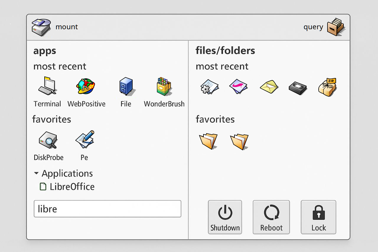
be menu: here’s where it gets interesting. I’m not sure if it would really be useful, so there is the first proposal, what if one could have a hub to launch things with this layout :
Vertical
Horizontal
About
Mount
Trash (trash real files, uninstall packaged apps, remove favorite items)
Find
Settings
End
Horizontal
Vertical
Apps (label)
Most recent (label)
Icons (row)
most used (if Einsteinium enabled)
Favorites (drag and drop enabled, reads from / writes to be menu folder)
Tree view (Instead of a dropdown menu, you could have alist view , maybe custom, with type-ahead filtering enabled, both by name and by type (productivity, development, preferences, games, utilities, media, etc.)
Filter Field (hidden?)
End
Vertical
Files/folders (label)
Most recent (label)
Row of recent files
Row of recent folders
Most used (if Einsteinium enabled)
Favorites (drag and drop enabled, reads from / writes to go folder)
Optional: best rated (queries items with MEDIA:rating > 8) or query by keywords
End
End
End
Second proposal:
It should be possible, via preferences, to display these sections (find, shutdown, recent items) as replicants instead,
removing them from the menu.
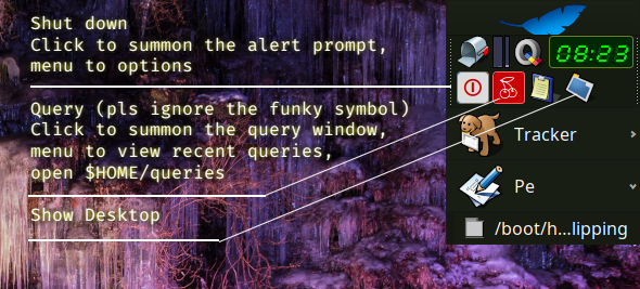
Taskbar - the logic for clicking on it should also be reviewed, as it currently changes depending on whether the expander function is active or not.
ctrl+middle click to resume the last active window (Tracker only; other apps open a new window)
ctrl+shift+middle click closes the selected window (only with expander active)
Edit:
About and settings menu should go, as icon buttons, in the upper section with mount and query
6 Likes
I fully support more Replicants ![]()
I want a Terminal Replicant and a Webpositive one ![]()
4 Likes