Applying a label would not be a problem 
We already went through an evolutionary , and revolutionary, change with packagefs that disrupted part of the user experience; some still complain, but that change was necessary and I won’t return to the old installation methods.
I realize that UI/UX is different, the current deskbar has been a long-standing habit for almost 25+ years, so suggesting a different approach can seem unusual or even, as someone wrote here, “crazy” — dang man, that feels a little harsh !
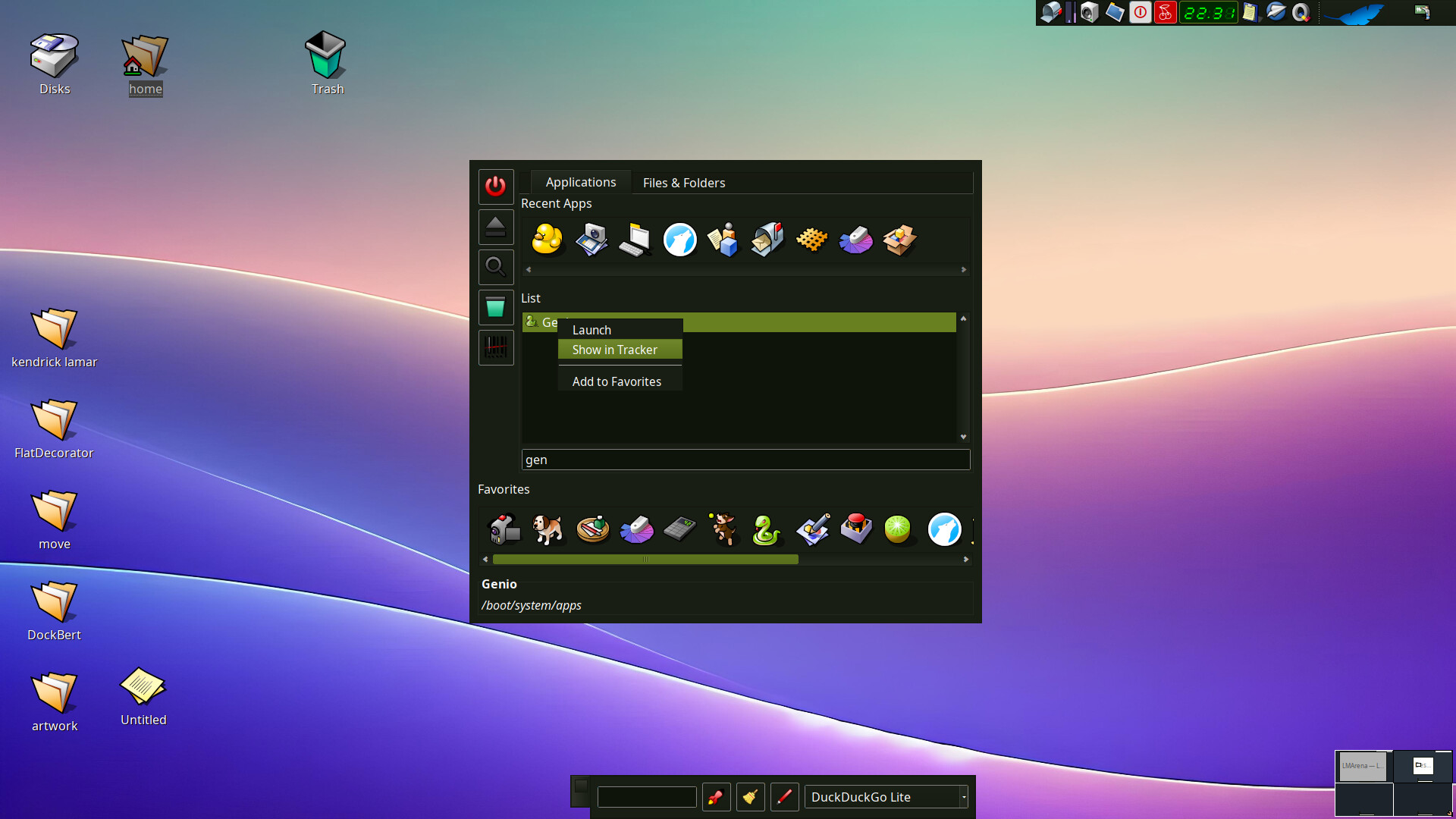
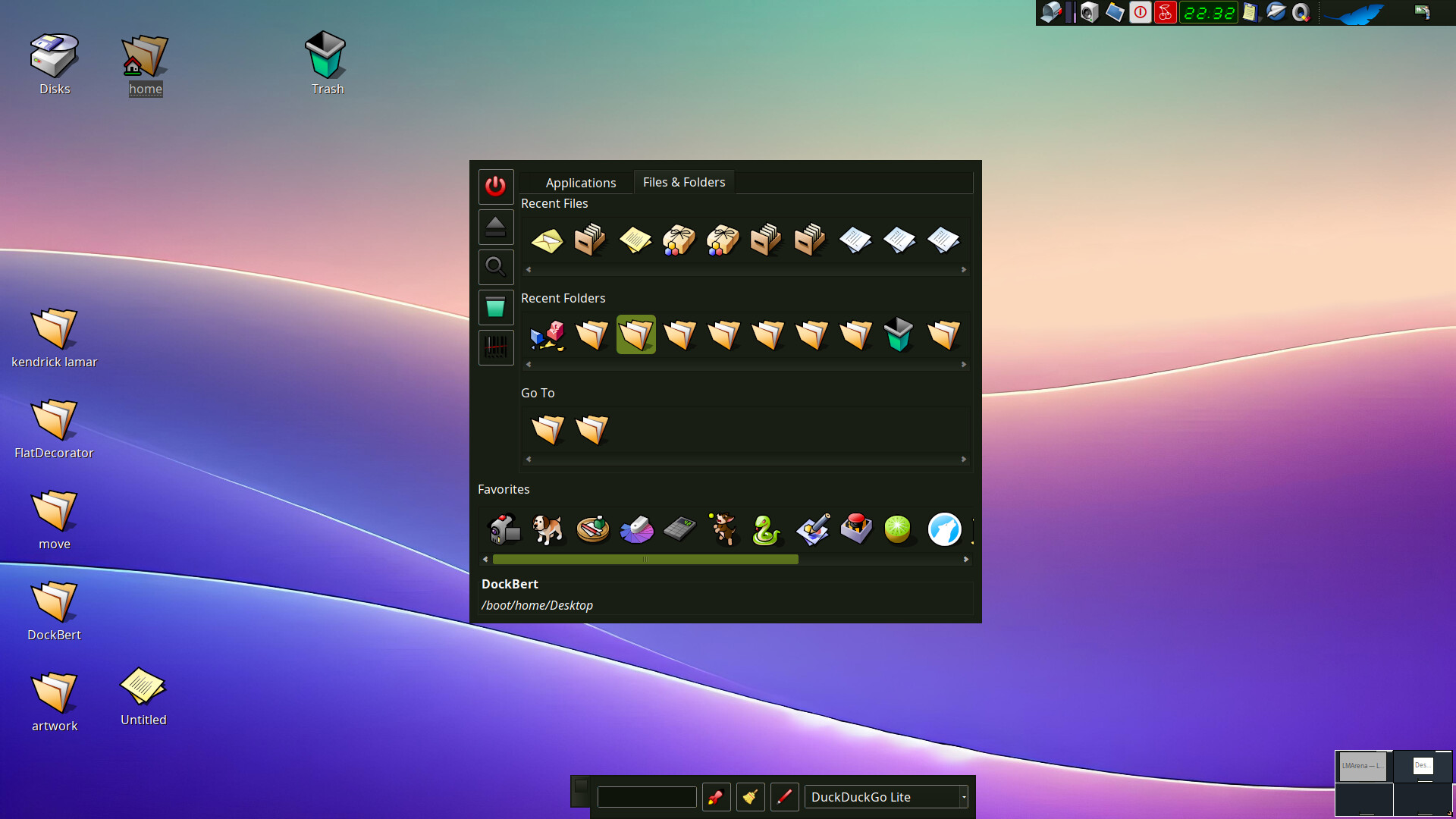
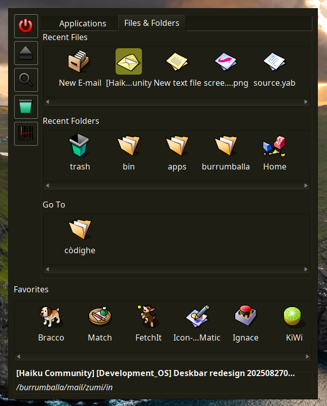
The current deskbar fails according to Fitts’s and Hick’s laws in several ways: it has a long vertical menu with nested menus (so adding categories to application list would be worst), small elements, and seldom-used items at the top.
Probably I’m wrong because I’m not a programmer , but I think it’s difficult to implement a search in the current menu because it doesn’t use a BView where you could add a text control and a BList (like QuickLaunch does); instead it uses a BMenu with BMenuItem, maybe it may be subclassed ? but the previous problems of decision noise for the user would remain, so if the deskbar has to be redesigned — at that point it’s better to rework it to be more usable.
My design, while far from a perfect solution, better follows those principles: larger, more easily clickable elements; visually separated sections; menus shown only on user request (right-click); it features drag-and-drop completely absent on the current deskbar; quick text search (the text control would receive focus when the window is opened); and shorter action times compared with the classic deskbar, a group of talented programmers as you all could find a much better solution.
What I’ve shown here reflects my own needs and may differ from those of other users.
The mockup is intended to start a discussion about user needs that the existing deskbar does not currently meet, but instead I’ve perceived a little too much rage, I’m sorry if this hurt someone’s feelings, but it was unintentional.
Obviously not every need can be satisfied, and compromises will be required.
The paradigms in this mockup are similar to features already used in other programs, such as LaunchBox for the favorites/go icon strip, and the type-ahead filter in Tracker or QuickLaunch for the app search, so a similar approach won’t mislead an experienced user (and probably neither a rookie).