4 Likes
Any advantages over the current design?
inb4: being “modern” is usually a disadvantage
8 Likes
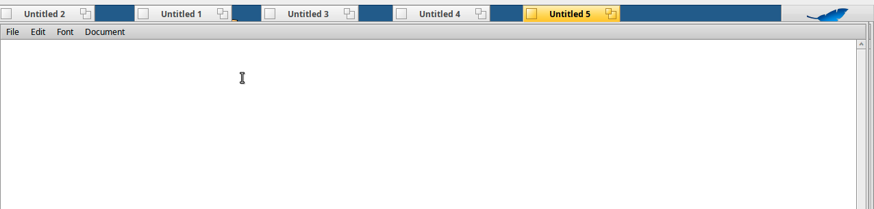
Full-width title bar will probably make Stack and Tile impossible - that’s why the Windows and Mac Classic looks have been abandoned. S&T is a USP for Haiku.
For the rest, it is flat. Really, really flat. Tiny icons floating in a sea of grey. Yes, I know that’s where everybody else is going: it’s getting harder and harder to tell at a glance whether someone is using Windows, MacOS or one of the Linux DEs. Why should we join the herd?
13 Likes
I’m still in favor of current design, no need to rush user experience trying to mymic(?) others.
12 Likes
Fully agree with previous comments.
No flat design please. Aside from fashion, it has usability issues.
UI design guidelines and UI design action is getting steadily worse the last 15 years (at least).
BTW, before suggesting any kind of changes to any system, the first step is to analyze and understand what is doing and why is doing it a specific way.
5 Likes
so stack them right above
Where did you get the idea that people want to use haiku and be stuck in the 90’s?
the half width title bar is a terrible outdated design.
I always assumed there would be themes eventually but we need to modernize these outdated designs.
OSX , Windows and, Linux have already established the perfect system there is no reason “reinvent” the wheel and go back to an old system.
BeOS was out in a time when companies were trying to invent the desktop environment, some parts of it are cool but there are well established styles that just work and stuck around like the full width titlebar.
1 Like
Five documents, all stretched to fullscreen. Didn’t even bother to Stack and Tile them, just held down Shift and moved the tab.
Switch between documents? ONE click. Switch to Deskbar? ONE click.
That’s the functionality you get when you don’t use up unnecessary screen space.
12 Likes
Where did you get the idea that people want to use haiku and be stuck in the 90’s?
The raison d’etre of Haiku is to implement BeOS. People use Haiku because they like the BeOS way of doing things, not because they want to clone everyone else and being “modern”.
14 Likes
Too small icons and text, and too spaced.
Also, that flat look is bad. Maybe some people like just because they are used to google ways of things, but it just makes finding things more confusing to people.
2 Likes
The partial title bar actually dates back at least to Smalltalk on the Xerox Alto, in 1976.
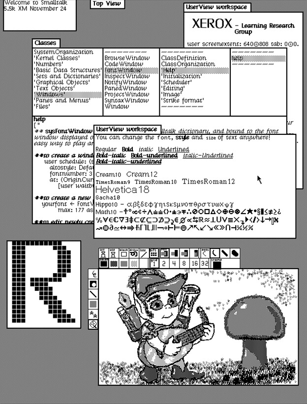
They also had already invented flat design and monochrome icons, as you can see. And even “floating” scrollbars that only appear when you hover a view.
So, yes, why be stuck in the 1990s when you can travel further back, to when computers were actually good and futuristic?
15 Likes
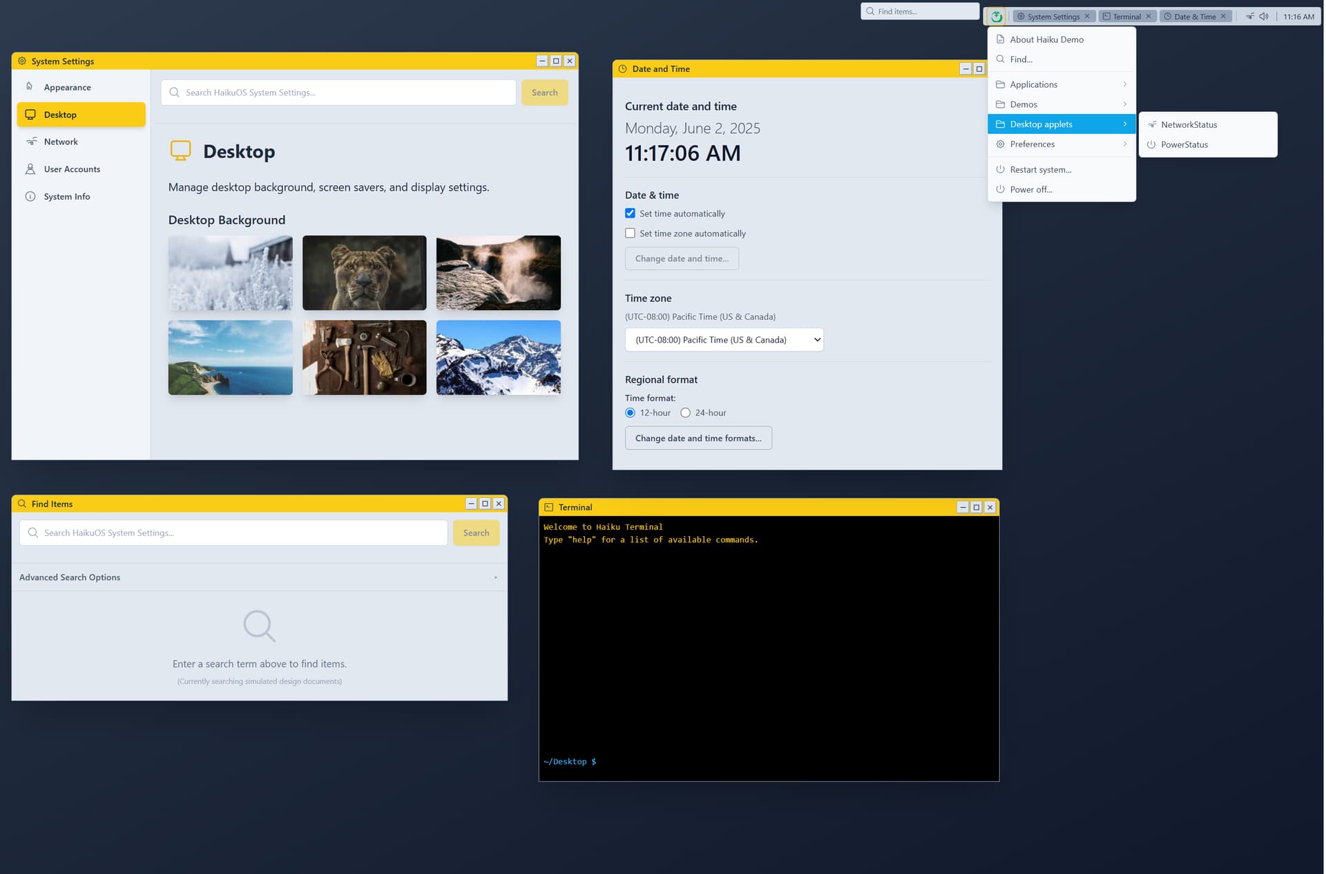
There does not seem to be a design proposal in the OP but the accompanying images are coming through okay. Others have responded, so I guess it must be there. Could someone append what I am missing?
1 Like
There are only some screenshots/mockups in the initial post, without any formal proposal or explaining what the goal is, what the project is, if it is a mockup or a theme for another os.
But people are quick to reject it without knowing what it is.
5 Likes
First of all, welcome to the community, @Hamguy . Just posting screenshots without any explanations is not really very helpful. It would be much better to explain what is the rationale behind your design, and how it relates to Haiku. Just stating that we are stuck in the 90ies isn’t going to cut it.
That said, I actually like your design, but it doesn’t look like Haiku at all. Maybe there could be a gradual evolution from our current UI to a more modern one that still feels like what people are used to from Haiku. And also fits in with Haiku’s usability functions like stack & tile.
Also please keep in mind that major UI changes will most likely have to wait for R2 (after R1 is ready and released). That’s of course no reason not to talk about and discuss it.
7 Likes
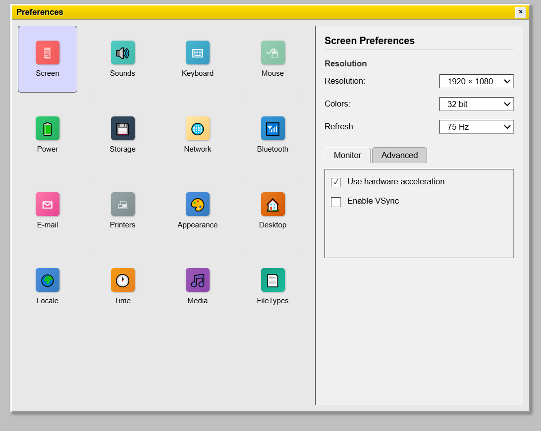
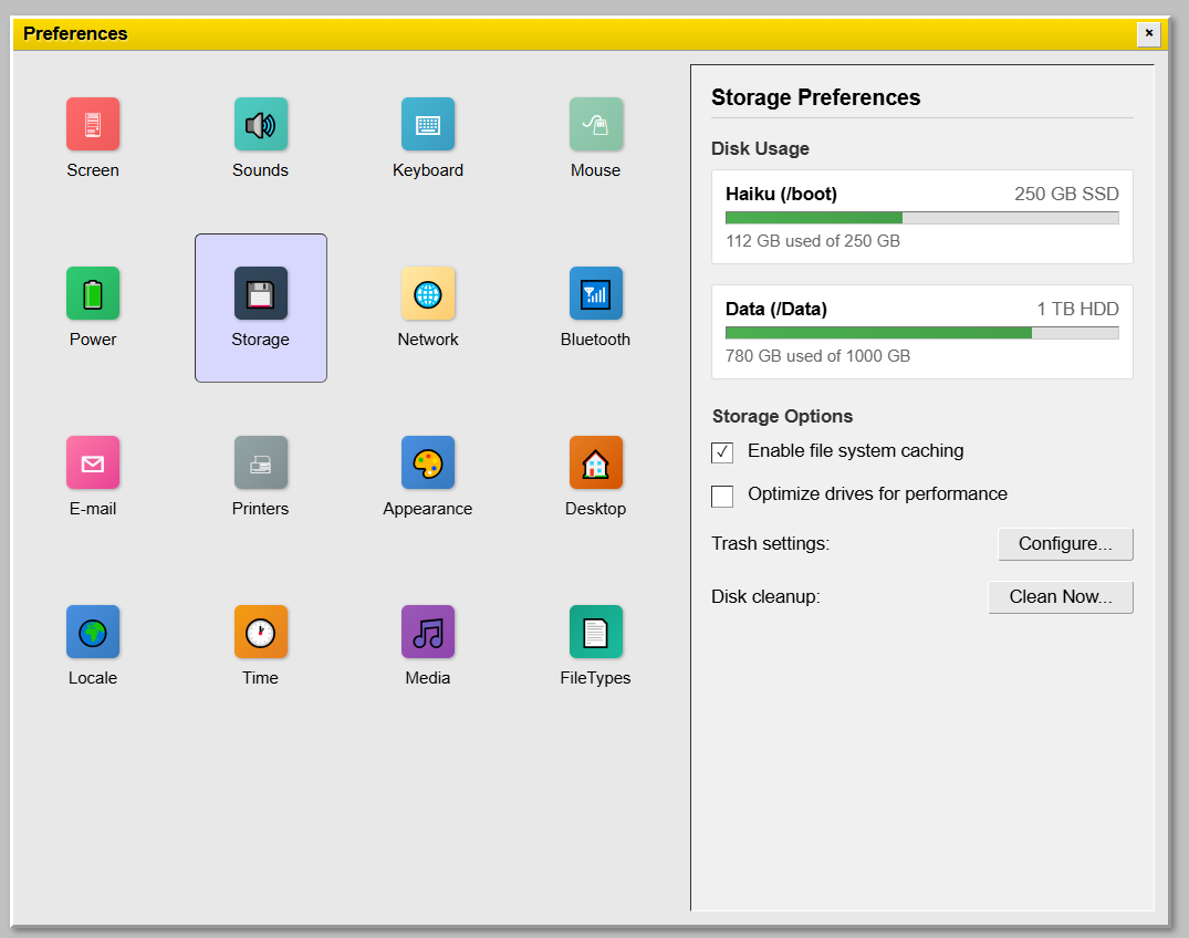
This looks like a mashup of Haiku and Kirigami (KDE) design styles, which to a lesser extent already exists while running some Kirigami apps (NeoChat, Tokodon, etc.) in Haiku right now. The System Settings mockup in particular is very reminiscent of Tokodon.
The icons are very generic and lack a lot of Haiku’s visual identity, which is terrible given that Haiku iconography is one of its strongest assets. The overall aesthetic mixes elements from the Be and Flat ControlLooks in a rather haphazard way. You are using soft drop shadows and app views with rounded corners alongside bevels and rectangular fields. There are two different button styles:
- big and flat buttons with rounded corners and large padding
- small and bevelled buttons with regular corners and smaller vertical padding
There are three different selection colours, two of which have bluish shades that contrast heavily with the generally yellowish UI. Metrics are all over the place, making all of it look even more inconsistent than they already are. Finally, the close button in your Preferences mockup is not in the same style as the window decoration buttons in the other mockups.
1 Like
Just make your work into realistic,don’t mind the objection.That is the way which Haiku work out from BE.
Continue this theme pls,thanks.
One thing should be said against the kitchen sink preference app. A strong feature of BeOS, Classic Mac OS and AmigaOS was conceptual simplicity. System menu is simply a folder. List of preferences is also simply a folder. A particular preference is a normal application, not different from any other application.
Everything is deeply integrated, and the OS interface itself tries to disappear in order to not disturb you.
4 Likes
This looks nice. Basic proof of nice work @Hamguy Are you willing to share these files? Some link to download them in original format ![]()
![]()
27 posts were split to a new topic: Deskbar redesign
Please, kill this thread…
4 Likes
Why would we want to do that? It is on topic (until now) and the participants are all acting very civilized (as far as I can tell). The only off-topic, non-constructive comment so far is yours.
So, if you disagree about what was said above, join the discussion and let us know what you think. And if you’re not interested in the topic, just ignore the thread. It’s that easy ![]()
6 Likes