yes please! maple leaf is better! even always wanted to change that blue icon and i dont undertand why it cant be edited/configured
Making it easier to change would probably be nice. AFAIK it is embedded into Deskbar, which is part of the haiku.hpkg, which means it is read only, unless you make a new haiku.hpkg. Adding a setting to change the icon to a local file would be possible but someone would have to do the work.
One of my main hobbies is plants, primarily ones native to my state in the US, Florida. Blue leaves do exist but are more common on conifers and less common on broad leaf plants. The leaves in green, yellow and orange in the Haiku logo are natural and common, the blue just seems odd.
With all the said, the designs from @apgreimann look nice, even with the blue leaf. I just don’t think the small blue leaf in the Deskbar button looks good. At that size is definitely looks like a feather and it also looks kind of cut-off.
Anyhow we are moving kind of offtopic. Though that tends to be how these forum posts evolve 
I’d vote for that. It’s killing me that I can’t change it to the Atari Fuji on the VCS.
That being said, I like the maple leaf ones, but the larger leaf.
But I also like all of them, so I’m not much use here.
+1 to bring back the ladybugs! If I could do this one again, I’d add a few bugs peeking from under the leaves…
Also, don’t touch the bright blue unique Haiku Deskbar leaf! I’ve enjoyed looking at it for over a decade, longer than at the BeOS or BeEarEye logos of BeOS… ![]()
Not quite satisfied with this one, but here is another one:


Yes, I like the idea! Maybe the “Haiku” text can be made even smaller, or completely removed. And the text Beta3 should be made even bigger… and replaced with Crap3.
Sorry for the joke ![]() .
.
I understand somehow a little the reasoning behind the naming… but I think it is give to much importance. It would be less confusing if haiku would start with “Haiku 1” and then incrementing it … like all the major OSes are doing… iOS , Android, Windows
That is exactly what we do. We start with Haiku R1. But before we get there we have a few work in progress alpha and beta releases.
This is also done by Apple (https://beta.apple.com), Windows (https://insider.windows.com) and Android (https://www.google.com/android/beta). As a normal user you just don’t get to hear about it, and it should be the same for Haiku. But it seems we have quite a few very enthusiastic users who will use these unfinished, work in progress versions anyway.
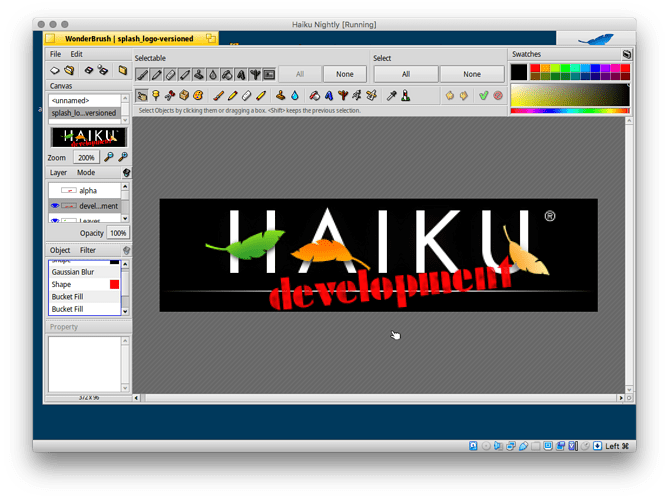
Not sure (not on the Haiku dev team) but I looked at the file in WonderBrush and it looks like it’s just a stenciled design? It’d be possible to extract it from Haiku’s artwork files I guess; there’s also a stencil style that’s kinda close on Allerta Stencil - Google Fonts and anyways hope this helps answer your question
I spent over an hour in Woderbrush trying to change it to beta 3, but I could not understand how the program works.
This is the original file: https://git.haiku-os.org/haiku/tree/data/artwork/HAIKU%20logo%20-%20black%20on%20white%20-%20installer
Maybe @humdinger have the knowledge to add beta 3 to the file?
Yes, it’s shapes, not a font.
If you have a specific question, you may want to start a thread with it and we can try to help there for the benefit of future WonderBrush user generations.
The issue I see with that file is that it uses a font that’s not part of a standard Haiku. We do see the text, but we cannot change it unless we install the exact font. Looking at the WBfile in DiskProbe, it appears to be “SISTEMA FONT BT”.
Just a reminder this contest closes in 2 days.
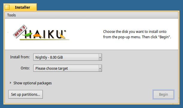
I’ll take the “most fav’ed” images and put them into a poll with example usages in the Installer window.
Locking since we just passed the deadline for submissions. I’ll make another post for voting shortly!


