@apgreimann, The last one is a ** beauty **
3 Likes
dang. Agree. @apgreimann those look good 
I do personally wish the logo was still in there somewhere (even shrunk above the R1/beta3 in the first logo?)… but this one is one of my top favorites so far.
I think there’s good reason to make the version text bigger than the logo artistically… R1/Beta3 is the most exciting part 
4 Likes
Thanks guys ![]()
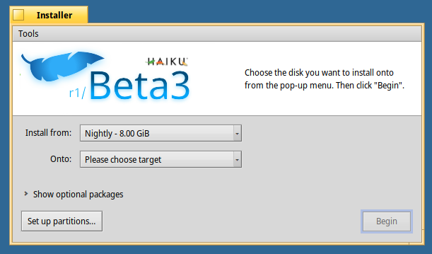
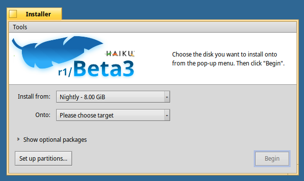
Wish granted ![]() It didn’t feel good to me to shrink the leaf down when I messed with it but I made Beta3 larger and added in the Haiku logo above it
It didn’t feel good to me to shrink the leaf down when I messed with it but I made Beta3 larger and added in the Haiku logo above it
I also tried a version with the lighting from the top
And a version with the lighting from the bottom

Hope everyone likes these ![]() Later
Later
13 Likes
Just one more detail, if you could make the “r1/” part in bold it’ll be perfect…i think?.
I like the designs with the blue leaf, but unfortunately the blue leaf doesn’t “say” Haiku. Only the “dead” orangey-brown leaf says that.
You acknowledge that fact by including the word Haiku in your later versions, but then they lack the simplicity of the earlier designs.
Part of the attraction of the earlier blue designs was the use of just one colour. I suspect all-blue is more effective than all-orangey-brown, but it might be worth applying a single colour to the R1/Beta3 on your earliest design because that is the one that “says” Haiku without using the word.
1 Like
Which font is used for the red stamp overlay text?
So adding in the mini Haiku logo was a thing I did for @kallisti5, but I don’t have to if it takes away from it, here’s the new design without it, it’s totally up to you guys how you like it


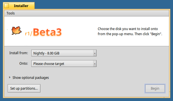
So here’s some designs using just one color (blue)
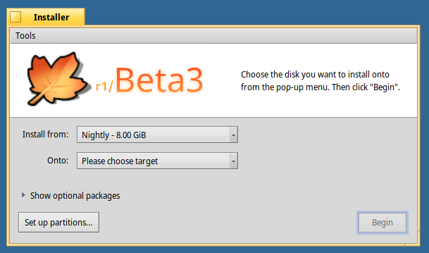
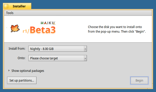
also just with one color (orange)
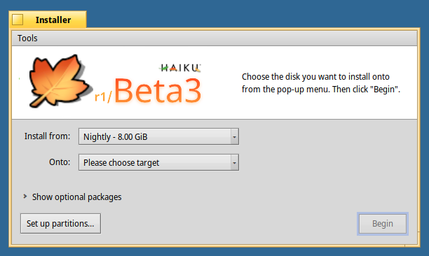
Here’s the r1 in bold, hoping it looks better
I also tried some stuff with the leaf smaller (but ngl I’m not really into these…)
Anyways, that’s the latest batch, hope everyone likes these
Thanks guys ![]()
16 Likes
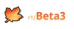
The maple leaf with r1/beta3 looks the best in my opinion. Neat!
The orange should also work nicely in a dark mode I’d expect, but maybe you can test that?
(dark mode isn’t ready for beta3, but will probably be for beta4)
3 Likes
Wow @apgreimann !
This one is awesome. I think it could be scaled up a little, but overall it’s pretty spot on 
In a little over a week we’ll hold a vote on which on the community likes the most
5 Likes
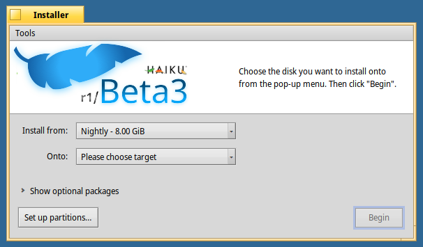
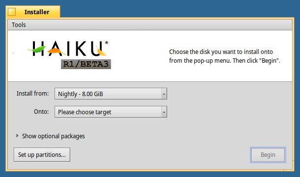
IMO, if there ever was a place for the official logo, it’s in the Installer. The above, again IMO, looks unofficial and jumbled together.
Maybe we should just use the official logo wth a BStringView above/below with a bold centered version. The version could be fetched from an rdef, keeping us consistent in the future with minimal effort.
6 Likes
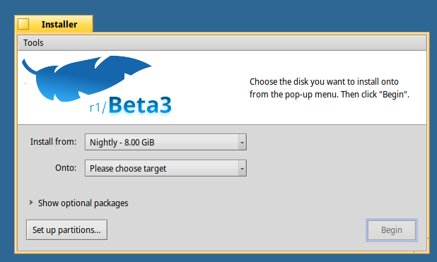
Yes, I think we should just use the official logo with some subtle changes (the stamp or beta banner and maybe some bugs hiding under the leaves).
If we want to do something else, I think we’d have to discuss a complete logo/brand identity change, because changing this only in Installer makes it inconsistent with everything else. The leaf logo looks nice, but doesn’t blend in with the other parts of the OS
6 Likes
I mean, technically this is all artwork from our source repository inline with our HIG.
First impressions are important… and the Installer is something most everyone sees “first” at some point.
The stamp stuff is fine, but it really looks “10 minutes in photoshop / gimp”
The blue feather is also in our Deskbar menu though. A reduced render of the maple leaf is overlaid over the Haiku boot / system volume on release images too.

7 Likes
Good day @kallisti5,
I always thought the blue feather was a blue leaf… 
So Haiku has the Haiku logo (name with leaves), the Blue feather/leaf and the Maple leaf??? This branding needs some sort of reviewing!!!  Trinity explained
Regards,
RR
1 Like
I actually have no idea ![]() It looks more feather than leaf.
It looks more feather than leaf.
1 Like
This one is perfect. It does not steal focus from the main logo yet subtly adds the beta flair.
@apgreimann’s also look nice but the focus should not be the beta part.
This one is still my favorite
6 Likes
I also like many of the @apgreimann options with the one very pedantic observation that it probably should be R1/beta3 with a capital R and lowercase b. At least that matches the naming on the previous versions.
Also while even though @kallisti5 also calls it a feather and it really looks like a feather I am quite confident it is a blue leaf. Even though blue feathers actually exists but blue leaves really don’t 
In fact I’d love to know the history of the blue leaf as the Deskbar button icon because I’ve never really liked it and I also prefer the maple leaf.
7 Likes
Blue maple? Wisteria? Juniper? Cebu?
Natural blue leaves exist - deep blue to light blue. Natural hybrids as well. Coral leaf plants as well.
Note:Lots of this depends on the bacteria and/or natural pigment (i.e. the chemical makeup) making up the leaf color. Similar things like ‘red tide’ or blue tide’ (aka bioluminescent waves) in the ocean. Nowadays, many plants/trees are imported hybrids (i.e. human involvement changing the ‘known natural’ color).