Beta 3 is clear enough. Why using\mention R1?
R1= BeOs R5 replacement release!
BeOs5 R1 Beta3?
I like this best. It just needs a darker colour for the R1/beta3 text.
It’s not very clear, but I meant your original design, Humdinger. Simple is good.
Because after R1 it does not stop ![]() After R1 the next big goal presumably will be R2, and thereikely will be a beta phase, giving a R2 Beta 1 etc.
After R1 the next big goal presumably will be R2, and thereikely will be a beta phase, giving a R2 Beta 1 etc.
This one is my personal favorite so far. It’s the most refined.
I’d like to see R1 in the image as I think “Beta 3” alone isn’t enough, but folks… keep in mind I’m trying to keep this is a community decision ![]() . If y’all overwhelmingly prefer something without R1 in it, I don’t have a leg to stand on.
. If y’all overwhelmingly prefer something without R1 in it, I don’t have a leg to stand on.
Correct. This was my thought on it. We’re going to have R1, R2, etc
This is for friends, i see.
I loose my time.
Not really sure why you would come to that conclusion. The submitted artwork will be voted on by the community. Yours is #2 on my personal favorite list.
Here goes our proposals! if its needed, we have the psd sources.


Good day,
A slight review:

Actually, R1 should have more presence than the beta3/b3 stuff… Don’t you think so? Here shown at the size it should be, same as HAIKU. Uses same base font as HAIKU does.
Regards,
RR
![]()
Surely what’s changing is the transition from Beta 2 to Beta 3. R1 is constant. So it’s Beta that should be emphasised.
Something like this would be my vote.
Going by BeOS numbering this should pre PR1 anyway. There was never a R1 or R2, they did DR1 - DR8, AA, PR1, PR2, R3, R4, R4.5 and R5 as official releases on various platforms.
BeOS did switch to the RX versioning scheme for the last couple releases though, so Haiku having R1 is already quite fitting.
Well, it was R3 onwards. But even then DR == Developer Release, AA == “Advanced Access”, and PR == “Preview Release”. I don’t know why PR1(*) and PR2 became “R1” and “R2” in the numbering scheme, but R3 coming after PR2 implies that.
The DR releases were mainly BeBox, though I think DR8,3 was Mac also. AA was almost called DR9. AA was a version of PR1 before it was quite ready, they put it out because the transition from DR8 to PR1 was a massive leap (the new BFS filesystem, new Tracker Desktop, quite a lot changed under the hood, the database was gone and replaced by attributes on BFS.)
(*) PR1 was originally just PR IIRC, the one was retrofitter because PR2 happened. PR2 was the version a lot of magazines gave away and was Mac compatible.
+1 for the Haiku logo with bugs and overlayed red text.
-∞ (infinity) for the beta1 design. The grey line under the Haiku logo makes it look like the logo is misplaced so that the background becomes visible (the line has the same/similar color as the background). The R1/beta1 is badly stylished. Release is shortened but beta is not. Release is capitalized (since it only has one letter) but beta is not. It is horrible.
Use the design in alpha 2/alpha 4. The beta 2 design is not as polished. The color is to dark, the text to small and it is placed wrong. It should be more “fuzzy” and on top of the logo, as to resemble a stamp.
TLDR: Copy the alpha 2 or 4 design and just change the text.
Why it is not:
Haiku Alpha 1
Haiku Alpha 2…
Haiku Beta 1
Haiku Beta 2
Haiku Beta 3
Haiku Beta 4
and then Haiku R1
Haiku R1 Beta 1
Haiku R1 Beta 2…
That like!?
You cannot release a stable version (R1) before its beta (R1 beta). The current development version is for R1. A beta version of R1 is therefor R1 beta.
Alpha → Beta → Stable
R1Ax → R1Bx → R1
The cycle repeats:
R1.1Ax → R1.1Bx → R1.1
R2Ax → R2Bx → R2
And before each release, you usually have additional stages like release candidates (R1B3rc1). They are not official releases, just candidates as the name implies. The last release candidate becomes stable and is released as such.
Just a reminder, mid way through a release is not the time to change the version 
Once the submission window is closed, I plan on taking the top 5 “liked” renderings here and putting them into some kind of voting post with mockup examples
I know everyone’s already made theirs (so hoping I’m not too late on it) but here’s my contribution to the post 
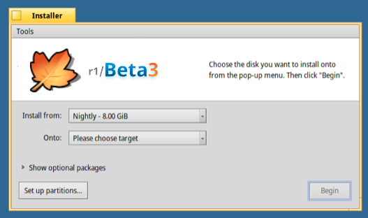
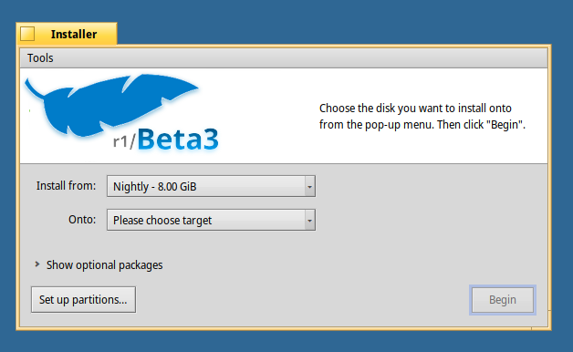
And I get everyone’s went with the usual H A I K U logo that’s been used since the very first alpha, but I thought I’d suggest another idea. I love icons over words for logos as I think they’re friendlier and cleaner, like everyone knows the Finder logo and round release buttons for Mac, the Android bot, Windows logo, Ubuntu logo, and so on. So why not do this with Haiku?
 1: Haiku leaf
The first idea is based on Haiku’s leaf theme, and it’s the official icon of the AboutSystem app and there’s a badge like it on the startup volume for releases, so (maybe it’s just me) but with its use in a few places, it feels as much a thing as the Mac logo or Windows logo is, so why not use it?


An alternate version could be a stack of 3 leaves to show it’s the third (beta) release

 2: Haiku ‘feather’ (blue leaf from Leaf menu)
The second idea is the blue leaf from the Leaf menu; I get it’s not as official as the About leaf, but it’s still a symbol of the Haiku OS already and more people should know its not the feather menu  so, idk what better place to let people see it than here?


On topic, I’m prob the first to ask but… why is the blue leaf in Haiku? Sorry if I’m wrong in asking this but tbh it’s used nowhere else in the system, so nothing says ‘this is Haiku’. So… maybe R1/Beta3 could start a trend where the more official leaf could be in the Deskbar to unify Haiku’s brand?
![]()
