
Here is a bit more than a rubber stamp, maybe.


(why is it not allowed to upload wonderbrush files by the forum?)

I would go with ‘b3’ instead of ‘beta’ anyway. But it’s required the ‘beta3’ thing. 
Aesthetically R1|b3 looks more balanced than R1|beta3.
Regards,
RR
Thanks! The idea came about while trying to figure out a design that would be in line with Haiku’s overall visual identity, while still remaining within the bounds set by the call for logos.
Made a revised version with slightly larger text and box for better readability:

Here’s the Krita file, if anyone wants to make improvements on the design:
https://0x0.st/-pBH.kra
It should work on the Haiku port as well.
I’m going to insist on the permanent marker, it gives it a DIY feel.
You asked, I delivered:

Based the leaves on SNES games and some clever tricks I remember seeing in ASCII art recreated in GIMP with the “Wind” effect and a lot of “pencil” work in order to get rid of the aliasing in the classic Arial font. It’s fundamentally different but much more lowkey, in my opinion. I can also combine the previous things I used to denote the release (e.g. an actual permanent marker and a pen) here.

Maybe we should keep the current Haiku logo, but with a “sticker” that says “Beta3” on the side, like what is used in the “Get Haiku” button:

Obviously for this we’d move the stamp to be partially over the logo, and the “download it now” text wouldn’t need to be there. I do wonder if we could keep the background, though - it would look quite nice.
I kept the r1/beta3 because it still felt appropriate. I used some filters to make the leaves just a bit more black then used an airbrush and a smudge tool to give it a watercolor yet pixelated look. I can still replace the “ribbon” however deemed appropriately.

Totally agree
+1
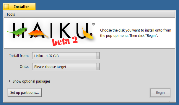
Yep. Like this better than my first try:

It will look a bit bad if the ribbon suddenly gets cut off though, right?
The ribbon could continue a bit to the right, I guess. At the bottom, it’s cut off by the grey options view.
Or: put the ribbon into the top left corner to avoid it being cut off by the right text view:

Here’s my take on win8linux’s idea!

The white one is great ! I really appreciate it
Here are my logos!


It’s missing the “R1” part, though.
Yeah, it could be added I guess. OTOH, there will probably be enough time between we hit R2/beta3 and R3/beta3 that nobody will be confused. 
