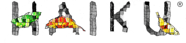
I think we have a good opportunity to customize the Haiku R1/beta3 installer logo.
Base:
Transparent logo (in-case you need it):
I’d like to collect some submissions and have the community vote on them.
The image size shouldn’t change. 316x102
White background to match the rest of the installer window.
Haiku’s logo should remain the “primary” part of the image.
Registered trademark logo (circle + r) must remain.
No trademarked content / all modifications must be cleanly released under the MIT license.
Ideally, “R1 / Beta 3” should appear somewhere + somehow within the image.
The deadline is July 9th, 8:00 am CDT. Submissions should be made within this thread.
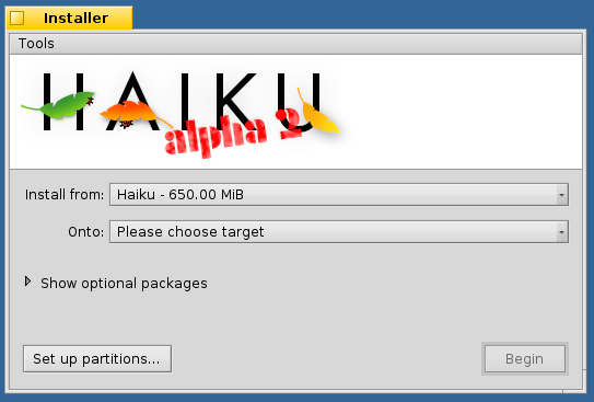
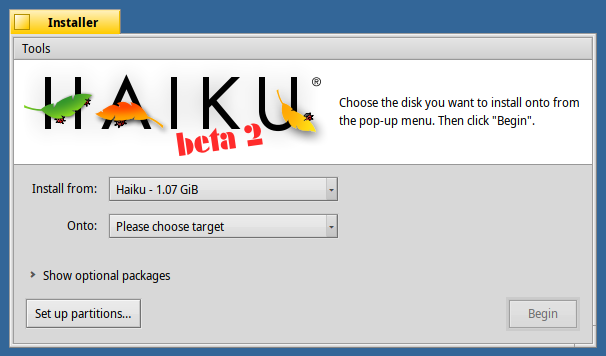
Here’s context on how the image is used:
https://cloudflare-ipfs.com/ipfs/QmaxfbW9p43LV4P97P1upoMFqgL8GWbMuGe2TxwnbmEHdk/installer.png
1 Like
Perhaps it could be a shade darker, for better contrast? It’s light on light, which isn’t good for readability and comfort.
Tried out something experimental based on dungeon games I used to play. The logo has been resized for clarity in the forums.
2 Likes
Made two designs for a possible logo.
Simple:
This one builds upon @humdinger ’s idea, but uses a darker orange colour from the second leaf for better contrast. Not much more, really.
Tab:
This concept aims to evoke the iconic yellow tabs, which are a major element in Haiku’s unique visual identity.
9 Likes
fkap
June 25, 2021, 8:03pm
9
I loved the one with the tab!
Nice! keep them coming!
I like the mosaic, but the big point is getting the release version into it.
This is the normal file for the installer for wonderbrush: https://git.haiku-os.org/haiku/plain/data/artwork/HAIKU%20logo%20-%20black%20on%20white%20-%20installer
It also has the beta2 alpha3 etc images in it
Just a nitpick, but why… R1/Beta3… which one is it? R1 means to me a “sharp” release… Beta3 means “experimental” to me… Quite ambigious.
1 Like
Mostly because we’re working towards “R1”. That’s kind of the gold standard “big” release.
R1/alpha1
R1/alpha2
R1/alpha3
R1/beta1
R1/beta2
R1/beta3
etc
Eventually we’ll get R1 out. R1’s goal is “a replacement for BeOS” and I’d expect it to be “supported” for a looong time.
After R1 (R2, etc) stuff’s gonna get crazy ™
4 Likes
Ok, makes sense, thanks for the clarification
Same file, not sure if the Installer does respect bg color, but if not i’d fix it to do so I suppose.
Neither did /any/ of the previous Beta or alpha releases, do you have any good justification as to why this is suddenly different?
You can even check the source file i linked above, it contains all previous installer images
1 Like
are we all over the road? Yes.
Personally I like consistency, and I think the R1/beta3 is more confusing even if it makes sense to us, it won’t for users since / usually means a dividor as a logical or, R1 or beta3 instead of the meant beta3 of Release 1
Wierdly enough I didn’t remember the beta1 installer image, maybe that sais more about me though, but it looks like you are indeed correct, even if beta1 seems to be a clear outlier there.


