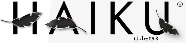
I kept the r1/beta3 because it still felt appropriate. I used some filters to make the leaves just a bit more black then used an airbrush and a smudge tool to give it a watercolor yet pixelated look. I can still replace the “ribbon” however deemed appropriately.
Totally agree
+1
Yep. Like this better than my first try:
It will look a bit bad if the ribbon suddenly gets cut off though, right?
The ribbon could continue a bit to the right, I guess. At the bottom, it’s cut off by the grey options view.
Or: put the ribbon into the top left corner to avoid it being cut off by the right text view:
Here’s my take on win8linux’s idea!
The white one is great ! I really appreciate it
Here are my logos!
It’s missing the “R1” part, though.
Yeah, it could be added I guess. OTOH, there will probably be enough time between we hit R2/beta3 and R3/beta3 that nobody will be confused.
Beta 3 is clear enough. Why using\mention R1?
R1= BeOs R5 replacement release!
BeOs5 R1 Beta3?
I like this best. It just needs a darker colour for the R1/beta3 text.
It’s not very clear, but I meant your original design, Humdinger. Simple is good.
Because after R1 it does not stop After R1 the next big goal presumably will be R2, and thereikely will be a beta phase, giving a R2 Beta 1 etc.
This one is my personal favorite so far. It’s the most refined.
I’d like to see R1 in the image as I think “Beta 3” alone isn’t enough, but folks… keep in mind I’m trying to keep this is a community decision . If y’all overwhelmingly prefer something without R1 in it, I don’t have a leg to stand on.
Correct. This was my thought on it. We’re going to have R1, R2, etc
This is for friends, i see.
I loose my time.
Not really sure why you would come to that conclusion. The submitted artwork will be voted on by the community. Yours is #2 on my personal favorite list.
Here goes our proposals! if its needed, we have the psd sources.