What font you are using?

This is probably caused by the “hinting”, process, which distorts the glyphs to try to align them better with the pixel grid. You can disable it in appearance preferences, but maybe we should have a bit more options there (to do only vertical or only horizontal hinting, maybe?)

Some people prefer the distorted but very sharp characters, others prefer slightly more blurry but less distorted ones. With current displays having a quite high dot-per-inch, and also subpixel antialiasing, the blur is not so noticeable anymore as it was when we decided to enable the hinting by default.

With current displays having a quite high dot-per-inch, and also subpixel antialiasing, the blur is not so noticeable anymore as it was when we decided to enable the hinting by default.

It’s still pretty noticeable on an 4k 27’ display.

1 Like

Sure – it’s the TTF hinting instructions of the particular font. Plex obviously contains instructions to squeeze the letters at small sizes.

Last year, when I played around with Plex on Linux, I also found out that in FreeType not only the TTF renderer gives us options how to handle the hinting instructions, but also the CFF renderer. Back then I tried various degrees of hinting with both outline technologies. At least on my screens, CFF gave me in any case the better result for the Plex fonts, since it doesn’t have this tendency to distort the letter forms in such an unbalanced way.

From what I saw, I’m convinced that it can depend quite much on the particular font.

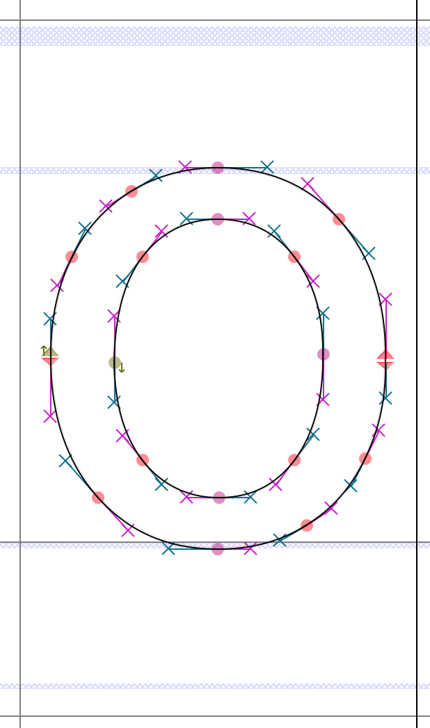
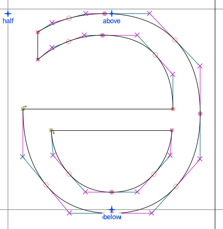
First, on how they were drawn: Some fonts were drawn initially with cubic bezier curves (PS/CFF) and then converted to quadratic curves (TTF) or the other way round. This can be very obvious when you open the font with FontForge and take a look at a round Letter like O. If it’s inside a very regular hexagon, it was likely drawn directly with quadratic bezier curves and not converted. When the hexagon is irregular or is not even a hexagon at all, then the font was likely converted from PS/CFF. In PS/CFF fonts there should be four straight lines around the O that do not touch each other. If it’s more than four, the font was likely converted from quadratic outlines to cubic.

Examples:

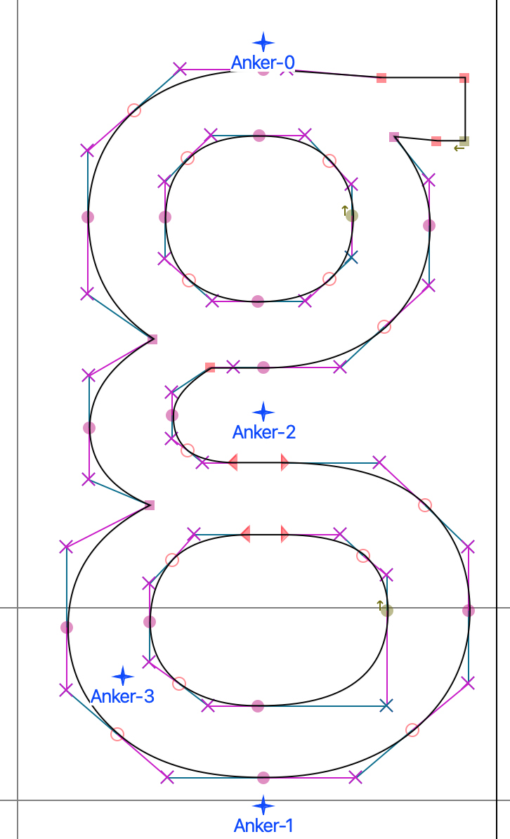
The outlines of the PragmataPro TTF letter “g”. Typical structure of a font that has been drawn originally with quadratic curves. Perfect hexagonal structures in order to achieve the minmal amount of nodes (with lines that touch their neighbours, like they do with quadratic curves):

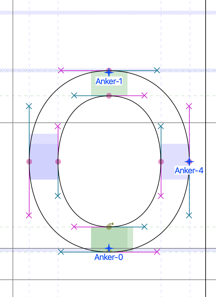
Inter CFF OTF outlines of the letter “o”. Four lines for a full circle to achieve the minimum amount of nodes. Blueish cubes: Vertical PS/CFF hints. Greenish cubes: Horizontal PS/CFF hints:

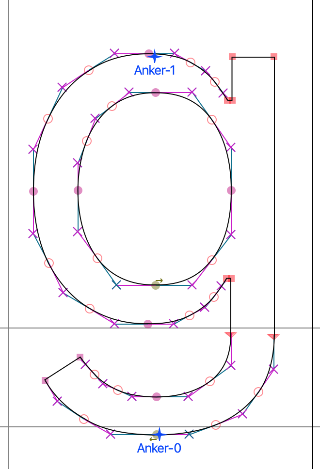
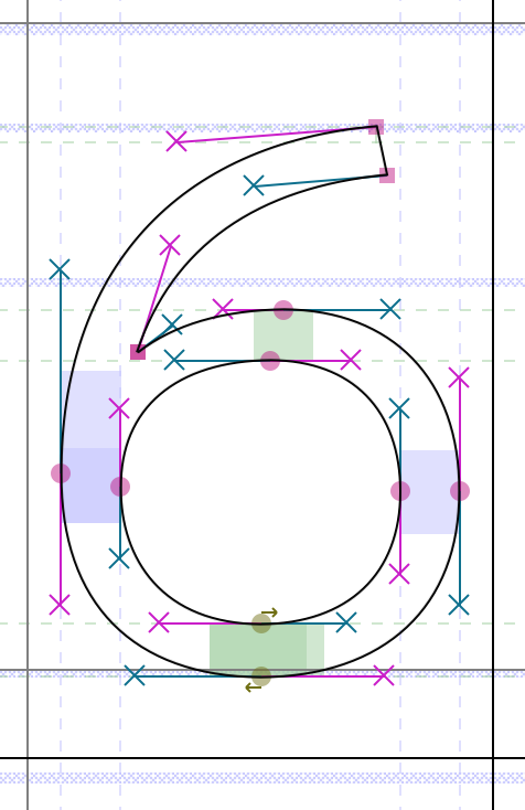
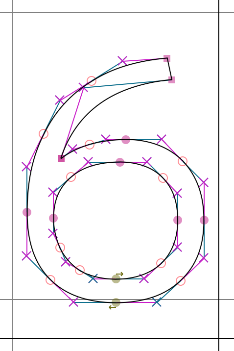
Inter TTF letter “g”: Might be converted from PS/CFF cubic outlines, because the structure is not exactly hexagonal:

Roboto CFF: Obviously converted from an imperfect TTF to CFF. I guess it was drawn initially as PS/CFF, then converted to TTF (because the structure is not hexagonal) and then converted another time to CFF. Even the hints are missing:

Second, it is very important how much effort was put into the hintig. When the hinting of a TTF was not done manually but with an autohinter instead, the result will be quite likely really bad. If the hinting instructions are missing, it will be bad as well.

A TTF with superb hinting is e.g. PragmataPro. Fabrizio Schiavi, the author of the font, spent years (well, now even decades) to achieve this kind of perfection.

For Plex and Inter I suspect that the two fonts were originally drawn with cubic curves and then converted for systems on which CFF does not work. I also suspect that not nearly as much effort was put into creating the TTF hints in Plex and Inter as is the case with PragmataPro.

A similar discussion with similar findings from 2018:
https://github.com/IBM/plex/issues/198

1 Like

I agree! I have two of them. One from EIZO and another one from iiyama. On 4k 27″ (= 163 ppi) and with FreeType rendering without any scaling applied aftwards, the stems of letters like t, l, i etc have this inconvenient blur when I use the TTF version of Plex. When I use CFF, there is less of this irregular blur.

On GNOME and Plasma this works only, if you don’t use fractional scaling. If you put GNOME to 175 % it renders actually 200 % (of 96 ppi) and scales it down afterwards which makes everything blurry, no matter if you use TTF or CFF :smiley:

Haiku’s solution is way better in terms of keeping all text as crisp as possible.

Bitstream Vera Sans (open-source Verdana alternative): https://www.dafont.com/bitstream_vera_sans.font

1 Like

There is also an extended version of Bitstream Vera named DejaVu: https://dejavu-fonts.github.io/

DejaVu TTF capital letter Schwa:

Obviously originally drawn with quadratic Bézier curves.

1 Like

Howdy,

I use (and love) the M+ font series.

https://mplusfonts.github.io/

This is a Japanese font, but looks great in other languages as well (not sure how many languages are supported).

Plus, it is available in weights from 100 to 900. You can see M PLUS 2 here:

Enjoy!

1 Like

Nice! Thx!

Some additional links:
Project page: https://mplusfonts.github.io/
Github repo: https://github.com/coz-m/MPLUS_FONTS/tree/master/fonts

MPLUS1 CFF OTF numeral “6”:

MPLUS1 TTF numeral “6”:

Obviously the font was crafted with PS/CFF cubic curves – the inner circle of 6 is not perfectly hexagonal and the em square size is 1000 instead of 2024. The TTF files are merely converted. We should thus use the OTF files.

@xanadu, many of these fonts are already packaged at haikuports.

If you’re up to it, you could adjust those recipes to package the OTF instead of TTF where it makes sense.

2 Likes

I have already thought about proposing this. So far I have exported the list of all fonts from Haiku Ports into a spreadsheet and started researching font by font to see in what formats they are available and which is the original one.

2 Likes

Great! Got your work cut out for you there… currently there are 68 font packages. :smiley:

I don’t mind changing the formats of fonts available at haikuports, but keep in mind that future beta5 will support variable fonts, and we should definetely use them at that point in haikuports. (especially for shipped fonts, to take advantage of the size in image reduction)

So any work reworking fonts now might need future rework unless the PR’s can be held off untill beta5 : )

2 Likes

That is great! Didn’t know that variable fonts will be supported that soon. Inter is actually a variable font. <3

Will there be also support for OpenType alternate glyphs? Like tnum (Tabular figures) which would make sense for the clock in the deskbar. For now the clock is jumping around because the wrong numerals are used. :smiley:

our font support is based on freetype, if freetype supports this in some form we might add it, but I didn’t know about that feature before this, will investigate this.

EDIT:

I suppose an api for this would declare what kind of numerals to use for a rendered BTextView? hmm

edit2: looking at the API to load glyphs for Freetype I don’t see a straightforward way to specify what number variant would be needed

FT_Load_Char

Defined in FT_FREETYPE_H (freetype/freetype.h).


  FT_EXPORT( FT_Error )
  FT_Load_Char( FT_Face   face,
                FT_ULong  char_code,
                FT_Int32  load_flags );

I would expect load_flags to accept a flag for this, but there does not appear to be any.

The other api FT_LOAD_GLPYH accepts a glyph index from the font, so perhaps we can build this regardless ontop, sadly I’m not that deep into the api for freetype : )

FT_Load_Glyph

Defined in FT_FREETYPE_H (freetype/freetype.h).


  FT_EXPORT( FT_Error )
  FT_Load_Glyph( FT_Face   face,
                 FT_UInt   glyph_index,
                 FT_Int32  load_flags );
1 Like

Since alternate glyphs are an important part of OpenType features (regardless of whether a font uses a TTF or CFF table) this would be great to have. In LibreOffice e.g. there is a menu that shows all the smartfont functions of a font and corresponding dropdown menus to set the options.


In the meantime I did some research on why there is no CFF OTF version of the Inter Variable font: Their font editor software failed to create it when they tried the last time in 2021.
https://github.com/rsms/inter/issues/187

Yes, true. However stuff like litagures falls into this aswell, and likely would be much easier to implement by adding harfbuzz to the mix, which is a plan aswell. I don’t think number variants neccesarily falls into the text layouting though, so would make sense to add here. (So, stuff that is really just 1-1 glpyh replacing seems fine to me. Anything more is probably harfbuzz territory)

2 Likes

A demo page for playing around with variable fonts including a subpage for fonts with a CFF2 table: https://v-fonts.com/tags/C107

Difference in size between variable fonts of CFF2 (*.otf) and TTF flavour:

Sizes_CFF2_vs_TTF_VF

Downloads for local testing:

According to Wikipedia:

Montserrat is a geometric sans-serif typeface designed by Argentine graphic designer Julieta Ulanovsky and released in 2011. It was inspired by posters, signs and painted windows from the first half of the twentieth century, seen in the historic Montserrat neighbourhood of Buenos Aires.

Nice!

1 Like

Montserrat on Github:

https://github.com/JulietaUla/Montserrat/tree/master/fonts/otf

1 Like

Where are they packaged? I’m pretty sure they be overriden via either /system/non-packaged/data/fonts/ or ~/config/non-packaged/data/fonts/ as described here: