What font you are using? I changed the fonts and increased their size to meet my needs. I taked some screenshots and you can look for comparision.
What font you are using? I changed the fonts and increased their size to meet my needs. I taked some screenshots and you can look for comparision.
For easy comparison these are the main, commercial fonts used:
Maybe I did not understand your question here…
I think font change settings should be hidden behind some settings key or an “Advanced” settings button. By default Haiku should ensure that a standard font viewing experience is provided.
The reasons for this:
There are not many contenders. Noto checks a lot of boxes, it’s reason of existence is to be able to display every single Unicode character, and it looks decent. Optimised for screen display as well. My only complaint is that the Regular style is too thin, at least Medium should be used.
There are other candidates like IBM Plex or Ubuntu, but these are directly associated with other entities, therefore should not be included with a Haiku install.
BTW, for HiDPi screens do you need to manually adjust font size or it scales automatically?
I disagree because it will be dumbed down. I think that current defaults are simple to understand.
I need a font with the same letter size ‘height and width’ to create text files for gaming projects
The size: height and width of a font depends on the operating system, and is therefore not transferable that easy.
It is a manual process at the moment.
You mean like a 8x8 bitmap font?

Or do you need monospaced fonts? All their letters are of the same width (e.g. ‘i’ is the same width as ‘w’.)
If you want do create a pacman like game with levels created as text files, you can see the level during creating in ASCII style
For the Haiku UI I do use Inter Display 4.0 CFF (*.otf files) since Adobe’s CFF renderer in FreeType delivers a more crisp result than the TTF renderer.
Inter Display is a free font with a huge range of glyphs and supported languages. It was derived from Roboto to overcome Robotos shortcomings. It is also said that the new UI font of macOS was derived from Inter. I like Inter Display also for the reason that its appearance ist somehow similar to the Swis721 BT font that was used by BeOS but way more modern.
Actually I’d like to propose to make Inter Display CFF/OTF the standard UI font of Haiku.
For fixed width I use PragmataPro Mono Liga which is a very well hinted commercial TTF font by Fabrizio Schiavi.
The Inter font is available in the HaikuDepot. It’s the ttf version, however.
Should we switch to otf instead? Are the differences noticable? (Not with my bad eyes, that’s for sure…![]() )
)
In case I changed the recipe to install the otf version instead, would someone else complain bitterly?
No I for myself wouldn’t complain, the open type font is the more modern used font!
TTF is somewhat older! Helvetica, Arial and Swiss are very similar designed!
OTF has more ligatures and it would be good to use this instead of the .ttf fonts!
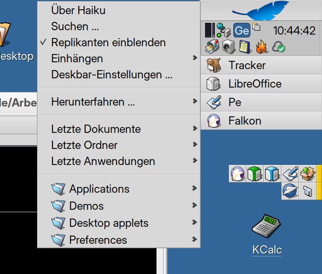
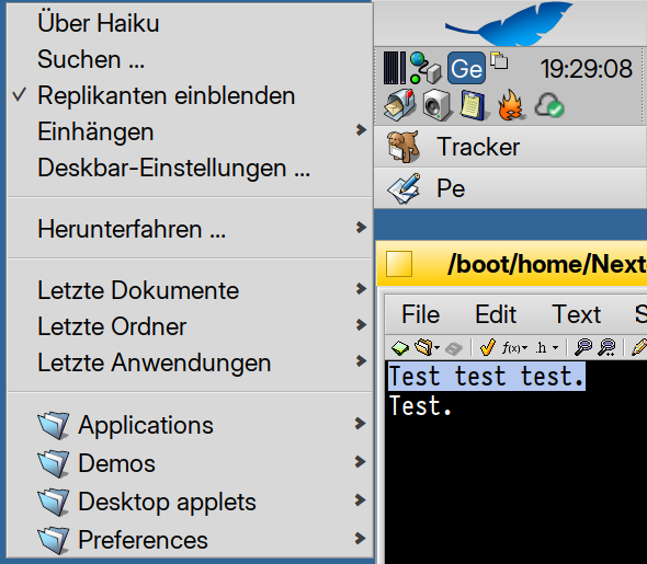
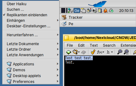
I made 4 screenshots for direct comparison.
Two for HiDPI with 23 pt font size:
CFF OTF:
TTF:
Two for LoDPI with 12 pt font size:
CFF OTF:
TTF:
I really don’t like the spacing after the l and i letters at the lower font size. It looks like some of the letters are touching each other. For example, between “ic” in words like “Applications” and between “le” in “applets”
There are two versions of this font, one is called Inter and the other one Inter Display. Inter has wider spacings. Maybe it’s more suitable for smaller sizes.
Inter CFF OTF 12 pt:
(Regarding CFF vs. TTF: The most obvious difference I see is that TTF distorts the Letterforms more depending on the size. At 12 pt TTF renders all the capital letter a lot higher, at 23 it renders the vertikal lines of P, E, R etc. at a lower position. CFF is more true to the design, regardless of size.)
With TTF fonts, the hinting intelligence is in the font file, in the form of detailed intructions. With CFF fonts, however, it is in the renderer. The font itself literally only contains hints.
TTF fonts were originally developed by Apple to replace bitmap fonts at low resolution on CRT screens. That’s why the instructions in the font files were trimmed to spit out pixel-perfect glyphs on these now old systems. When antialiasing and subpixel rendering came along, these instructions no longer suited so well. That’s why renderers nowadays ignore some or all of the instructions from TTF fonts. So Adobe’s solution of putting the intelligence into the renderer, which can be adapted to the new display media without having to change the fonts, proved to be advantageous. In addition, in Asian writing systems, which have thousands of characters, it is far too much effort to manually create instructions for each single TTF glyph (taking in account several display resolutions and font sizes).
However, the renderer from Adobe was closed source and secret. When web fonts emerged, this licence policy proved to be a disadvantage: All fonts on Android devices were TTF fonts because FreeType rendered CFF fonts so horribly. That’s why Google approached Adobe and made it clear to Adobe that it would be better to release the commercial renderer as open source. Adobe realised that this was true and from 2013 the former commercial renderer could be integrated into FreeType. Apple then also decided to create its new system font SF Pro in the OTF CFF format.
Thanks for that background info!
FWIW, the Inter font has been updated to the OTF version.
Thanks a lot!
I forgot to mention that CFF generates smaller font files than TTF, hence the name Compact Font Format. The smaller file size is of course advantageous for the distribution and the storage space on the system disk.
Right now I’m working on similar screenshots like the ones above for Noto Sans Display TTF and CFF. I’ll publish them here later. [Well, I can’t, because Noto TTF is a pre-installed system font, so I can’t delete it. ![]() ]
]
Another font that could be switched from TTF to OTF is IBM Plex.
Since I could neither uninstall nor delete the Noto fonts, as they are protected system files, what prevented me from visually comparing TTF with CFF, I took screenshots for IBM Plex Sans instead.
Similar to the Inter fonts, also IBM Plex was created after Adobe contibuted the CFF renderer to FreeType. Thus also IBM Plex was like Inter implemented with both outline technologies – TTF and CFF.
IBM Plex was commissioned by IBM to circumvent the huge market power of Monotype, which has bought up almost all of its major competitors worldwide over the last three decades. IBM had previously used Helvetica for its branding, but like so many companies, IBM was no longer willing to pay Monotype’s high licensing costs. However, Plex is much more than just a typeface for IBM’s corporate identity. It was created as a font that is also suitable as a legible UI font with serif and monospaced variants.
I personally use IBM Plex Sans Condensed for my GNOME and Plasma desktops on Linux, because I think it looks better there than Inter and because the Condensed variant is advantageous for the long German words.
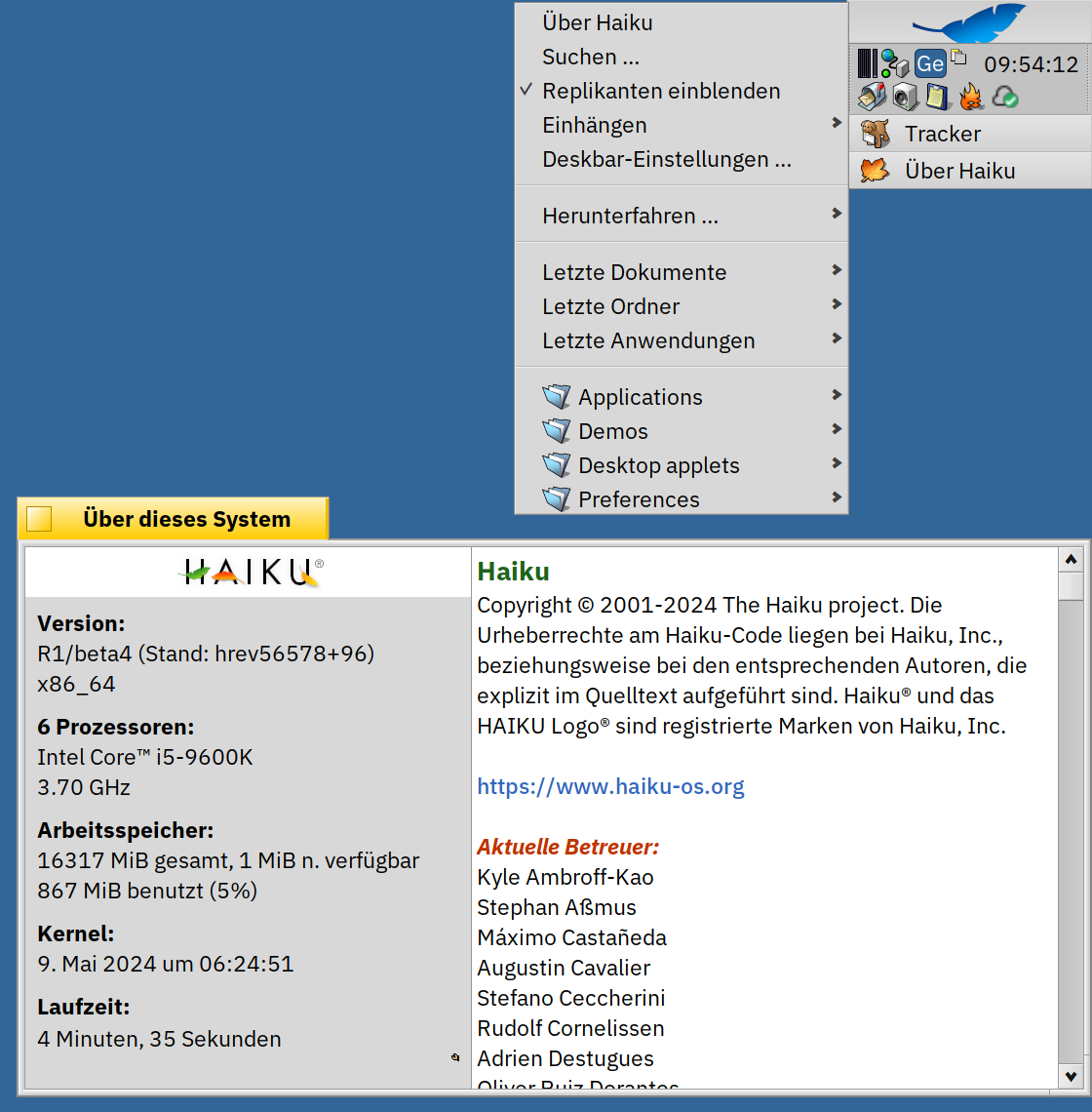
IBM Plex Sans CFF OTF 23 pt:
IBM Plex Sans TTF 23 pt:
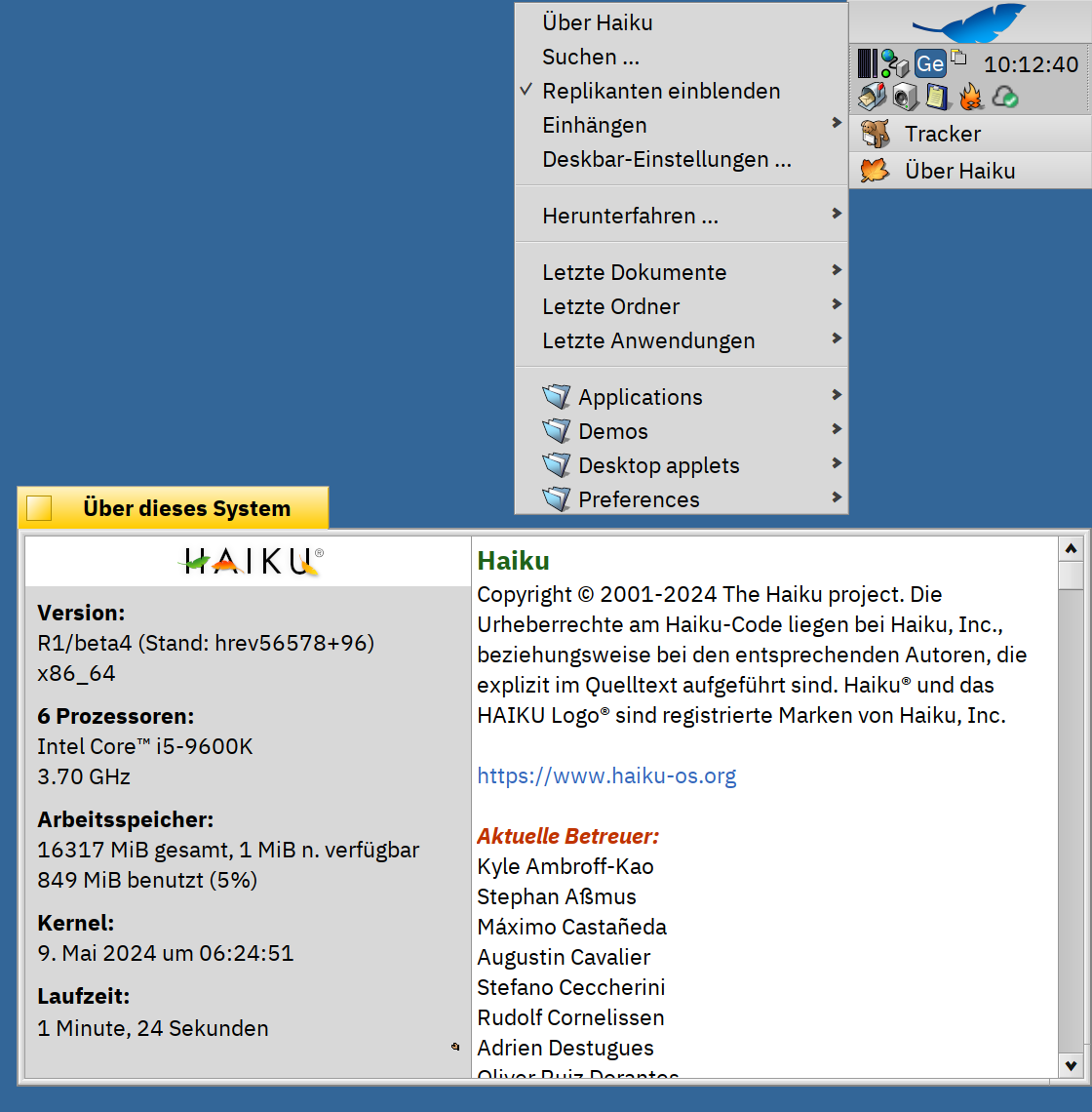
IBM Plex Sans CFF OTF 12 pt:
IBM Plex Sans TTF 12 pt:
What I notice with 12 pt is that the TTF renderer squeezes the lowercase letters vertically. This is very obvious with a, e and g. Words like “Anwendungen” and “Einstellungen” therefore look pretty ugly in my eyes.
At a size of 23 pt, the TTF renderer seems to draw the letters a bit bolder than the TTF renderer.
At both sizes, the CFF renderer produces a more balanced general appearance. What surprised me is that 12 pt is so much better with CFF.