We should still encourage B_DOCUMENT_WINDOW in the interface guidelines, if it isn’t already there. But, as you say, there are a few cases where it needs to be disabled.
1 Like
macOS didn’t have that gap between the Dock and the edge of the screen up until BigSur (released in 2020). But please note, how macOS provides an important visual hint where the text label (and the optional magnification) lets user know which item will be clicked. That UX is a trade-off between usability and the iOS-like design, and I’m not a big fan of it, but the visual hints at least allow the user to be sure what happens when they click. What visual hints would you introduce for the floating Haiku Deskbar?
Overall, I like many of your design improvements in this thread, but not the floating Deskbar one. Maybe it could work, if the gap would be smaller.
After I had wrote that I actually went to measure it and realized the image you provided is quite zoomed, so the gaps are not that big as they look like. They are 3 pixels wide, I’ve adjusted them locally to 2, zoomed the picture out and don’t find them annoying anymore, at least on my Retina MacBook. Need to check how it looks on some older screens though.
Btw, thanks for showing how the blue leaf should look like, I’d love to have its position and size fixed in Haiku, but we already had a huge discussion on that topic before, so I’m not holding my breath.
3 Likes
Thanks for this lovely message; it was heartwarming to read, and you’re totally on point. macOS provides excellent visual hints, text labels, and hover reactions that the user knows what to expect instinctively.
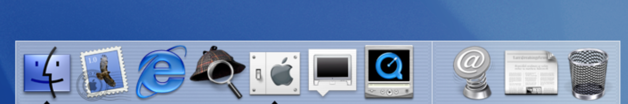
Also, yes! macOS Big Sur detached the dock for the first time. macOS Cheetah in 2001 already had this principle for its floating and irregular icons/buttons; the extended hit targets and clever hints not only solved the issue but also made it enjoyable to use.
Good catch! Yes, the gap is that small.
That’s a very good question. There are features I think would be great to have, such as the leaf moving when you hover over it, a contextual hint, given that package titles are there. Yet, we need to consider Haiku’s principles here and what would make sense for it.
If we get the blue leaf there, it would be all worth it.
Thanks again for being cool!
4 Likes
Aah, you know that’s sad, because I love the designs (but how can innovation thrive with so much resistance) Haiku community come on guys, is this how much an option is fought against ![]()
![]() .
.
I think if we learn to allow people to try things, then if there is a reason it may not work because of a missing feature in the main os, perhaps that could give a chance for them to desire to put work into areas that were untouched ![]() , just saying…
, just saying…
1 Like
This problem can be solved by adding invisible borders that only respond to mouse dragging.
3 Likes
More so than changing the defaults, in fact. Adding an option means we have to keep both versions of things working, forever.
But I toink people have already pointed out that there is an add-on system in place (here you will probably need to do both a decorator and a control look). So if someone implements that, they can distribute it on their own, and abandon it when they get tired of it. Or if it’s actually good, everyone will want to use it and it may make it into Haiku. Few of the experiments in that area over tne years went that far.
1 Like
It is breaking change, so it can’t be approved. Applications may draw something important in bottom-right corner and become unusable with B_DOCUMENT_WINDOW flag.
@Nukacal, can you provide your mockup in some vector format such as SVG?
2 Likes
Yes, totally! I have these vectorized. The only question is what would be the best way to export them. Should I keep the stroke borders and stuff like that?
But let’s figure it out.
4 Likes
What editor software is used to create it?
That would be Adobe Photoshop.
SVG or something compatible with Corel DRAW as well, basically for vector editor
Honestly I have no problem with the current UI design but that’s just me
4 Likes
Yep! SVG will be the format, but the question is how to slice it.
Should we use separate files that are square or power of 2, or have each UI part in its own file. Like header.svg, top_window.svg, sort_menu.svg, close_icon.svg, and maximize_icon.svg?