GNOME is not done until the features and usability becomes none ![]()
100%!! It’s heart breaking, unnecessary and completely counter-productive. “Yays and Nays” are fine and helpful in calculating consensus when consesus is needed. Everyone has a right to their opinion and are welcome to state it. But for an optional theme to be fought against? Its disturbing. It comes across like “The Gods Of Haiku forbid it” and thats not us…
If you’re not a fan of somebody’s pet project, there’s plenty of other stuff to do here.
EDIT: Having to change the App Server and the Haiku philosophy of “optimized defaults” is another thing, and I agree that shouldn’t be messed with without consenus and careful deliberation… And I think Nukacal would agree.
The designs look pretty good to me, however you’ll find it is a lot more easy to create a mockup than it is to create an actual implementation. Our current decorator and control look date to around 2006 so it may be time for a visual refresh. The next step would be to create a Tidy Decorator and Control look.
We have 3 examples to go from: Default, Be, and Flat available in the repository. To make this work you’ll probably want to start from the Default decorator, make a copy and alter it from there to create the Tidy decorator. This will cover the Window tab, borders, and menu borders including pop-up menus. You’ll likely run into issues with rounded corners not rendering how you expect as that feature has not been implemented on the app_server side yet. You’ll find that windows have several styles you’ll need to implement including borderless windows, menu windows, and modal windows.
Then you’ll be able to do a similar process for the control look, copy with Default one and alter it to fill in the resize control, scrollbars, pop-ups and anything else that needs to be reimplemented.
With these in place you can alter Tracker and Haiku Depot to add the breadcrumb to the status bar, create the vertical panes, set the backgrounds, etc. Put these changes up for review on Gerrit, respond to feedback on style and code quality issues.
I have doubts that anyone would be willing to go through the process of making these changes and getting them approved so that they can be included in Haiku. I enjoy the mockups and the discussion and take them for what they are: food for thought.
Hi! I really like the mockups you’ve made, they’re very much in line with what I’d also like to have in my interface ![]() .
.
There are some points that can be difficult to resolve (I know because I’ve tried), but it’s always worth having someone else give it a shot, as they might come up with different solutions that weren’t previously considered:
- Green: It’s hard to blend the gradient of the menu with the edge window, one part is handled by the decorator and the other by the control look. I haven’t been able to achieve a decent result working solely within the customization layer that Haiku provides.
- Purple: Same issue, the window border is part of the decorator, while the ends of the menu belong to the control look. As a result, it’s difficult to draw the end line of the menu within the decorator where the menu stops. What happend if the windows dont have a menu? …
- Orange: The problem here is that column headers are also buttons. So if you change the aspect to that light blue, all buttons will appear in that color.
- Blue: Since there’s no flag “should I draw this?” at the control look level, if you don’t draw anything, you’ll get an unrendered space. You could draw a rectangle in the background color for the “disabled” flag case, but even then, you wouldn’t be able to repurpose that area for anything else. The same applies to the scrollbar on the right… you could draw a rectangle using the control color.
- Brown: All of my attempts resulted in artifacts or KDLs. Maybe someone with solid Haiku knowledge can come up with a decent solution without needing compositing as discussed prev.
Pay special attention to the colors selected by the user—Haiku is extremely customizable in this regard. You should try to make any combination look good or simplify things directly within the decorator by ignoring the user’s color selections.
Be cautious with dark/light color themes—if you draw dark lines to identify controls against a dark background, they’ll be lost, and vice versa.
Get to work! and remember, the community is always there if you have questions.
Exactly! I don’t know why anyone would care about an optional theme.
If it’s hard to develop maybe we make a compromise that looks sort of like this but without all the fancy hard stuff. I wish I could help, but I’m just starting to learn C++ ![]() .
.
Maravilloso! Thank you, I really appreciate all the detailed info and how you highlighted each point so clearly. It’s really cool.
It was exciting to read, and now I have a much better understanding of what’s handled by the window decorator versus control look and the shared button libraries, like how changes such as the light blue buttons would affect other buttons system-wide.
I’m happy the interface has resonated with you and others here. The whole goal has always been to make using Haiku more enjoyable, without losing what makes it unique. I don’t like to say the word modern, but I do like what shaka444 said here.
BeOS tradition but feels modern. This fits perfectly with what I had in mind. Thanks! @shaka444
I do believe I can make adjustments to reduce some of the issues you mentioned. That said, the more I work on it, the more I feel a theme will just struggle to be maintained and might not be the best way forward.
Can we start with just rounded corners system-wide? It’s something that other projects could benefit from
IMO, there should be nothing wrong with a visual refresh, but it should not come with the expense of existing features.
I personally have a couple of iron rules that I don’t want to see touched.
- Do not reduce the available screen estate
- Do not reduce the visual clarity and the hierarchy
- Do not increase the number of clicks to do things
I don’t think these are much to ask for at all. Actually these should be the bare minimum. @Nukacal, I welcome all the efforts to improve things, but so far your proposals regress the first two bullet points. Maybe making it “Tidy” is not the way to go.
This! Microsoft made that mistake 30 years ago with the Start button in Windows 95 (and fixed it only in Windows XP), let’s not repeat it.
p.s.: if somebody is curios what we’re talking about, here’s a short video that explains it well: https://www.youtube.com/watch?v=3wbnf87dGms
I think it’s just poor implementation when dead zones are left around critical UI elements. For these, you should always have larger hit areas than what is visually shown.
That’s the case in the Mac OS dock, which has been floating for over two decades. No issues there
I don’t understand why you would want to merge those. Personally I even use yellow borders for the active window to make it stand out even more. This border not only alnows to grab the window and move it around (without having to rach for the titlebar), it also provides a visual hint of where that window ends. And overlapping windows are very important to the way some of us use Haiku (with lots and lots of windows opened, in ways that would be impossible in any other system).
Removing that would make things very frustrating to me. I don’t think the cleaner look is worth it, or tou will have to provide replacements for these functions. The visual hint could be done with a shadow, but there are technical difficulties drawing that, and it ends up using more space than the border. For the window moving/resizing, I don’t know what the alternative would be.
FWIW i never use window borders or the resize knob for either purpose, but always use the keyboard+mouse combo to move or resize the window… but that is not something I expect casual users to know how to do, for that window borders are usefull.
Exactly! removing these clear demarcations is not “tidy” it’s confusing. Where does one element end and another begin? These borders convey important information.
Dead zones like floating toolbars and such?
That’s a good question! The thing has a whole lore behind it. It is a well-established principle in human-computer interaction across apps, games, and operating systems.
It’s about using larger hit/click targets for ease of use. In game engines like Unity, these are called raycast targets, which can extend beyond the visual boundaries of a 2D button asset to make interaction accessible.

You can see here that I am nowhere near the actual button, but the interaction works just the same. I don’t think regular users even consider this. It just works for them.
Of course, it works anywhere you place the Dock

Apple took this further and introduced Dock magnification as an option with the first release of macOS X. When you hover near icons, they enlarge dynamically, effectively increasing the hit area and improving precision. It’s a very clever solution that it’s still present all these years later. I would argue, makes it easier to use than the Windows Taskbar
Honestly I’m not sure what the fuss about the deskbar is. I’m pretty sure most people would realise you can click on the empty space.
Still gives me a big smile when I see those BeOS screenshots ![]()
![]()
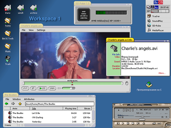
Ah Dano, we never got to realize your full potential before Be Inc. went under.
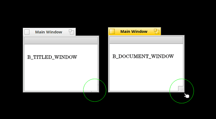
As far as usability, B_DOCUMENT_WINDOW should be standard, (IMHO)
not B_TITLED_WINDOW. Twice as fast to grab and resize a window.
Personally, I would make B_TITLED_WINDOW just a pointer to B_DOCUMENT_WINDOW to unify things.
There’s a good reason that titled window is the default and not document as the resize knob may get in the way of what you’re app is trying to do. You wouldn’t want to have a resize knob covering your game app window for example. It’s good to have both options and let the developer decide what’s best.


