I used BeOS in 2001 and was blown away by its speed, simplicity, and ease of use. Everything was coherent and enjoyable to use.
I’ve been following the Beta’s progress through the years, and during my summer holidays, took some time to reconnect with this lovely OS. I wish I could drive it daily, but many of the apps I need are still out of reach for now.
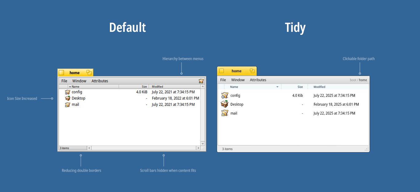
I wondered if the interface could use a bit more streamlining and decluttering. I took the liberty of softening the edges (though that might not be necessary) and adjusted the icon sizes in the Tracker so that the beautiful icons are more readable on a 4K screen, among other things.
I’ve also considered redesigning HaikuDepot along similar lines, with a bit more visual impact to highlight the great work that’s gone into bringing apps to Haiku.
This isn’t meant to replace the default interface. If it makes sense, it could be an option. I don’t want to mess with anyone’s nostalgia or attachment to the system
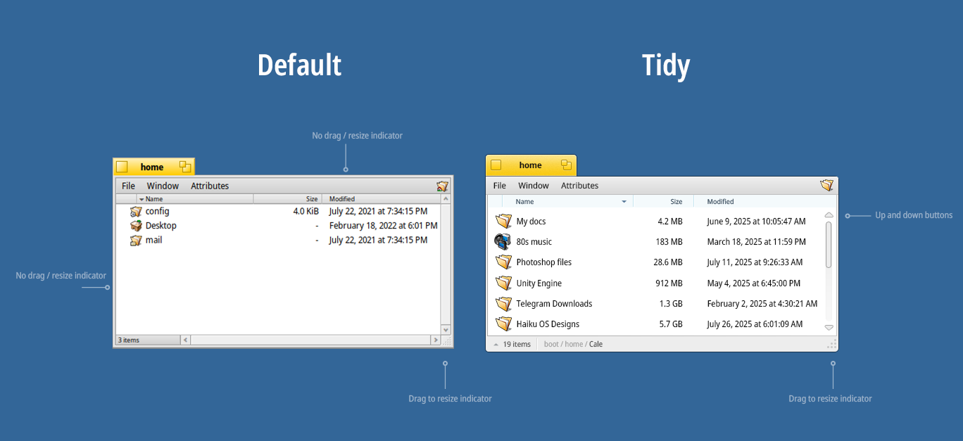
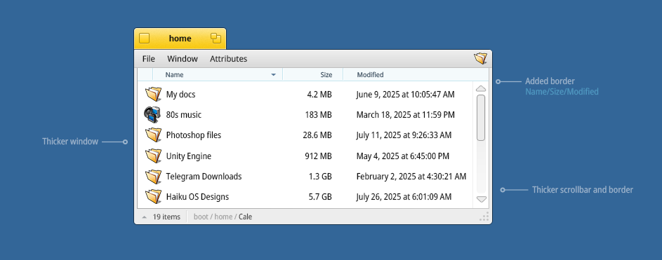
The borders around the window are intentionally thick to allow easy grabbing to move and resize the window.
You already have easy access to parent folders by clicking the statusbar at the bottom of the window. On the other hand, you removed the folder icon at the top right that allows to drag and drop the folder and move it elsewhere. Also if you hide the horizontal scrollbar, that statusline is now just empty space that can’t really be used for something else.
The list mode is intended to provide a very high density display. If you make the icons big, you lose that.
I guess I am very used to the current UI, whicheis intentionally very compact and “verbose” (a lot of small details, but they all have a reason to be here). I think the “cleaner” look alwnys goes with losing some of these functions.
Overall I like it, fewer lines and gradients makes the window look more sleek and modern. We could go with slightly larger icons and a bit more spacing between files, it is quite compact right now.
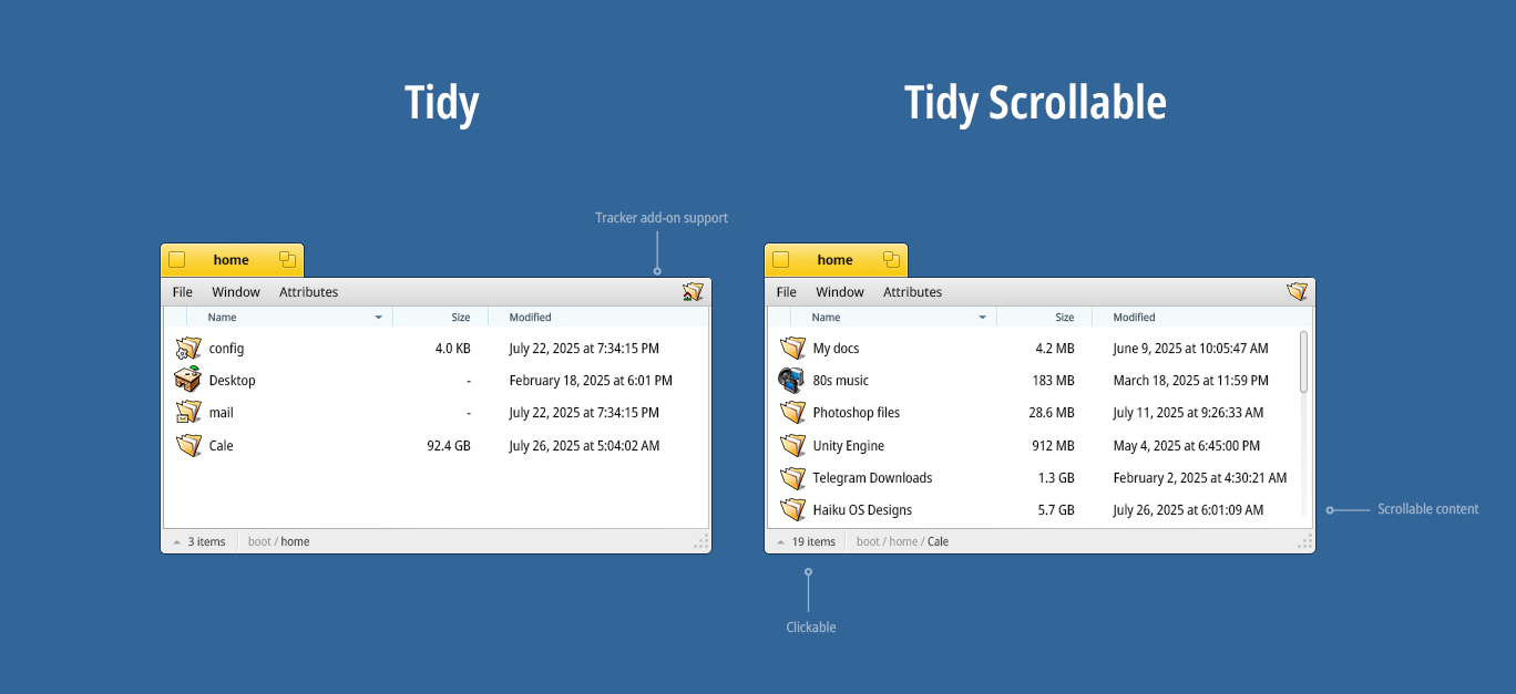
That said there’s a couple of problems with your design. We support Tracker Add-ons that expand the menu options which will eventually cause it to run into the breadcrumb, although we could probably get around that. The little icon on the right hand side is draggable, I suppose we could change how that works. The “3 items” doesn’t look like a menu. Then again it doesn’t look much like one now, we could use a little down arrow to indicate it’s a pop-up. How do you expect scroll bars to work, are they supposed to appear when the view is scrollable?
I’m glad! It’s been fun to work on this, and you guys are raising valid points. I’ve tried to incorporate the feedback by moving the breadcrumb and making the “items count” button more clickable. So we solve the Tracker Add-ons issue, and it makes sense to place the breadcrumb alongside it, so they both feel connected.
The scrollbar would appear automatically when the content doesn’t fit the window. I’m not sure if the up/down buttons are necessary, since you can drag the scrollbar or just use the mouse wheel. But if needed, we could always bring them back
I would strongly prefer keeping the scrollbars as they are now. There are a lot of ways you can use them: dragging the knob to rapidly go somewhere, clicking above or below the knob to scroll bt a page, clicking the button to scroll slowly, and of course the mouse wheel.
Even if all of these are not used often, the GUI elements are scaled accordingly (the tiny buttons for the feature you use the more rarely), and it’s very annoying when an app decides to do away with some of these features (for example implementing an instant jump when you click anywhere in the scrollbar, instead of the normal page up/down behavior).
It’s similar for the window borders: in UI design language, these provide “affordances”: hinting that there is something you can interact with there. If you have been using computers for a long time, maybe you don’t need these affordances, because you know your way around. You can pretty reliably guess when something is movable, resizable, or scrollable. But people who have not used a computer before, not so much. And so, it seems important to dedicate a few pixels to that, at the cost of a slightly busier interface.
The disabled scrollbar is also in the same category: it tells you that this particular view is not currently scrollable, but could become scrollable if you add more things to it or resize it. This is different from something without scrollbars. When looking at Tracker on its own, it may not seem an important distinction, but that keeps Tracker consistent with other places, where the distinction between a scrollable list where you can add/remove things, and a fixed one with just a few choices, may matter a bit more.
Regarding the breadcrumb, for one there is a window navigator option, with it enabled this would look busier than the default. One could also imagine having this in the window title instead
Thanks, that’s a fair point. Having the scrollbar buttons covers a wide range of use cases, which is why I wasn’t sure about removing them. I placed the scrollbar inside the content list to make it feel more visually integrated, without compromising functionality.
Regarding borders and resizing, I see the value in visual affordances. My thinking was that power users would likely discover that you can still resize by dragging any edge or corner, even without a visible cue in the window itself, but in the cursor (double arrow cursor), just as it is right now, by hovering over the edges.
But for newcomers, the bottom-right corner still signals that the window can be resized. That way, the full functionality is still there, just a bit more subtle
The reasons for keeping the scroll bar as is are already well explained.
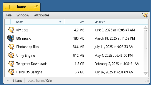
I would add that the color scheme is sadly approaching the bad style we see everywhere nowadays, with , for example, the titles for the column names in list view almost not showing the separator between them. Hard to find whre to click to resize the column. Also, with too thin borders, one has a hard time knowing where to click when some windows’ are over others.
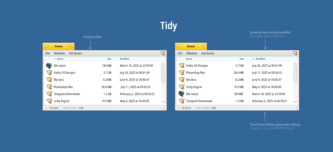
Looking at this, the time format seems wierd to me. Why isn’t the time and date a seperate column? It would make more sense to me (also without that wierd am/pm stuff)
I think Tracker should honor whatever the date time preferences are. Folks in the U.S. (like myself) are use to the AM/PM indicator. I obviously can manage 24 hour time, but still prefer the AM/PM for myself.
Sorting depends on which column you select. Here I’ve sorted by name first, then by modified date. I totally agree that it should follow the system’s date preferences.
I use 24-hour on all my devices, but the OS should take care of that setting
If it is possible, divide the cell in two parts (date part aligned to the left, time part aligned to the right) but it it needs to be seen as a single thing. Otherwise, you wouldn’t be able to sort by full timestamp, only by date or by time.
If dividing cell is not possible, an alignment to the right would already make it look better.
Please do not increase the paddings. Haiku is not a mobile-oriented operating system, and click targets are pretty-much sufficient. There is no need to increase the list view icon sizes as well.
There is no reason to make a change just for the sake of making a change. Do airplane interface designers change the fonts and the paddings on their fuel displays with every iteration?