This would mean you can sort by date (ignoring the time) or by time of day (ignoring the date), which seems a bit strange to me. We can improve the alignment of the text inside the column, but I don’t think two columns would be a great choice here?
6 Likes
Some people believe that more padding looks nicer. I am not one of those people, however I know many people who are.
It would be nice to have an option to increase the icon size and list view item spacing. We could for example have a submenu on List View with options for Mini or Large icons… again.
Airplane designers certainly do change the seat spacing every iteration!
4 Likes
I understand this might never be implemented, and I think both the reasons for keeping things as they are (default) and the case for the optional change (tidy) have been well explained.
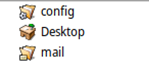
You can tell by the Mail folder envelope icon being barely visible:
In any case, padding should really be a setting, and users should be able to adjust it to their liking. (If there is one, I couldn’t find it)
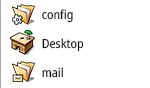
In this example, the increased padding makes the icons larger, more readable, and less cramped. It’s not change for change’s sake; it’s about streamlining and improving visibility for all the information, as we discussed and collaborated on above with the rest of the changes
6 Likes
That’s really great! I got a good chuckle out of the seat spacing in each iteration ![]()
3 Likes
Exactly! I find myself using Magnify just to see the icons!
The primary differentiator here is the label, not the icon.
[quote="jscipione, post:23, topic:16988”]
It would be nice to have an option to increase the icon size and list view item spacing.
[/quote]
It would be nice to have an icon size setting (if there is not one yet). Item spacing? I really cannot see the point, we are not trying to make it more tappable.
[quote="Nukacal, post:24, topic:16988”]
it’s about streamlining and improving visibility for all the information, as we discussed and collaborated on above with the rest of the changes
[/quote]
I hear this justification quite a lot with each new horrible UI design among various mediums, and it feels like we were displaying a lot more information with those low-resolution screens in the past, than we are doing now with our UHD monitors.
1 Like
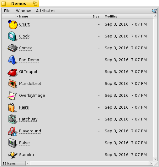
This was implemented in 2016, but the feature was reverted: Here’s what it would have looked like:
1 Like
Why was it reverted?
That’s really nice! Any reason why it was reverted?
If there would be an option to increase line spacing / padding while also making the icons respond by getting bigger, then that solves it for me; and keeps things small and close together for anyone who prefers it that way
1 Like
From hrev52496:
“This also removes the mini/large icon mode for list views; it’s now simply always matching your font size.”
2 Likes
Borders, depending on the look and feel, from my point of view should have a minimum base thickness and a maximum base thickness, so that there is a certain dynamism between themes, right?
Re: icon sizes
Removing icon size preference also removes the need for big, beautiful HVIF vector-formatted icons! This totally needs to be reintroduced! There should be at least 5 sizes, if not absolute pixel-size selection as used in the Tracker toolbar preferences!
1 Like
We still have icon sizes, just not for the list mode, there the icon matches the font size. Really for that part there is nothing much to be done.
2 Likes
Since haiku is themeable, you can make this a Tidy theme. I think it has some very nice elements.
3 Likes
What about horizonal scroll bar? Windows will be probabbly more populated
I like Tracker, and I’d love to see this implemented as an option. There are a few features I’d personally love to see added alongside it, (not many) though I’m not sure if themes alone could support them:
- Icon size options for list view
- Padding adjustments
- Scrollbar visibility: Always / Auto
I’m a game designer, so I’d definitely need a programmer’s help to take it further. I enjoyed the collaboration here and happy to keep going
Things that only affect the rendering or visual look are possible with the decorator and controllook api, a more glossy controllool could be cool.
I started one but my ideas are more in the direction of macos aqua.
Stuff like autohide/non-visible scrollbars is almost impossible without support in intrerface kit and the many apps that still hardcode scrollbar margins… and even then Haiku has little interest in that, that’s one area we are stuborn in. We want the scrollbar to stay and always be visible.
Padding is possible via the controllook api aswell in some instances, icon sizes in list view is not (but I also fail to see why you don’t just increase your font sizr, it does the same thing…)
If you want some more concrete back and forth pointers feel free to hop onto irc #haiku on oftc. ![]()
3 Likes
One detail in your design that probably can’t be implemented is that the menu bar ignores the window border, since that would mean that either the window now has to draw the window border (which would involve major changes to applications) or that the decorator gets the info about the menu bar, which would require some way of communicating this information, which currently does not exist (apart from if the window is focused or not there is no context about the window that is inside the decorator passed to the rendering routines)
1 Like