There is actually an API to set a “main” menu bar in BWindow. I think it does nothing currently, but could be used for that (or top-of-the-screen menus like in mac os)?
Regarding that, if a menu is constructed with the layout kit, can this work with a global like menu? I think explicitly sized menus that position the below view differently probably can’t?
Edit: I’ll probably start making the docs for the layout kit menus if that is the case, since I would really like a global menu ![]()
3 Likes
The “Modified” and similar time attributes are displayed in a format that depends on the available width of the attribute column. “Februar” is sufficiantly narrow to fit, while “September” is too wide and the date format falls back to one that fits.
Personally, I’d appreciate if the column width adjusted to the short “DD.MM.YYY, HH:MM” format when double-clicking the column divider. Currently it resizes to the long format.
Perhaps, performing a check to see in which format the longest date would be displayed with that column width, then imposing that format to all timestamps, would make the column consistent.
1 Like
This is how it was done before localization, someone had checked the longest possible date in each format in English. But, to do it for all languages, you have to do something more dynamic. Either check all possible dates and times at start of Tracker, or check everything in a directory when it is opened (this can take some time if the directory has a lot of files).
So, yes, it makes sense that all dates should use the same format, but it turns out determining the best format may not be so simple.
Even if there isn’t a perfect solution, it should be possible to do much better than what we have now, wich is deciding fully independendtly for each file (we start with the largest format and try smaller ones until finding one that fits).
But you can easily fix it for yourself by making the column larger or smaller ![]()
I’ll love having a user-friendly relative time format feature in tracker.
One that will not display the absolute time as a text, but instead a relative time like, in english, “3 weeks ago”, “1min30 ago”.
Could be useful for email queries windows, for instance.
Or any folder on which the average content *freshness" mater more than the exact time values.
To put briefly: a relative (to current time) time formatting option.
No change to sorting, as ascending and descending by value still make sense here.
1 Like
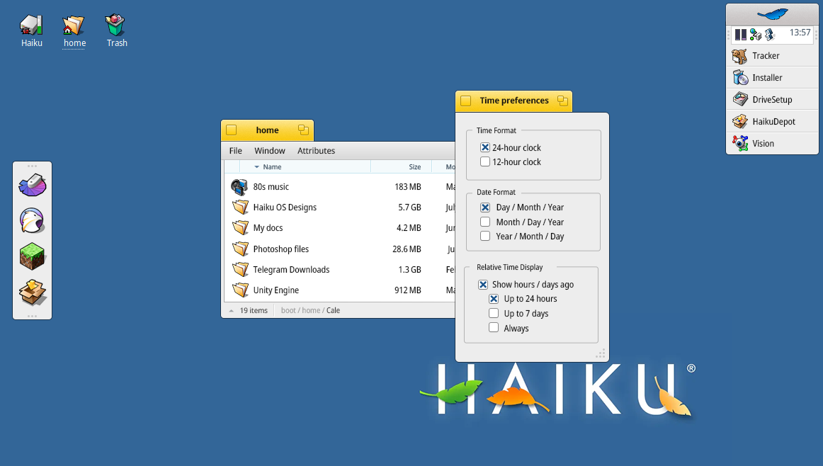
This is what I had in mind for time preferences. It could be available via Tracker and/or handled at the system-wide level
The date format could offer another option like numbers only or spelled-out months
8 Likes
Just configure your locale preferences correctly, we already have a setting there and we don’t want to have it in severall places.
That looks great… And it finally has a “Leaf” that isn’t cut off!
3 Likes
This is an objective regression in usability and focuses on visual fluff more than actually making things any more usable. It inflates the size of the titlebar for no reason, eliminates visual elements that provide clear demarcations of functionality, like borders, scrollbars, etc. and chases trends, rather than taking the time to understand what works for UX starting from first principles. Like why have the window menu and dock detached from the side of the screen? What usability problems does that actually solve? By hiding things like the window border, you’re not getting the UI out of the way, you’re putting it in the way by making it that much more difficult to use.
One of the major things about the Haiku experience that makes it so great is how it hasn’t adopted these backwards-facing UI trends that have damaged desktop usability over the past 10+ years. As it is, Haiku feels like a leap forward compared to most modern desktops and we should keep it that way.
5 Likes
I disagree but you’re free to have that opinion.
1 Like
Thank you! The leaf cutting off feels odd to me; nothing else in the OS experience has that approach*
It reduces the feel of a clickable button, too.
Edit: I wanted to edit, and the delete button is easy to click on mobile for this forum. I deleted/undo this twice and then just kept toggling to see how it worked ![]()
Summary of Changes So Far
Goals
- Streamline and declutter the experience
- Keep existing functionality while introducing new user options
- Tidy experience is optional
User-Facing Options
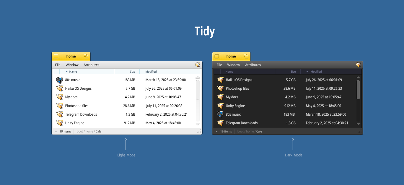
- List View Icon Size (Tracker): Adjusts icon size and indirectly influences padding and spacing.
- Padding (Tracker): Tunes the spacing between elements for a clear or more compact layout.
- Scrollbar visibility Toggle: Always visible / Auto (only when content overflows)
- Time preferences:
- 12h / 24h clock format
- Date format (e.g, DD/MM/YY or month name)
- Relative time display (e.g, “Modified 2 days ago”)
Here we have
Tracker: Updated with clearer affordances, icon scaling, and layout addressing some feedback. And Dark mode for good measure.
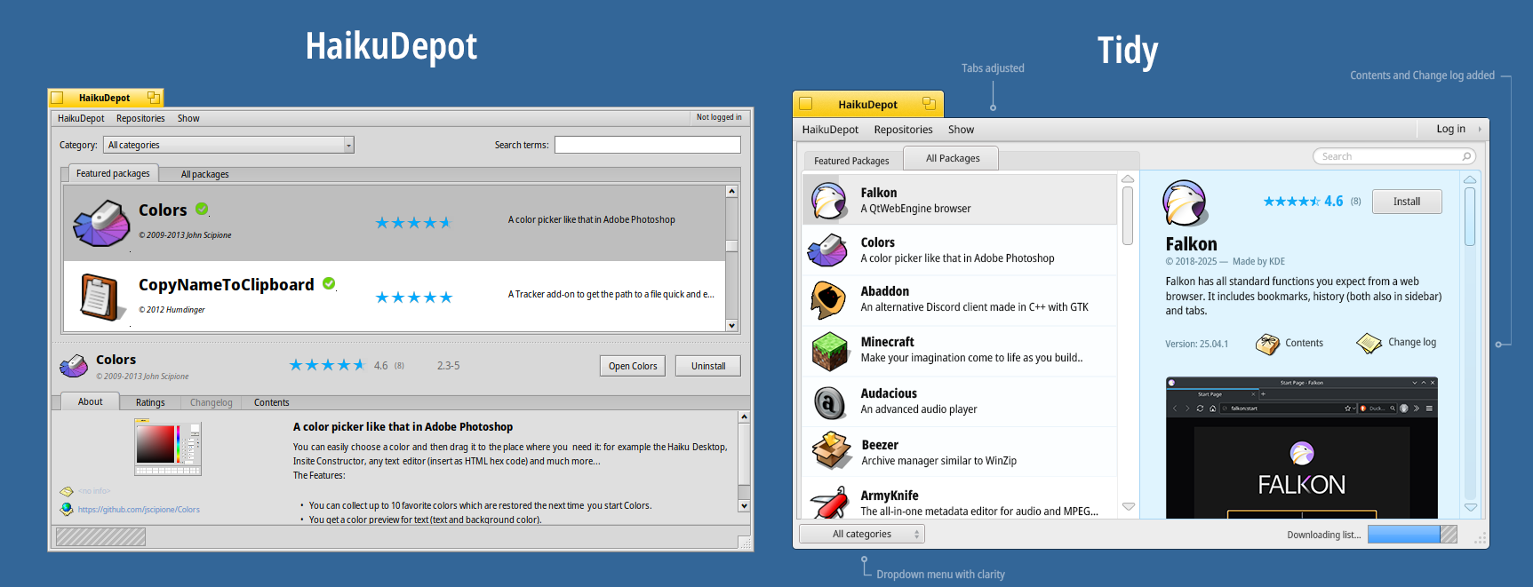
HaikuDepot : More visual hierarchy, more apps to view and compare, clear focus on the app’s offerings and keeping all the functionality
There are a few adjustments for the Deskbar to match the rest of the changes, including a full leaf icon to make it feel more like a button
6 Likes
Can’t wrap my head around this, call me old-fashion, gives me some Gnome vibes that I’m not in favor of. My 2 cents.
7 Likes
Core devs, please correct me if I’m wrong, but AFAIK, we can’t have rounded window corners/window tabs until we have window compositing (which I’m desperately waiting for to get my HiQDock working as it should, which by the way is compiling and running with a few major (new) bugs on Qt6.7 ![]() ): How to transform the app_server code to use compositing | Haiku Project - #26 by PulkoMandy
): How to transform the app_server code to use compositing | Haiku Project - #26 by PulkoMandy
2 Likes
This may need some app_server changes, but I don’t think it would need full compositing. Especially if it’s done at the window decorator level.
But it will surely make things quite a bit more complex (and slower) especially if the round corners need antialiasing?
That’s exactly what motivated my position. GNOME is a MAJOR leap backwards in terms of usability.
5 Likes
I appreciate you taking the time to voice your concerns. I’d like to respond to a few of your points and hopefully clarify the thinking behind this.
First off, Haiku’s UI is clean and purposeful, but it’s not entirely free of bloat, as evidenced by the HaikuDepot. Yet, Haiku’s principles are good and are one of the things that drew me to it in the first place. I’m not trying to erase that, quite the opposite. My goal is to preserve its strengths while providing a clearer hierarchy to the elements (you know things that guide your eyes to notice first and second)
In a word, Tidy aims to provide flexibility.
On visual clarity and usability:
The intent isn’t to remove affordances or reduce clarity, but rather to give users the option to adjust specific parameters such as icon size, padding, and even border behaviour. The only significant change would be to remove the border from the top part, as it contains the menu and yellow title bar. You still get the functionality, but there’s no additional indicator on top of the existing one.
The borders are still present and usable on three sides, with the top using the titlebar itself to maintain clean lines while retaining functionality.
On inflated titlebars and visual fluff:
The titlebar size was adjusted in part to accommodate pointers and accessibility. However, I’ve had to click multiple times to grab it on my machine. Do you want smaller padding for the yellow titlebar? Sure, another possible configuration.
Ideally, this would be optional , not imposed.
On UX fundamentals:
I’m not chasing trends for their own sake. Some of the inspiration came from studying timeless designs like NeXT, BeOS itself, and early macOS systems that valued clarity and directness. I’m also trying to back changes with user-facing benefits: for example, cleaner separation between active and background windows, better contrast in UI elements, or modern conveniences like optional relative timestamps and time format controls.
Regarding the Dock and window menus:
Some people prefer detached elements, such as Mac OS and its Timeline Dock. Others prefer everything to be locked down. That’s precisely why I think having options could be the best path forward and not a redesign that forces anyone’s hand.
Finally:
The last thing I want is to diminish what makes Haiku special. I’m a game and Game Designer with a background in systems design, and I’m sharing ideas in good faith, not to chase trends, but to contribute where I can. I respect the care that’s gone into the OS and the community around it, and I’m always open to constructive feedback, as you have seen my responses to others and making changes when it makes sense.
Lastly, I’d appreciate a more constructive tone. It’s important to foster open discussion by asking questions first, rather than jumping to conclusions. This is a volunteer-based effort; a demanding or harsh tone discourages participation and sharing thoughts.
Again, this wall of text is not to discourage you; on the contrary, it’s to showcase where I am coming from.
Cheers, and let’s have a cool day!
7 Likes
I can totally see this as an optional theme, but not as default
3 Likes
You don’t need window compositing, non-rectangular windows (shape based) would be sufficient. Though this is more complicated to calculate in parts, but not too much.
1 Like