I got the impression from your earlier comments that in order to support very old hardware you were making compromises that could effect new hardware.
If I misunderstood, and it’s not the case, that’s great.
I am one of those who likes to play with old equipment, but Haiku must support the latest kit or it will surely die.
Sure, send it over!
Okay ![]()
I will start developing one to send you :3
Resurrecting the old thread, as we have migrated to Trac 1.6 but we still keep the custom small font size in the haiku.css:
/* Revert some things to their (better) pre-Trac 1.3 appearance. -waddlesplash */
body, th, tr {
    font: normal 13px Verdana,Arial,'Bitstream Vera Sans',Helvetica,sans-serif;
}
Is there a chance that line can be removed?
Yes, but I don’t understand where this file comes from. It does not seem to be in the infrastructure repository nor in the Trac git mirror.
There’s @waddlesplash name in that comment, maybe he remembers where the file resides?
I haven’t heard too many complains about the font size besides yours (if any.) I personally like the font size as it is. What’s the problem with just increasing the zoom in your browser? Even WebPositive supports this properly, so it shouldn’t be an issue.
trac is also broken in the filtering of tickets
Each time I add a new filtering option to the form, it makes the request but modifies the status to only show reopened tickets, but why??? I never asked for that. Or else, it hides all columns other than ticket name and a second one like milestone.
I‘d had developed the start of a new (derived) theme to fix some of those issues (like font size, adaptability to screen size, and color), but it was reverted since some developers didn‘t like that. And I just don‘t have the ressources to set up some huge focus testing instance to develop this instead of developing with feedback directly. So it stays broken like it is shrug
I’m not trying to flex any design knowledge or anything like that, but zoom shouldn’t be an excuse for plain bad design. It’s a clear issue and zoom only is good for destroying compositions. The typography makes the site look amateurish and outdated. Not that it’s that big of an issue nor that your statement is false, but it just doesn’t away the mentioned facts above.
Please do it anyways, but implement it as an optional opt-in theme, so it can be tested and improved, while the conservative users or devs keep using the current broken theme.
What’s wrong with the typography, exactly? Haiku also looks “outdated” according to many people, because we don’t have a “flat” look by default like most other OSes and DEs have switched to. I don’t see how it looks “amateurish” either.
I’m on HiDPI, so there are all sorts of sites that I use a non-default zoom level on, and things generally look fine. (The Haiku Trac instance isn’t one of them; I use the default zoom level there.)
I’m sure you do, otherwise you wouldn’t have overridden the default value ![]()
May I ask, do you also like the font size here on the forum, or do you find it too big?
You can reread this whole thread and see other people saying that increasing the font size would make it look better (like here, and here, and here).
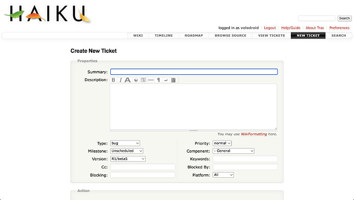
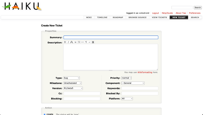
That’s a workaround, not a perfect one since it proportionally increases the other elements like Haiku logo too, but it definitely makes things better. 125% zoom (image on the left) brings the result quite close to the default Trac font size (image on the right), just the default Tract 1.6 text style is a bit better (field names are in bold).
But then there’s a question, if the default Trac font size makes things more readable for people with larger screen resolutions (and also removes a bunch of that silly empty space on the left and right of the content), then shouldn’t it be used by default for those resolutions instead of proposing the users the zoom workaround?
That’s a bummer, do you have any screenshots saved of how it would look like?
+1
Like I said, it’s not that bad, but diversifying fonts to certain elements and making use of the big empty space goes a long way. Aswell as making the text a little bigger, which is fittable if the big empty space actually gets used. The use of red also is redundant since it signifies links, but the white buttons on the nav bar also does, and the ticket titles also are red; It’s just incosistent. I can go on but that’s pointless. I’m not saying that Haiku’s tracker should look like that of Trac because that site is just ugly. Or go for a metro look to apeal to modern standars, but just be consistent and make use of blank space. It also is horrendous on mobile devices but so is https://haiku-os.org.
The value I’ve added in the override is actually what Trac’s own default used to be. You can check in the Wayback Machine to see that this is the case. I was just annoyed at how large the fonts were after a Trac upgrade, and put things back to the way it was before.
I generally don’t maximize my web browsers, at least on widescreen/HiDPI displays. So there’s not nearly as much “big empty space” for me, at least; and neither would there be on users on laptops or phones. (Isn’t this a problem on all websites, not just Trac, though?)
Trac doesn’t support mobile devices properly, but haiku-os.org should. What’s wrong with the mobile layout there?
No need, you wrote the reason in the CSS comment. In any case, Trac has changed the default font size long time ago, and we’ve been overriding it as we upgrade through the Trac versions.
Can you tell how you like the font size here on the forum?
It does look bad on laptops with HiDPI/Retina display, my initial message in this topic has the screenshots.
Nothing substensial with https://haiku-os.org, just missing padding and elements out of their container. On another note, why doesn’t it use vector icons more. They aren’t always appropiateon, but big front page items I would say would be improved by using them. Use of raster is awfully obvious on mobile.
I don’t think it’s too large, if that’s what you’re asking. But the forum and Trac are different sites with different designs and purposes, so I don’t think they need to have identical sizes. Trac’s font size is the same as that on most online code browsers; I suppose the two are associated in my mind.
Yet most of the time Trac issues are about the discussion between people and not about code browsing (and the code blocks could use a smaller font size indeed). But I understand this can be a matter of taste, especially if you’ve been used to it for many years.
I’d love to see @nephele’s theme implemented and have it as an optional theme in Trac’s profile. Does Trac support theme per user selection?

