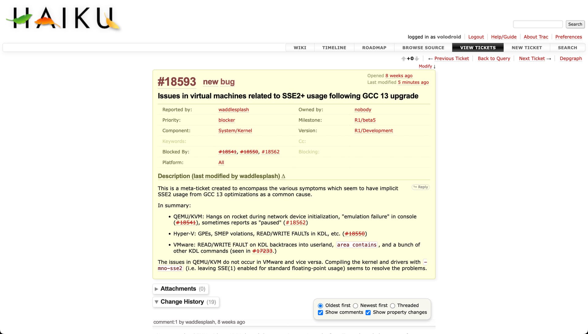
I always struggle to read issue details on the Haiku Trac site. The font is too small for comfortable reading, so I have to zoom it in to 125%. I also wondered why there’s so much unused blank space to the left and right. But I thought “it’s Trac, an old issue tracking system, it was probably never updated to be readable on modern screens”.
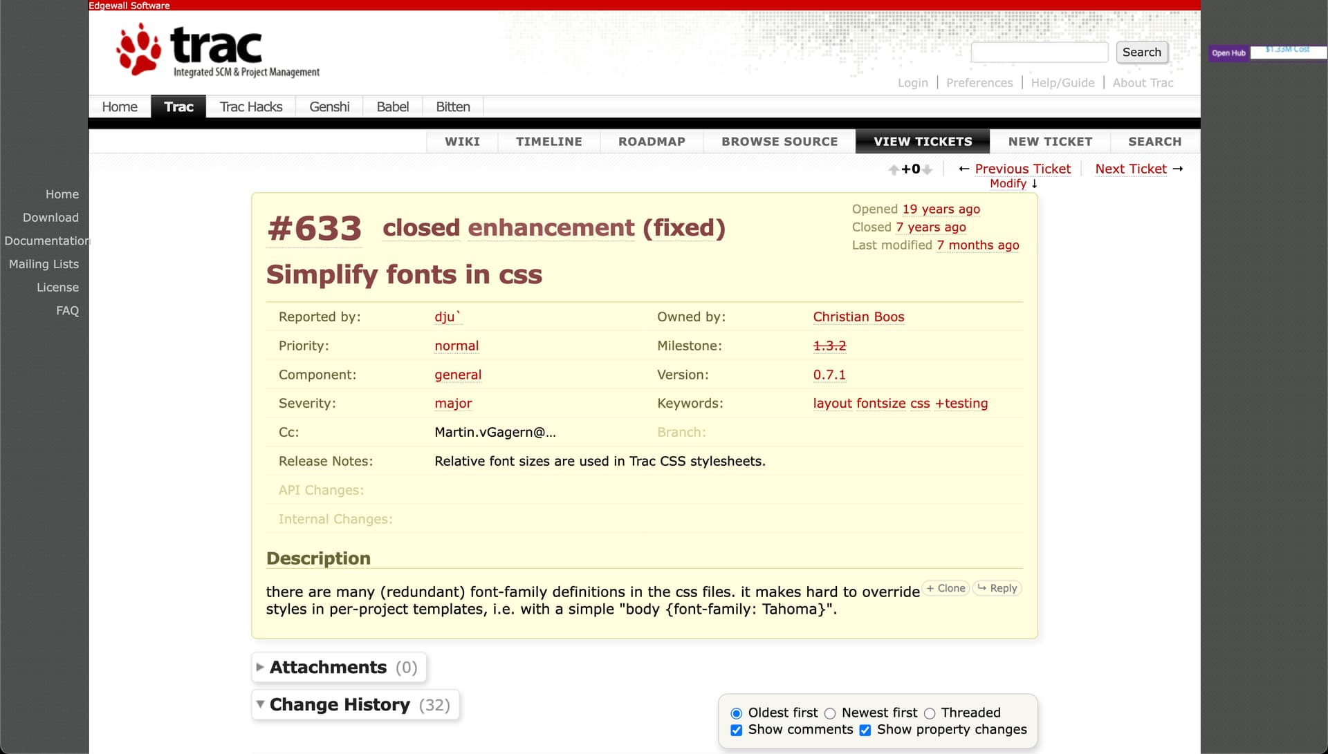
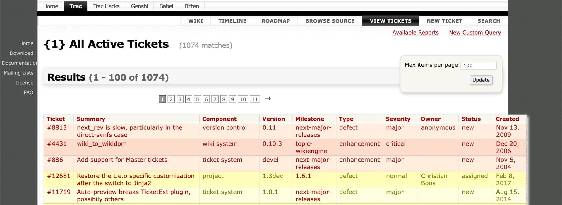
Until I actually visited Trac’s own site today. Whoa! It looks so much better: bigger comments font size (16px Roboto vs 13px Verdana we have), grey margins on left and right form better UI structure and keep the menu and the search field on top properly aligned.
There’re some minor things I’d like to change, like the big header Trac uses for the issue number (IMHO that’s not an important information at all, no need to shout it out at me, but it’s their vision of the UX so that’s fine), but overall to me their Trac site looks much more usable and readable than ours.
The gray margins seem more like an odditiy since they want to add their links to the left.
I agree that the css can be improved for trac, I actually wanted to work on this myself soonish (in the same general area as dark mode, also bringing the colors in line with other Haiku web presences)
Do you think having a top-row like trac is a good idea to combine Haikus sites? currently this seems quite difficult, discourse would be difficult to theme this way, gerrit would too.
The userguide and dev guide and main page would be doable.
Other than that I’m not sure what is ment with better menu structure.
Increasing the font size somewhat would likely be good indeed.
I’m not convinced it is. Overall I’m not a big fan of having multiple navigation menus stacked on top of each other on the same page. In that aspect Trac’s site is quite bad, as they somehow managed to put 4 horizontal menus there (we just have 3 and I see no reason we should make it worse). Vertical menu on the left can be quite useful if they keep it visible during scrolling. But it’s also okay to not have it at all. Another option would be to make the Wiki | Timeline | … menu sticky at the top of the screen once the user starts scrolling the content, but I’m not sure we can easily achieve it without tweaking the Trac code, and if we want to maintain the made changes afterwards. Ticket navigation menu doesn’t look good on both sites, but that’s a minor thing and can be addressed later (if it can be addressed at all).
By “better UI structure” (not “better menu structure”) I mainly meant two things:
There’s no more feeling we’re wasting 50% of the screen for nothing (even though if you count, 40% of the screen width is still unused, but I’m talking about the visual perception here: on our site the content is just lost in the middle of those big white spaces to the left and right). Saying that, Trac must have done the grey areas symmetric, and not like they’re now. They also have a ticket list broken, which is a shame:
Their main menu section Wiki | Timeline | … | Search doesn’t look so detached from the main content as our does. On our side it’s just aligned to the right and lost there. In both cases I have a mixed feeling about it being right aligned, as I’d usually expect the main menu to start from the left as it has been used for decades in the OSes and apps (and then the menu row could have embedded the search field on the right), but that’s a separate topic.
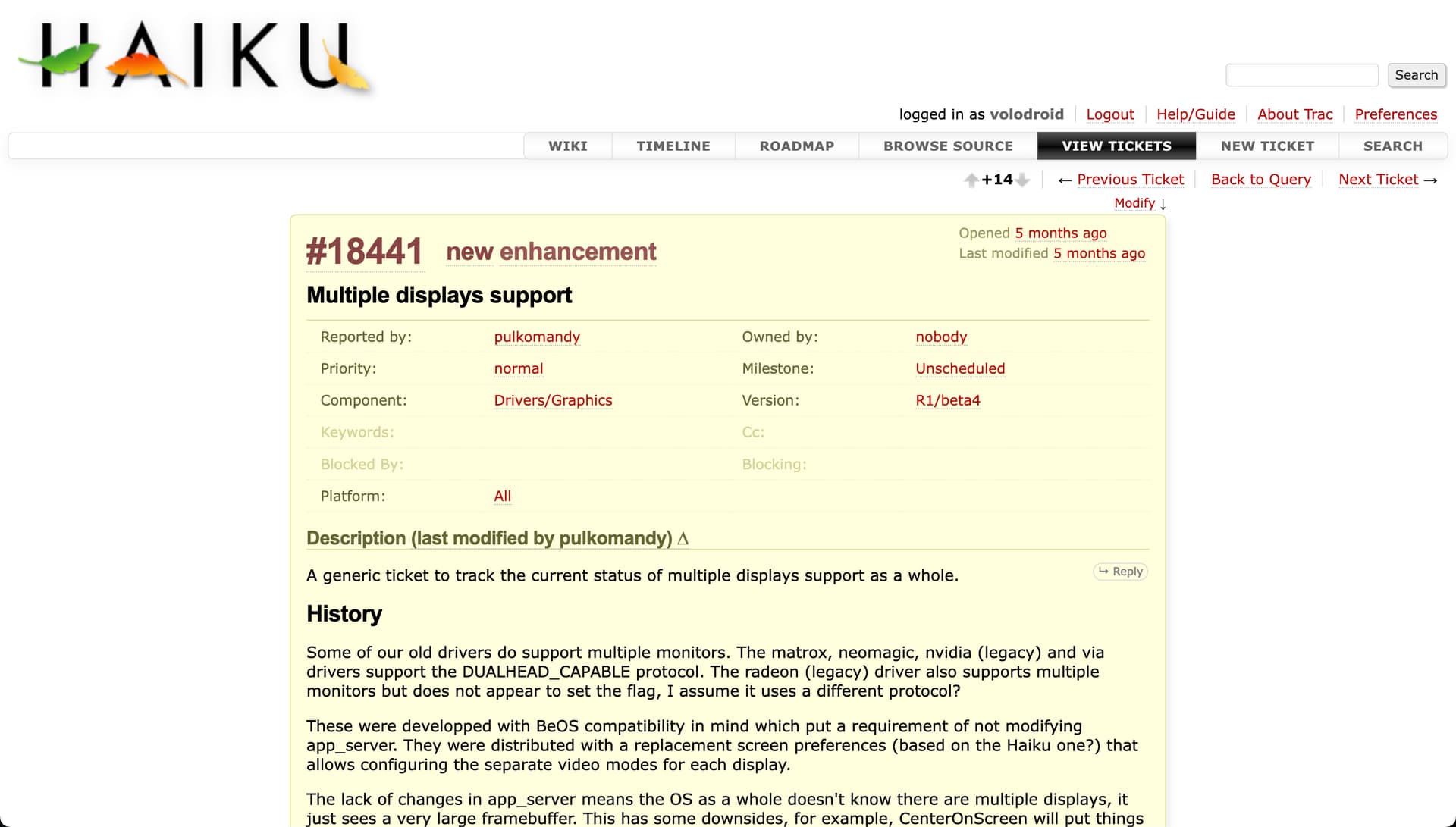
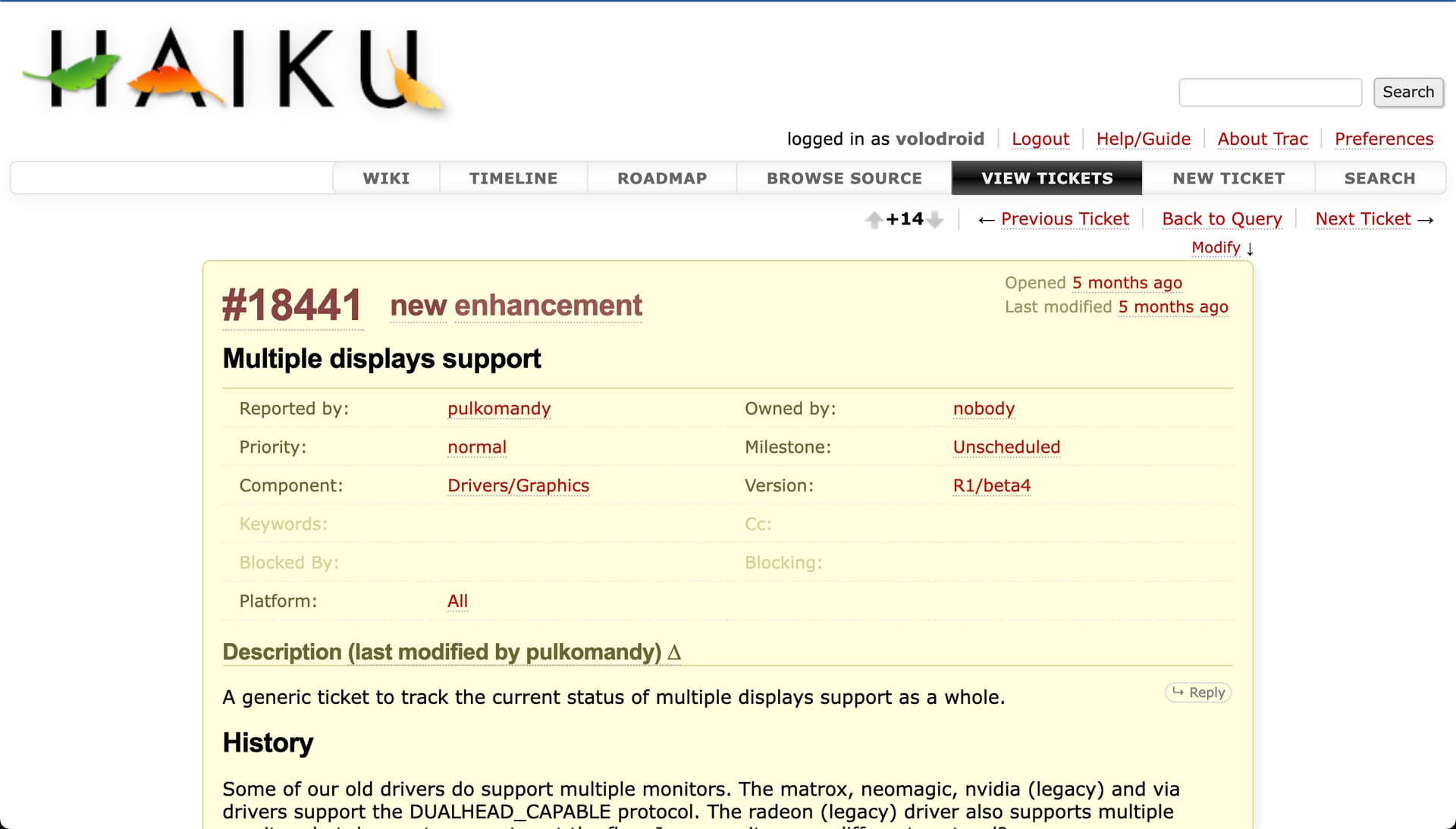
To sum it up, at the moment I find our Trac site comfortable to work with if I zoom it in to either 125% or 150% (screenshots below), but I have a Retina screen, and it’d be good to hear (and see) how other people deal with the small fonts.
Almost everyone has Hi-DPI displays by now, and some Haiku design cues are from a time when DPI wasn’t that high. A laptop 720p screen felt humongous in the 2000s but nowadays it’s kinda cramped for current OSes.
I reckon the Trac theme follows the same criteria, and since devs use it daily they’re accustomed and don’t see any problem. But for new contributors, I agree the bugtracker looks clunky (intimidating, even) and might benefit from a UI revamp.
Slightly offtopic but related… This is something I do on EVERY Haiku installation otherwise I’d need a magnifier
a) enlarge desktop icons size (usually 48x48)
b) enlarge UI fonts slightly (personally I set 14pt or more)
Agreed with the font sizes, at the very least they need to change. Even on a 1080p screen, they’re rather tiny. Maybe increasing by around two points or so might be enough.
Could be, some parts are nicer for “responsiveness” although stuff like the ticket list works badly on mobile and requires me to zoom out, while I can use our normal trac instance just fine with just using 300% zoom
(Custom Query – GrafX2)
edit: that specific page also works badly on our current trac, so maybe not that different after all.
In addition this needs javascript to function, the hamburger menu breaks without it.
our trac looks to work correctly without javascript and I’d like to preserve that. (and I need to make parts of the userguide responsive too, do practice wouldn’t hurt)
Discourse also needs js… though that sadly seems like a lost fight : /
I have a couple of early eee PCs, with the 800x480 screen. They are fun, but I can’t believe anybody uses them for serious work. Whether or not Victroniko was correct in saying that almost everybody uses hi-dpi screens by now, I should certainly expect almost everybody to be using at least 1024x768.
Should Haiku impair the user experience of the vast majority for the sake of a handful of hobbyists, most of whom I suspect would have another computer with a larger screen for doing actual work?
I don’t know, but I am quite sure that Jeremy Bentham would not have approved.
Oh, I mean, since you use a Retina screen, maybe the default resolutions are a little “little” to the size, like 2000x1000 in a 13" screen.
Just for comparision, here with 19" or 22" “normal” screens, the font size seems good. But maybe a 2 pt increase would improve it to a lot of people, so why not ?
Also, have you tried changing that number in the css just as a test ?
I could’ve worded that better. I meant that modern systems don’t come with such tiny screens anymore. And I agree with you, most people who have such hardware also has another system for “serious” work.
Supporting lecagy systems is good, but IMHO not so much when it prevents better out-of-the-box usability for modern systems. And as graphically customizable as Haiku is, people usually sticks with the initial impression and seldom bother to personalize the UI (this is clearly shown in the myriad of YouTube reviews about Haiku).
Alas, I didn’t intend to derail the thread so mods can split this dialogue to another thread if needed
I have a 14" MacBook with 1512x982 Retina screen, but on an older MacBook Pro 15" (2015) with 1440x900 Retina the text also looks too small. If I change it by 3 points to 16px it looks perfect to my eyes. The font-family used is Verdana (I don’t have Roboto installed on my desktop machines). FWIW, here in Discourse the effective font-size is either 15px or 16px depending on a screen, and the font-family is Arial, with the line-height of 1.4 which also helps with reading.
We have a lot more actual users, who ran Haiku for several years, than people who just ran it for a few hours (if at all) to make a video about it. So thatws not a valid way to do an user study. Go and have a look at the “post your haiku screenshot” thread in this forum, or at any screenshot shared here.
You can find dark mode with the default look, the flat look, both at the same time, everything tinted blue, subtle changes like yellow borders for the active window, different fonts, … and of course the font size is adjusted (this happens automatically on high-dpi screens now, a larger ui size is used by default)
No, but there’s no reason to impair the user experience. On full HD screens, I’m happy with the default size, it feels my display is much larger than when using other OS and I can keep so much more data available. On larger resolutions, the GUI scales up (this is not perfect yet, but it’s improving). We can have support for both rather easily.
@nielx can this file be tracked in our source control, or alternatively can I send you an updated file? (and would you prefer I wait untill trac 1.6 is deployed to do this?)