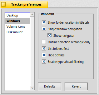
I have feeling that Haiku Tracker Preferences needs small redesign, something like appereance preferences with Tabs. what do you thin?. main reason why i write this is that for me is ugly
I think tracker preferences is ok as it is. Do you have a mockup of how you see it?
only my suggestion is Tab like prefs
1 Like
Unless there are more entries planned to be added in the left selection box, then I can’t see why it shouldn’t be changed to a tabbed layout for a neater look:
1 Like
nice to hear, thats ok
Switching to tabs does seem better actually. It is just this way because that is how it always was and no one has yet changed it.
1 Like
It would give at bit more space which is always good for translators. As long as it doesn’t break keyboard navigation, that’s something to try.
+1 for tabs, they make perfect sense there
3 Likes
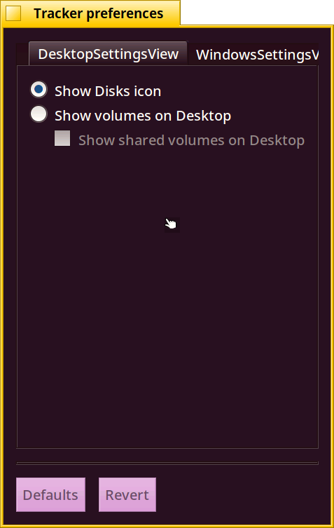
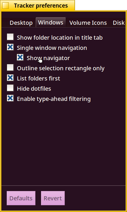
I think something like this is what you would want? (Please disregard the wrong margians, WIP)
Yes, thats right and i ask fór oné feature single click on icons and auto arrange icons on desktop 
TBH, I like current version of Tracker settings window (i.e. with no tabs).
3 Likes
This is how far i got anyhow, with the style matching that of pref/appearence
There is an issue with the size the tabview which is calculated too small (as in not enough room for the labels) which i probably have to fix for this too, doesn’t completely work yet either unfortunately, as in the defaults and Revert buttons :)
1 Like
Great job! 
I usually like it when UI elements are laid side by side, as it takes advantage of the widescreen aspect ratio. However, since most of Haiku uses tabs (see: Appearances dialog), it might be a better idea to stay consistent here.
Ask probono from HelloSystem to use horizontal tab switchers in his dream OS
I don’t think most of haiku uses tabs, we certainly use both were apropriate, Personally i think that for a fixed set of small items a tab view is neat.
One thing the old style did better however was that the section that had changes would highlight in bold to indicate where changes were, but then the revert button reverts all sections, so the utility isn’t as big, but a nice UI hint nonetheless.
1 Like
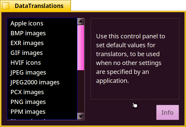
i think for DataTranslators is old style good not tabs, there are many items and current setup is more practical
I included it as an example for the list style, not planning to switch it to tabs
For me Tracker Preferences are working fine as they are
I’m sure BeOS developers had future features in mind while designing this dialog box. Otherwise they’d have gone with a tab layout. Tab layout also inherently takes more space than the current layout, making the window bigger (when spaced properly).
Some future features maybe:
- Tags/Labels
- Maybe a panel to configure a sidebar
- Maybe some extensive window view options, background colours etc.
- … anything else?
Also, no need to fix what ain’t broke.
4 Likes
Good day,
Actually, IMHO the only real issue I see here is consistency of the interface. I mean, preferences windows should? look all alike, be it horizontal tabs, vertical tabs or listview… or whatever?. Easier for the user to identify where is at.
In my personal opinion, horizontal tab panes are nice as long as they don’t span way too much. Think about browser windows when you open 10 or more tabs. Unable to read the tab title or you need to scroll right/left (instead of up/down with the mousewheel) to see the rest of the tabs. Mmmm…  Well, some mice also allow horizontal scrolling nowadays…
Anyway, no matter how strict or loose the HIG are, some software wouldn’t abide them completely. Best examples are flapple software, they have very strick HIG, but flapple cares about its own HIG when they want to care, on other situations, HIG are more like kids rules for beverage can football. Meaning that HIG are there for others to follow, and I’ll enforce them if I want to.
Thinking aloud : If there were a easy software interface generator, a la QtCreator, where we could generate windows of different kinds, like the application window, preferences… some sort of RAD tool, it would be straightforward to pick the preferences window model for the preferences window. Though that does not mean that each program would have to strictly follow, at least the chance to do it would be there. It would add consistency to the overall system. AFAIK, that has to be done by code at the moment, and with C++ 
If there would be a simple program to generate Haiku software interfaces that then could be merged in the project regardless the language used, it might improve/increase? the rate of new Haiku software? I’ve seen a boom in GTK apps since Ñome Builder came out and Glade improved the interface design to abide “new ñome HIG”, though not sure it also has something to do with Vala or Flatpak. 
Some might say that by doing this, low quality software would flourish like flies around cow dung. It might, but it would also be the door to new future good software, wouldn’t it?
Just some cents on the topic.
Regards,
RR