Or in layman’s terms, “Automatically pick other colours”.
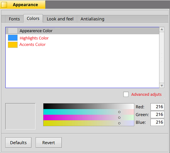
Ok then, I don’t see anything wrong with what they are doing, I just think my problem is with the variable names (which I understand will also be a problem to change). The screenshot with which I would feel happy is:
Anyway, take this as a suggestion… again, this work brings us a lot closer to simplicity.
Beautiful, thanks for working on this!
Is it sometime to get an alpha-channel sometime there, too?
Wonderful Idee, thanks again!
All the system colors are fully opaque, so there’s no need for an alpha channel selector…
1 Like
I hope that, whathever design is choosen, there will be an option to be able to configure the color for each of the components (like today).
I totally support the idea of makes things easy for newcomers, but not at the expense of limit power users.
1 Like
Perhaps also consider what system76 is doing with their upcoming COSMIC desktop environment in regards to colours as possible inspiration:
As for the checkbox text, how about:
Derive colours automaticallySet colours automaticallyCreate colour palette from settings
I’d also support having another checkbox to access the current Colour settings, perhaps with the text “Expanded colours” or “Extended colours”.
The checkbox does both. If you uncheck it, it displays all the colors (and changing any one does not affect any of the others.)
2 Likes
Thanks for the answer!
How can I set window border color the same as window tab color with this UI?
1 Like
The automatic color-picking algorithm doesn’t permit it. So, you’ll just have to uncheck the new checkbox, which will basically revert the dialog to its existing state (i.e. display all colors, no automatic color adjustments.)
1 Like
@waddlesplash Oh wow! This looks fantastic! Please oh please finish this!
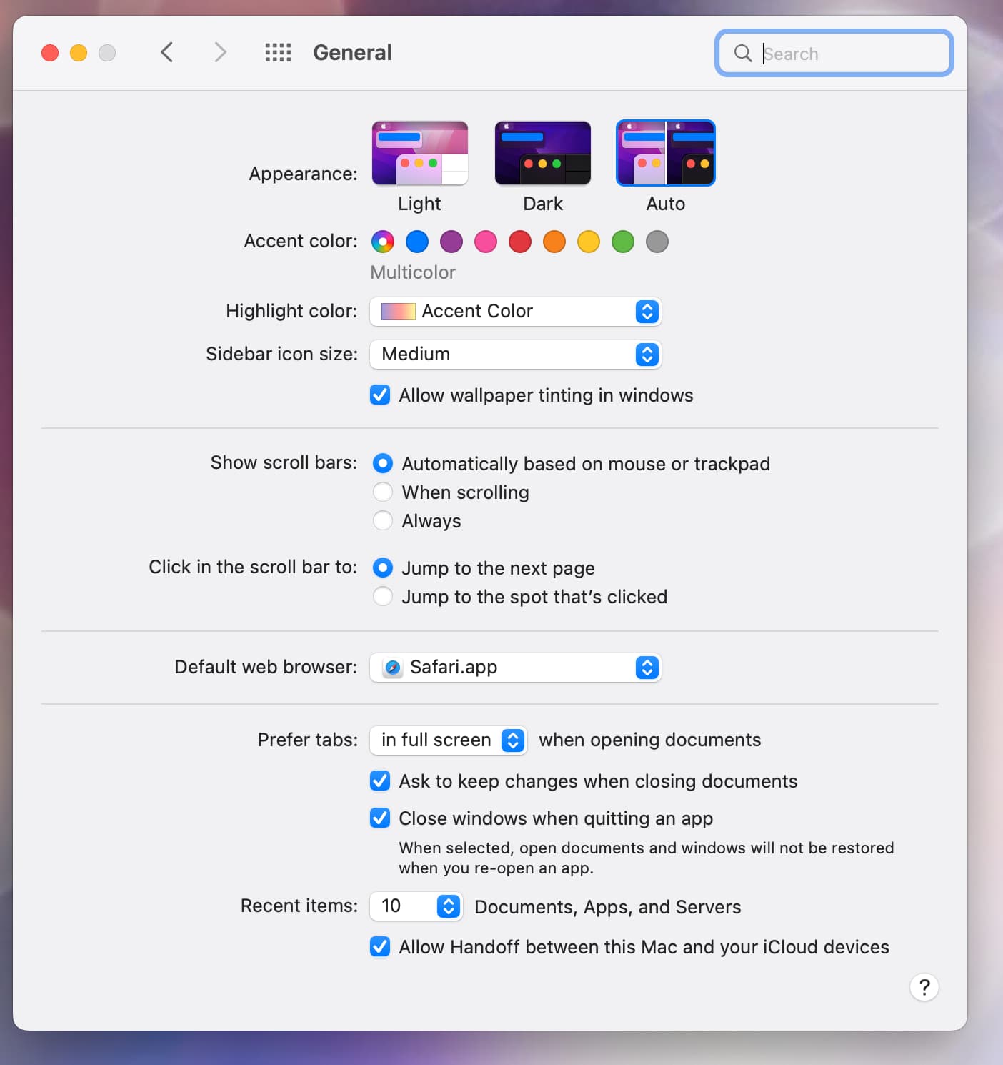
It’d be totally awesome if there was a built-in Dark Mode and accent colors available, here’s a screenshot from macOS 12 for inspiration! ![]()
Well, this system actually does handle “dark mode” to some degree already: if you set the “Panel background” to a dark color, it’ll automatically flip all the text colors to white (and so on.)
1 Like
This is just your own opinion, I don’t like the chaotic form!
I will not call it design!
The one we have looks clean and easy to use!
And it is well designed!
[WRT naming one of the primary colours "Status bar]
I have a bit of trouble with that name, too. Where can I see a blue status bar (with our default theme). I mean, from the colour it’s obvious that it controls all the blue “stuff” in the GUI. But I don’t see the connection to a “Status bar”.
1 Like
Perhaps because the items that it is colouring are more progress bars than status actually.
Yes, maybe it happens that the code computes things this way, but from a user interface point of view it makes no sense. “accent” and “highlight” (or something like that) would probably make more sense (at the UI side, there doesn’t really need to be backend changes for that).
4 Likes
“Control accent”, maybe? (The color is used as the basis for the one used in checkbox checks, focus rings, etc. in addition to progress bars.)
2 Likes
Those are all UI elements that an accent colour would affect elsewhere. An accent colour would logically affect the tab colour too, but for Haiku it’s prolly fine if that’s separate.
My 0.02 - I feel like the checkbox should read something like “Automatically adjust secondary colours”, and then split the panel into the 3 you have there with a label “Primary Colours” and then put all the others in another panel labelled “Secondary” Colours.
That way you can see easily what’s going to get adjusted when the checkbox is checked, and it also gives the user the freedom to adjust the other colours as well after they’ve been set automatically while adjusting the three primary colours.
I’m assuming here updating the secondary ones in realtime would be possible - that would be really cool to see the whole thing live updating like that!
It already does. The current Appearence colours are practically the future panel’s primary and secondary colours together.