More than just discussion, I’ve actually been working on this. Coming soon to a nightly build near you:
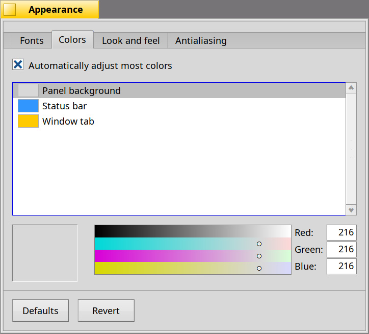
(There’s some ongoing discussion about what the checkbox should actually say.)
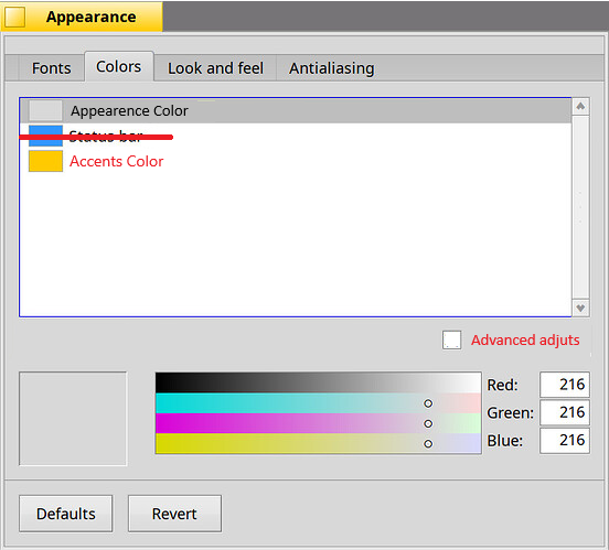
More than just discussion, I’ve actually been working on this. Coming soon to a nightly build near you:
(There’s some ongoing discussion about what the checkbox should actually say.)
I think the “Status bar” is too specific, it does not give the idea that, that is the general system accent theme… There ought to be an “Accent color” entry that calculates the “Status bar” color as well, and should hide it behind the checkbox…
But it’s not an “accent color”, it’s the status bar color. The preflet then automatically picks the “accent colors” (focused control borders, etc.) based on what status bar color you pick.
(That’s what the first checkbox is about. Maybe it should be called “Automatically compute most colors”? “Derive”? “Generate”? …)
IMHO:
The default behavior is to automatically calculate the colors and if the user wants, check the advanced option to select it manually (the list box obviously shows all the options like now).
I don’t want to derail the topic, maybe it’s best to see it when I try it myself.
Maybe there is no need to provide complex calculations, for my preference setting two colours is sufficient;
These two should be unique user-visible options. Checking the box would have these disappear, and give access to all the other colours. Setting one accent colour, and assigning it to all the colours I mentioned above should give a cohesive look already. To make the UX more pretty, we could have decent drop-down menu selections to change the look of the system. The idea is something like this.
Why remove the “Status bar” color from this list? One could probably derive “blue” from “yellow”, but why constrain users in that way? (The exact shade of blue used is also variable.)
All the colors you listed have, by default in Haiku at present, different shades of blue. That may not seem significant, but when you switch it all to use the same shade of blue, the lack of contrast in some instances becomes apparent.
Haiku has 38 different color constants for a reason. Some of those will be duplicates of others (in the default setup anyway), but quite a few are not!
It’s alright to tint the accent colour slightly, that’s fine. However, while the proposed UX is much better, it still doesn’t offer something on par with other operating systems/desktop environments.
Having one drop-down with pre-defined colours will work for most users. A “Custom colors” entry drop-down menu entry would open a window, and give a clean UI. I don’t mean no disrespect to all the previous authors of this dialogue, but it is ugly, with the modifications, it looks even more bare and unpolished.
Also I don’t think we have the text selection and menu focus background configurable currently, do we?
Yes, this one isn’t configurable at present.
But this one is, there’s colors for it.
Possibly, but that’s not what this change is about. We can still do that later.
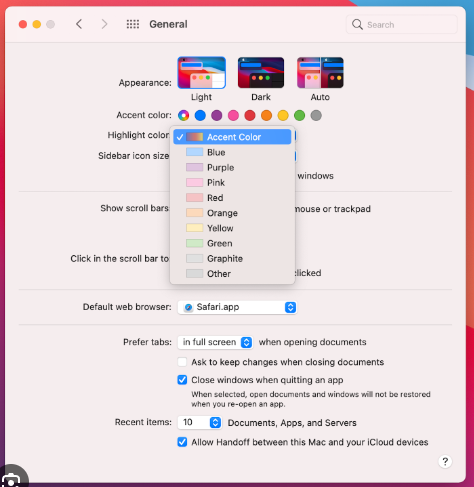
It looks relatively “bare”, yes. But so what? I think Apple’s equivalent looks pretty “busy”.
Ok yes, I understand what you say and is totally valid… Maybe I think about it from the user’s side: The point is, isn’t the status bar more important than the scroll bar (or another one), why can I select this one but not the other one in automatic mode? In any case, this brings us a lot closer to simplicity, we can leave it like this and continue improving.
Funnily enough, if you use 256 colors you actually do get a „plain“ color picker in Haiku. : )
Okay, missed the menu focus background probably.
It’s alright to look busy and have all the related settings discoverable in one page, rather than having to jump tabs. ![]()
Because there are other colors computed off the status bar color. Specifically: control border, control highlight, control mark, and “navigation base” (keyboard navigation)
Originally I had planned to make one of the “control” colors the base color and have “Status bar” be computed off that, but in the end it became clear that those shades of blue are less “pure”, and so it made sense to use the “Status bar” color, which is a much more straightforward shade of blue for people to pick.
Why not do it once and forget about it :). For instance we could even unify colors and look and feel into one tab already.
Because it makes sense to do one thing at a time…?
I don’t think we should get rid of the tabs here, the two settings are in fact pretty separate. Changing a decorator or other look and feel settings doesn’t change the colors.
The look and feel stuff should ideally be configuration that is up to the control look, like the arrow style for example. Currently this is hardcoded in appearence though.
Wording can be modified. These are essentially settings that decides how the system looks in general. Fonts and anti-aliasing and stuff are distinct enough to have their own tabs IMO.
I like that answer much more! So the problem is the name ( ![]() )… because I am not only selecting the color of the status bar… Im selecting several things. How about we call them “Highliths colors” / “Secondary colors”?
)… because I am not only selecting the color of the status bar… Im selecting several things. How about we call them “Highliths colors” / “Secondary colors”?
Yes, i know… others made that before (i dont know if macos uses the highlight color for the same)
The naming is currently menu colour and selection colour.
Another proposed text for the checkbox is: “Automatically pick secondary colors”. So the implication will be that these are the primary colors, and the “secondary colors” (all the rest) will be picked based on what is chosen here.