Compared to Microsoft Store, Mac App Store, and various other Linux application centres (I use them all), HaikuDepot interface is seriously lacking in usability. The difference is way too high, not enough words.
Partial reason for this, HaikuDepot is trying to be a package centre and an application centre at the same time. It’s confused. Either it has to go Synaptic Package Manager route, or become something like, say, Ubuntu Software Center.
I find the straight-forward nature of the HaikuDepot interface quite simple, attractive and very functional. I know it needs further work to provide polish, but I really don’t think there is a huge problem here and I think it shapes up quite well with other comparable applications on other platforms.
Categories and featured packages are things that it has had from early days and these functions well supported both client and server side.
I don’t know either Microsoft nor Mac App Store. My very brief experience with Linux (first Ubuntu, then Mint) is that I kept confusing a Synaptic app with some Software Manager app (cannot remember their names exactly maybe). One had the apps, the other listed every dependency/library/whatever. In one, I had to decide if I (IIRC) wanted to “just uninstall” or “purge” or “reinstall” or what else single or inter-dependent packages.
I like HaikuDepot being the one-stop location to find/install/uninstall apps with one click. Sure, it may not do a sort of presentation this month’s featured application, but 99% of the time that’s not what I want anyway. I read about an app on the web or IRC, I go to HaikuDepot, search it, and install it.
I suppose people just like (and expect) what they are already experiencing elsewhere. If you come from macOS, you like the app store, if you come from Haiku, you like HaikuDepot…
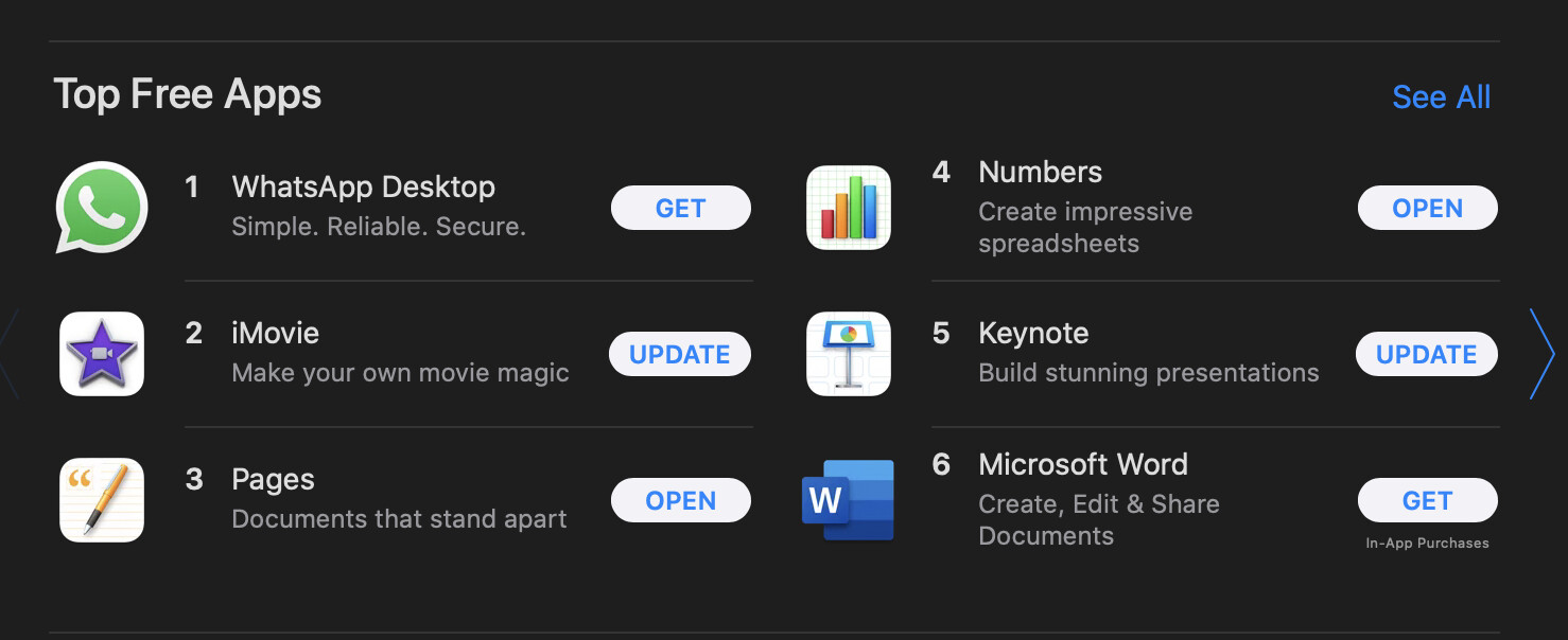
They are there but the UI is lacking. For featured packages, it needs to be more visual, preferably with icons in a collection view, using all the available window estate. Currently featured packages only can show 4-5 applications in a cramped list view. I think it’s straightforward ugly (my subjective opinion).
By the way, thanks for your all the labour on HaikuDepot! It’s really appreciated.
This is fair enough, and works for me as well; but as the number of packages and the applications grow, I think it’s necessary to optimise things a bit for easier discovery.
That’s fine for your usage as an experienced Haiku user, involved in the community, who follows forums and IRC. But I think the app is indeed not so great for newcomer users or in general, less involved people, who don’t follow all this and want to discover apps through HaikuDepot.
I agree with bitichi that HaikuDepot tries to be both a package manager in the Linux style and an app store. I think it is possible to combine both, but I am not satisfied with the way it is done now.
I think we have to go back to basics in UX and consider the different use cases and “personas” (typical profiles of people who want to use the app and do something with it). And I think the case of someone who is looking for an app by usage, rather than name (something like “I want to install some office suite”) doesn’t get a really great experience. Yes, sure, the categories are there, but they are a small menu at the top. Meanwhile, we have a way to “just list all the packages” which no one will ever want to browse through.
The way I see it, entry points to the app should be:
The “featured” view, which should show recent additions/updates, “trending” apps (in terms of user ratings or number of downloads), and staff pick. Right now it does only staff picks.
A list of categories with big, large icons.
A “search” mode, with at least a search bar and maybe several menus and checkboxes to refine the search (maybe you could navigate in a category, and then switch to search mode to refine your search)
In the current situations, I think all these things are doable, but they are not clearly separated and the result is a bit confusing. It is not clear that the initial list only shows staff picks and not the complete list of packages. It is not clear if the search bar will search only there, or in the whole list.
It is also not clear for developers what the search results should be: when to show only applications? When to show libraries? When to show development files and source packages? If we had dedicated places in the app (maybe separate tabs) for each of these 3 entry points, the “search” tab could have some options so the user can decide about that when they search for something. Or maybe it wouldn’t be options, but just showing the results in different categories so people can easily ignore the things they’re not interested in.
Although the app has definitely improved since beta1 with the tabs, the Featured part of the Depot should behave like an app center/store front with a nice featured slideshow, cube organized icons with a download/install button or symbol, or something that’s easier on the eyes (and less experienced or new users).
Then the Categories half could continue to be just a list and be the utility or ‘power’ side of it. That way there wouldn’t need to be a split into 2 apps but 1 to manage everything (like now). But yeah totally agree the Featured part of the Depot needs help — the struggle is real
Also about the name too… I agree with @bitigchi, it should just be “Software” like Fedora. It’d be way easier to find for anyone new to the system.
I disagree here, I don’t want a slideshow in the depot, or anywhere else in haiku, it’s too much motion. :)
What are cube organized icons?
I also disagree a bit here, poweruser features should be there, but there is still quite a lot of UI improvements to be done generally, e.g not asking whether to install deps too, since there is no way around them anyway. I also think categories should make room for tags that can be searched for directly.
I don’t see how the “list” view and “featured” warrant any destinction between normal view and “powerusers”, Gui applications should be findable just aswell in the normal view, if anything the featured packages should show they are featured in the normal view aswell.
For this SoftwareUpdater (or pkgman) could be handy, if SoftwareUpdater could have some selection where you could select the updated package, for pkgman it shouldn’t be a problem, you can just cancel there and install the package in Terminal (think there is an option “pkgman update ‘package’” for this?
Searching for “office suite” returns Calligra and LibreOffice, the two office suites for Haiku AFAIK. Currently the hundred language packs are listed as well when not setting the category. We may tweak the summar/description of those, but the user will have to see those some way or they cannot be installed…
I don’t see what’s wrong with a normal pop-menu for the category. I like my HaikuDepot to use the standard widgets like any other Haiku app. Space-efficient, standard GUI.
The “All packages” list isn’t for browsing as I see it. It’s the starting point for searches: Enter search terms, if too many results, either limit with additional search terms or choose a category.
This may be the crux of our differing opinions. I want a standard, no-fuss Haiku app while you and probably many others want something like a web presence.
Maybe big icons for categories, big app-of-the-month presentations and all those bells and whistles is easier done as a website. Possibly, with htm/css or some store software non-developers can even be recruited implementing all those bells and whistles…
So that is what bitigchi is seeing from the start. You want a Linux style package manager like Synaptic. That’s fine. But HaikuDepot is trying to do both that, and an application store (a more “web-like” thing if you want to say it this way, but I think it’s not a matter of technology, but of usage). And I think there is a lot of value to that second approach, as well.
I never said we should not use the standard widgets for this. It doesn’t have to be a thing full of flashing animations and autoplaying videos. Just a bit larger icons, and moving a few widgets around. The search function could be something like the Tracker find window, for example. Rather than being just a search bar in a corner (and a full list that has no purpose except filling your computer memory with an endless list of packages).
Yes, we probably want to do this in a way where we show the results live as you type. But still, we don’t have to start with the full list of everything. Would you consider that for Tracker Find window? Just show all the files and then let the user filter it down? To me it doesn’t make sense.
TBH, it’s the live filtering of HaikuDepot search terms that I miss in Tracker queries much more than I would mind a Tracker find window showing all files from the start. If populating the view with files were as imperceptible as in HaikuDepot, I wouldn’t care. Though it makes less sense for Tracker queries, but I recognize that you have to make a slightly absurd comparison.
that to me is way more confusing, the distance between the install buttons is like 5 times higher for half the apps, for basically no gain. I don’t see a point of making a list go to the right tbh.