I wonder when someone will improve/improve the Haiku GUI/UI. Not only the appearance of the windows is important, but also buttons, radiobuttons, checkboxes etc. Not one person said that the Haiku gui and windows look like the late 90s. And now the question is whether it makes sense to improve it or wait for R2, where there will be new gui elements. In my opinion, a slight cosmetic retouch of the GUI should take place in these R1 times. NO I don’t know if it’s related to the anti-aliasing support in the app server or something else. In short, not alone QT man is alive and feels a strong urge to watch high-flying GUI. There is also the issue of window animation can compromiz from linux not also be covered?
Personally I am very happy with the current GUI because it is:
Space efficient. I can fit twice as many things on screen as I’d do with other operating systems
Highly readable. Buttons are clearly buttons, checkboxes are clearly checkboxes (and it’s clear when they are enabled or disabled), etc. I know exachat will happen with each GUI item. The current “flat design” or “material design” trends prevent that.
Poweruser compatible. There are many little things (showing keyboard shortcuts in menus, drill-down menus to quickly navigate file hierarchies, etc) that make it incredibly efficient.
So far all the redesigns I’ve seen go with either making things more flat and less readable, or making things more rounded and less space-efficient. The fact that people have been trying to go in both of these directions means to me we have reached a local optimum, and moving in any direction makes us go downhill. Maybe there is a higher peak somewhere on the other side of the valley, but I can’t see it.
And so, saying “the GUI needs a redesign” without concrete examples of what to improve and how to improve it will not make any progress. What would you change, exactly? Why is a GUI from the late 90s considered a bad thing? What is the research and progress in GUI design since then that is worth including? I think a lot of it has been research for mobile phones, small screens with imprecise pointing devices such as fingers, and no physical keyboards. None of this applies to desktop systems, but people have been importing it there for unneeded consistency.
Okay, you convinced me.
You can use ThemeManager with some extra presets to make the GUI look even better, smaller fonts, softer colors, but the appearance of the windows remains the same.
I like plain simple desktops, (I usually use window managers on my Linux systems), whilst Haiku takes some getting used to, compared to most other operating systems, I feel it is part of what Haiku is all about, a clean simple system for the desktop.
Menus could perhaps do with a bit of ‘tidying’ up, but they work OK, just a bit different from what a lot of people, me included , are used to.
I think that Haiku’s GUI could do with some small touches. Buttons could have rounded corners, windows could have shadows, and the GUI could be better adapted to high DPIs. Other modern operating systems should definitely not be copied in this area.
For window shadows, the goal for them would be to make the Z-order of windows more easily visible. However, in Haiku, I use focus follows-mouse and that means I am often using non-front windows that are partially obscured by other ones. In that case, the shadow ends up being very annoying. I have noticed this a few years ago with Mac OS, at the time their shadow was like 40 or 60 pixels wide and very distracting for me.
We already have rather thick window borders, and I set them to a bright color for the active window which already does a pretty good job at delimiting where it is. For me, this is good enough and doesn’t compromise on the ability to use underlying windows.
For rounded buttons, I also don’t see what would be gained. Why would there be better? Is it just a matter of “I think it looks nicer?” or is there some usability argument for it?
And for high DPI, we have already made a lot of progress and that will continue.
I admit that I take a minimalist and functional approach to this., and so “it looks nicer” does not work for me.
Yes it looks nicer to me. Too much flat and square isn’t great. On the other hand, Gnome does take rounded a bit far by making the entire window rounded.
Only GUI change I can wish (because it would improve my workflow), would be having an (optional) left side TreeView in Tracker (basically, bring @3dEyes’s NaviTracker back! ).
I know I could use Seeker, but it just feels “odd”, and “breaks the immersion”.
Tracker (in ListView mode), + left-side TreeView… would be ideal for me.
I’d like a new ui element, in the form of a clipboard icon to copy read only ui elements with a click. For example for a MAC adress, ip adress etc. data that is usually displayed on a panel but is not ment to be mutable
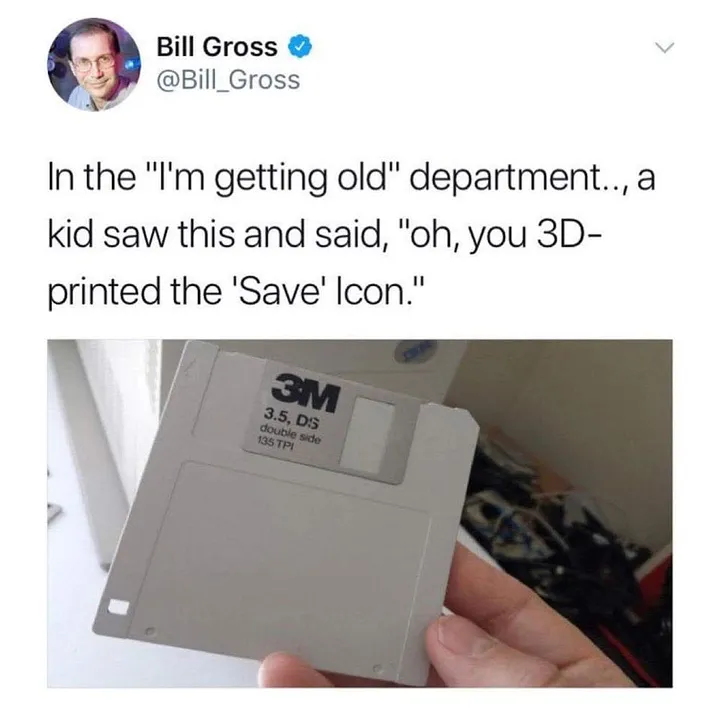
For bragging rights, it would be good if Haiku were the first OS to replace that obsolete floppy disk SAVE icon with something a little more up to date.
After several years jumping across linux distributions, and having tasted lots of DE flavors, I still prefer haiku UI by far because of its 90’s clean design.
The most similar approach to date you will find into xfce, in fact their developer team also focuses on reactivity and small footprint - no eye-candy.
I must admit, that’s where I find the simplicity and usability (and compact size!) top of the mountain, that is in their main menu, which I think is the best, period.
Some might not know or remember this, but some 20+ years ago three was a skin for Windowblinds (a customization program for Windows 9x and up) called BeOS V6. Not very space efficient, but still kinda cool for the time. Nowadays it looks outdated, but maybe it can be updated and facelifted to make it more modern.
As for me, it would be cool to have alternatives. But I feel in love with BeOS R5 because of the UI in the 90s and installed Haiku for the same reason. Currently I’m using the flat decorator.
 , are used to.
 ).
).