Haiku is not a Company or politic Party, who needs a Corporate Identity and or Design!
If you like to help with your wisdom please make some Designs and create a corporate Identity for Haiku.
Haiku is not a Company or politic Party, who needs a Corporate Identity and or Design!
If you like to help with your wisdom please make some Designs and create a corporate Identity for Haiku.
Haiku inc. is de-facto a non-profit organisation and the Haiku operating system project wants to achieve goals. The Haiku team and project is interested in making Haiku more known to the world. For this communications is needed. You don’t need to be a company or corporate to make use of professional-like communications.
Step by step. Helping jt15s and the Promotion Team to build up a styleguide for a Corporate Design (which is part of a Corporate Identity) seems to me the more promising way. So design and identity grow from the inside. Seems more promising than to tip in something from outside.
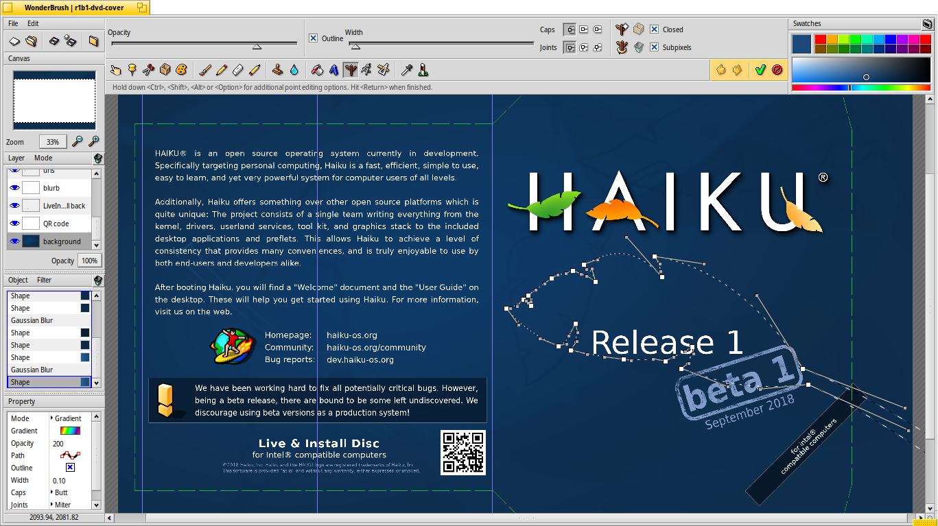
The design for the dvd is fully vector, it is available as a wonderbrush file, with all layers, the text, and everything modifiable there.
There is a raster export in the repository, it is pretty much the only option to properly export the file from wonderbrush in a way that can be used for printing (the other export formats, especially the vector ones, don’t implement all wonderbrush features, so the image is always corrupt)
If you want to work on these files you really need to work with wonderbrush. I am not responsible for this situation, I got the files from the previous DVD runs, and just made some layout changes to fit a different sleeve shape. But I find that Wonderbrush is a nice tool to work with, and as far as I can tell, it is full vector until the final export so there shouldn’t be a problem.
I know a few things about this, having helped my father in his printing/vinyl cutting shop as a child, and later on maintaining a pixelart drawing program for a few years. So I took care to preserve everything in vector format in the wonderbrush files. Again I don’t understand where you see a problem with these?
Of course Haiku needs good design, and that necessitates a consistent and logical approach.
I’ve prepared press kits media outlets can download that have images, logos etc. Here’s the one for Beta3 for reference: https://www.haiku-os.org/files/R1_Beta3_Press_Kit.zip
I personally use Inkscape a lot already. Using PDF makes sense for documents, but regarding EPS, isn’t that an Illustrator-specific format that’s proprietary?
Of course, there is also the issue that any graphics we make should be compatible with software within Haiku.
In terms of webpage design, it’s a bit complex since we use different website technologies for all our web infrastructure. The website at https://haiku-os.org uses the Hugo static site generator and the theme is built with Bootstrap with some changes. The bug tracker at https://dev.haiku-os.org uses Trac, and the User Guide and API Docs use Doxygen, whilst the newly created Developer docs use Sphinx. It should be pretty easy to create one unified theme for everything, since all these solutions can be themed using CSS, and there was a plan to create a unified CSS file, not sure how that’s going though.
Speaking of documents etc., I quite like the design used in this version of Programming With Haiku: https://github.com/theclue/programming-with-haiku, we could probably adopt something similar.
I found some English articles on style guides:
https://www.canva.com/learn/50-meticulous-style-guides-every-startup-see-launching/
Could a forum admin split these posts into a new topic?
So the problem has nothing to do with WonderBrush itself.
Yes, WonderBrush is a nice raster image manipulating program for painting/drawing pixelart — like GIMP or Photoshop are for pixelart. (Of course it is not on the same level as GIMP or Photoshop but it is much nicer than tools like Paint.NET) And here lays the problem: It is for pixelart and not for vector drawings like Inkscape or Illustrator and not for desktop publishing like Scribus or InDesign.
The problem is the low resolution (in combination with anti-aliasing). This leads to blurry looking and/or stair-like “jaggies“ at the edges of shapes and letters when a file is printed.
So, if I wanted to produce the next DVD/CD inlay/booklet I would remove all the text, the logo, the icons in WonderBrush, save a TIFF file and place that in Scribus and add all text, the logo, the icons, etc. Export as PDF. All disadvantages overcome.
Oh!It’s surprising that this OS is already 20 years old.That’s pretty old to a tech product!Well,kids grow up in 20 years,but our OS hasn’t “grown up” yet!
Nice! Scribus has been ported to Haiku and Inkscape will be too. I don’t know how usable Scribus is actually, I could not even start it today but it’s just a question of time.
PDF is standard in Europe since ≈15 years. In North America EPS “survived” much longer but PDF should be standard nowadays and no problem. I think we don’t need EPS actually but it can be easily converted. (E)PS can be easily used as PDF, both are not free formats like SVG or ODT are, but for (E)PS is no longer a licence fee required. EPS is not Illustrator-specific but Illustrator began as a PostScript correction tool. The .ai format was PostScript-based till version 8 or 9. Since version 9 or 10 the .ai format is PDF-based.
Wonderbrush is a fully vector program. It is not anything like gimp or photoshop, and certainly not meant for pixelart.
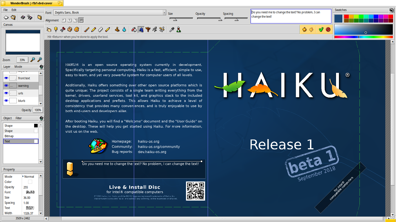
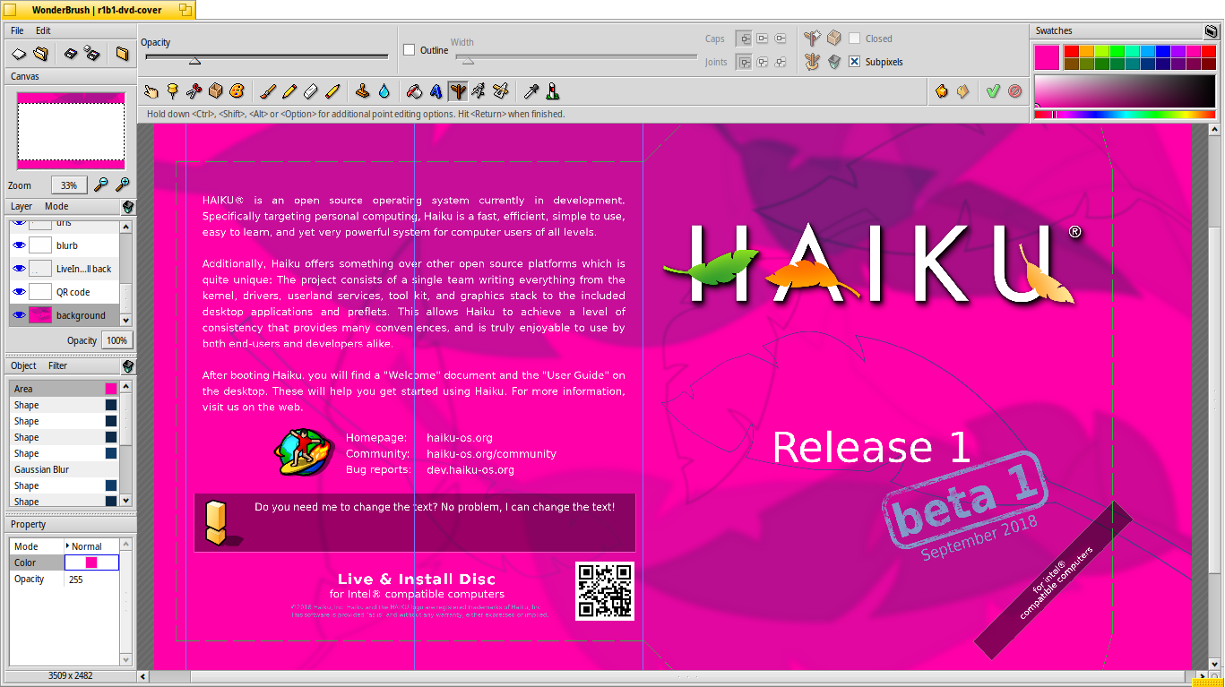
Apparently you don’t trust or believe me so here are some screenshots of: editing the text (since it is indeed not converted to outline or whatever, this is super easy), showing the control points for one of the leaves in the background (does that convince you it’s vector?) and changing the background color for the whole thing, showing how everything is re-rendered properly.
Now, do you believe me when I say that everything is stored as vector and I can provide a final raster render at whatever resolution is required by the printing process (which is what the printer requested of me)? And that I could export shapes to SVG if needed, but limitations in the SVG export code in Wonderbrush means this is a lossy process? (gradients render differently and some of Wonderbrush effects are not exported at all).
Oh and I forgot: this is also wrong, because I did not render the file at a “low” resolution. I rendered it at the resolution asked by the printer (600 dpi) and so no scaling is done from there to the printing process. Which you can easily confirm by looking closely at the DVDs. You can zoom all the way to see the dots from the inkjet printer, yet no traces of pixels.
Here is a picture of the DVD Taken with my phone (I don’t have a microscrope, but hopefully this is enough to convince you?). What you see here is not pixels, it’s patterns made by the printer to mix their colors. The cover is similar but with a different type of pattern because of a different print technology.

There are a few other things I am not happy with in this process, mainly the fact that I can’t use a color profile and so the colors are not the same on the sleeve and the DVD, and both are darker than expected.
Please, I don’t want to start a fight.
Of course I trust and believe your statements. So I took a closer look at WonderBrush with great anticipation.
I found out that due to the terms used, we misunderstood each other.
It is definitely not intended for pixel art, such as GrafX2 or Deluxe Paint - wrong term, my fault. It is also not a simple paint program like Paint·NET.
But it’s also not a real vector graphics drawing program like Inkscape or Illustrator. So I was confused about the “fully vector” statement. Of course, it’s not a layout or desktop publishing program either.
Yes, in WonderBrush everything is an object that can e.g. be scaled - and then the object is re-rendered. Text can be edited afterwards. With the two r1b1… files I could not edit the existing text (I could move the object, but the visible text did not change its position; text editing was not possible), but when I added new text I could move and edit it.
However, when you zoom in you can see the individual pixels - different to a real vector graphic drawing program. Current versions of GIMP and Photoshop can also use scalable vector shapes. So I put WonderBrush on a par with the two - but they’re very different. Ultimately, WonderBrush seems to be intended for graphics that are used on the screen.
I couldn’t figure out how to change the canvas size or scale the whole image afterwards. I could not set a DPI value. How does it work? How do you output the image in different resolutions?
In the photo DSC_2162.jpg, in my opinion, the text “September” is not very sharp, which is also due to the anti-aliasing, which should be deactivated for printed matter, especially with the inkjet process.
I have put a screenshot showing me editing one of the existing texts. Just double click on it in the object list on the left, the text shows up in the text tool at the top and you can edit it.
Yes, it is meant to export a raster format at the end - exactly what an inkjet printer needs, which is a good thing because that’s how the things are printed. So, it renders at a set resolution even if you zoom in further. But internally it is all vector and everything can be edited and exported at the right resolution.
It wouldn’t be appropriate for actual vector export (say if you want to use a vinyl cutter or something like that), but for some printing technologies (such as inkjet printers), you will have to rasterize your work at some point. And it’s probably better to do it yourself before sending the files to the manufacturer in that case, as long as you know which resolution they use.
Use the canvas → resize menu or press alt+R to bring up the dialog.
In Winderbrush 2 there is a limit of 4096x4096 pixels, which is sufficient for the DVD and cover, but probably too small for larger work (say if you wanted to print a poster). I think this is one of the limitations removed in Wonderbrush 3.
I think part of it is due to the way I took the picture (with my mobile phone and digital zoom) and to the printing process (you can see the patterns used by the printer to obtain different shades of blue, and they are larger than the pixels in the original file). Not sure if turning off the antialiasing would make a dramatic difference there.
I think that might be an issue if the font used when creating the WonderBrush file isn’t available on the system you opened it.
I suppose, it’d be nice for WonderBrush to inform about this and ask for a replacement font.
The problem only appeared with these two files and only with the existing text; when I added new text I could edit the text even after closing and reopening it. For all the others that I tested, it worked as @PulkoMandy described. The font is Noto, which is pre-installed.
Let’s stop talking about the text issue. The file is old.
According to DiskProbe, it seems to be “DejaVu Sans Condensed”.
Sure, since you’re so sure about everything you think or feel to be true…
The best result is achieved if you let the printer device’s own RIP (or the driver’s RIP) do the rendering. Then it can “decide for itself” how it renders which elements. Modern RIPs render texts, gradients and photos (and the like) differently. When all is a plain rasterized image, it can’t “know” what is text and what is photo. Please believe and trust me in this case, I’ve been doing this professionally for over 20 years.
I would see it. ![]()
Found, thanks.
Would be fine to get more tutorials about using wonderbrush. We have some of them on our knowledge base, and we are afraid about more stuff or step by step infos to reproduce and creating own tutorials.
If you were right about that, I wouldn’t have just checked whether I was wrong.
WonderBrush told me beforehand it was Noto, but only because DejaVu wasn’t installed. As a newbie to WonderBrush, how should I have known before you told me? Now that I installed DejaVu, I was able to edit the text.
Errare humanum est, sed in errare perseverare diabolicum. I didn’t insist on being right, so I don’t know what this hostility is about.
Well generally the WonderBrush user interface is often confusing. There is some work to be done there. But personally I would prefer to work on the new Wonderbrush 3 and not on the old Wonderbrush 2… and the version 3 needs more important work done in other areas…