Merchandise and 20th Anniversary Logo: Feedback, Ideas and Designs Wanted

Hi all! I’d like to unofficially announce that Haiku is partnering with Freewear (https://freewear.org) for merchandise. An official announcement will be published on the website once ordering for Haiku goes live. Unfortunately, this time of year Freewear, being a small company is really swamped with orders and thus the Haiku store will only open sometime in September. Thus, ordering 20th Anniversary merchandise will only begin then as well.

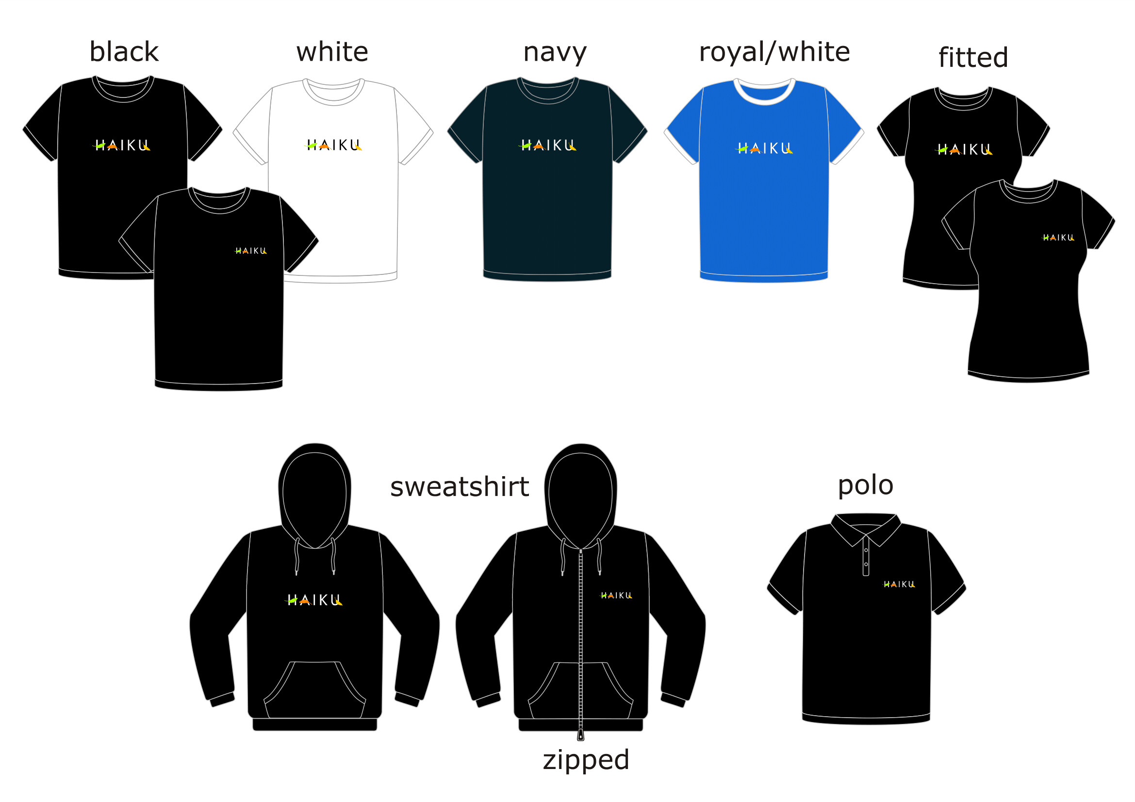
First of all, here are the “normal” designs which will be available for order:


There were some concerns raised that people who see our merchandise (who don’t know about Haiku) might think we’re fans of the Japanese poetry, not the operating system. Should we consider adding the words “OPERATING SYSTEM” under the logo in these designs?

Next, we’re thinking of having some sort of 20th Anniversary logo displayed across all of Haiku’s websites etc. Here’s a basic design I made by inserting the cake icon bundled with Haiku with the Haiku logo (note the logo is white so you might need to switch to dark mode to see it):
image
What does everyone think? I’m not very good with designing logos etc., so if you have any ideas/logo designs to share please do!

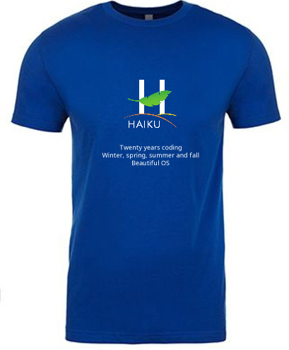
For our 20th Anniversary, as you may know, we’ll have some special merchandise to order via Freewear once ordering opens in September. thaflo on Matrix has made two designs:

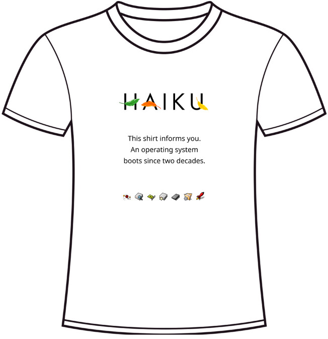
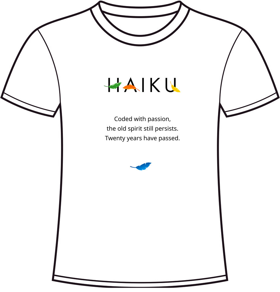
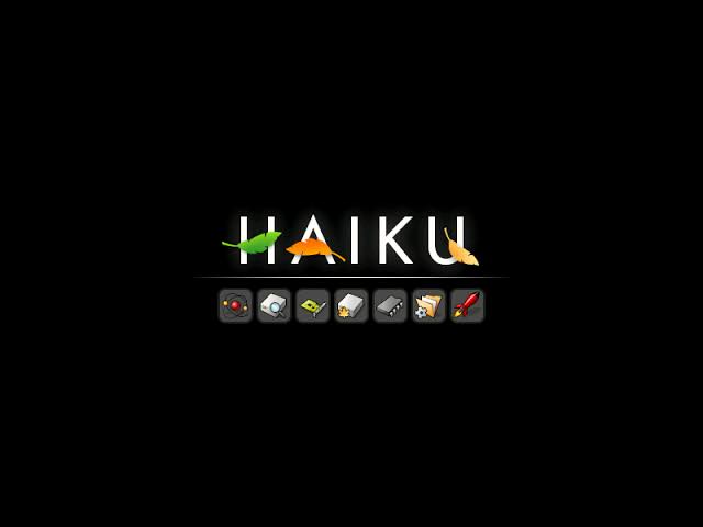
These consist of the Haiku logo, a haiku (as in the poem), and some sort of graphical element from Haiku (in this case, the blue leaf and the boot splash icons). The haikus need some work so any feedback/suggestions on these are welcome, as is feedback for the designs themselves! We will also need to replace the Haiku logo here with the 20th Anniversary logo once that is decided.

Finally, if you have any design ideas of your own, either for normal Haiku merchandise or for our 20th Anniversary merchandise, don’t hesitate to share them! If you’re interested, you’ll need to follow these design requirements:

The designs must be in vector format and in flat colors without gradients (except for white t-shirts), and our most common techniques are screen printing (for slightly large print runs, from approx. 30 t-shirts or more) and high-quality textile vinyl (when they are few shirts, or when we do not know how many will be). Fine details, with a thickness of less than 0.55 mm, are problematic. In screen printing, the maximum width and height of the design are 30 cms. (this limit has some flexibility).

Thanks!

8 Likes

Add coffee mugs, caps, and mouse pads,
Try adding the Haiku boot icons with the Haiku logo on a large mouse pad and mug…

3 Likes

I like the second Haiku, but not really the first, the design doesn’t quite seem fleshed out yet, but a nice start.

I’d have the t-shirt be black if you want to use the boot icons, they look not that good on a white surface

Maybe the first shirt, with the second shirtss haiku in a dark design could be neat?

3 Likes

I’ve purchased Haiku themed tshirts before and the quality + fit is not exactly commendable, and the colours fade after a single wash.

The boot icons in my opinion are are more appropriate logo. It adds an element of mystery …

image

11 Likes

Can’t seem to make that cake icon work… Too much for a limited space.

First draft:
20yearsHaiku

If it’s too small to read on that image:

Twenty years coding
Winter, spring, summer and fall
Beautiful OS

What I really want though, is pyjamas with all icons, like a wearable Icons screensaver. :smiley:

16 Likes

Please no text. :frowning:

Yes, let’s do this!

I agree. I will get one with just the Haiku logo. Keep things simple.

That’s one of the reason for moving to freewear.

It was not explained in this message, so here are some details.

Currently we are using cafepress as the provider of merchandise. There is a lack of transparency on how much money pays for the T-Shirt and how much is going to Haiku. Freewear has a transparency policy about this, and clearly shows on their website how the money is split.

Also, Freewear is specialized in supporting open source projects, and one part of this is that they can ship a set of T-Shirts and other goodies (pillows, …) to various conferences. Which means in this case we don’t have to manage a T-Shirt stock ourselves for selling at conferences. It makes our lives and accounting a bit easier.

If you are looking for more ideas, here are some test prints I had done a few years ago (didn’t proceed with this because I was not happy with the quality of the print, it faded away on one and just fell from the T-Shirt in small flakes in the other). My idea was to play a bit with our nice icons:

3 Likes

Freewear does do mugs, but it doesn’t seem like they do mousepads unfortunately. They do have other things like stickers, cushions, vinyls and caps.

I’ll ask about mugs and see if mousepads can be considered.

1 Like

Not too sure what you mean here - are you suggesting the second shirt be black or the first one?

Freewear assures me that their shirts are of very high quality, so you shouldn’t see that happen with their shirts.

That’s a great idea, the boot icons also work for both white and black t-shirts as well which is a good thing.

I’ll ask if pyjamas are available :slight_smile:

I should have explained why we are moving to Freewear but I forgot :sweat_smile:

Hmm, can’t seem to see the image from my end. Opening the image in a new tab doesn’t work either.

@humdinger Where did you get that Haiku logo? Can’t seem to find it.

How about designs around the leaf logo? It’s fairly simplistic, which allows for lots of possibilities.

1 Like

It’s in the artwork repository, one of our sticker designs:

First print: artwork/haiku-stickers/businesscard/preview-front.png at master · haiku/artwork · GitHub
Slightly different version for a reprint (with a different format): artwork/haiku-stickers/stickermule-80x45/haiku-sticker-preview.png at master · haiku/artwork · GitHub

I already own two of their T-Shirts and I can confirm this. The print is also good and doesn’t wear out.

2 Likes

I ment A T-shirt that combines both would be neat, the boot icons and the second haiku, on a black shirt.
I don’t like the first haiku because “boots since two decades” sounds like a very wierd specific boast to me.

The blue leaf on the second shirt just looks out of place, probably because it is the same leaf as in the A in HAIKU, and it is very small

edit: looking at it again the boot has the icons on a grayish square, if we copy that either color is probably fine (but I like black shirts more personally)

1 Like

Ah, ok.

Yeah, that one needs work.

Ok, would making the leaf bigger improve that?

I think so, yeah. But i think that tshirt might look good without the leaf too.

1 Like

I agree that it would be nice to have no text, but the problem is that without text or some other explanation the vast majority of people who see the shirt won’t have the foggiest idea what Haiku is. So what’s the point of it?
The idea of a real haiku is nice, but a bit long-winded, and reinforcing the connection between Haiku and haikus which will simply confuse people.
I think the best solution may be a short and snappy slogan that tells people where Haiku fits in the universe, using just a few words.
“Faster than Linux”, “Better than Windows”, or even just a picture of a computer screen. We need to associate Haiku with computing.
The start screen icons are nice, but not sufficiently informative. I’d keep them, but add a slogan or picture as well. Perhaps on the back.

5 Likes

Good idea, I did have a couple of (cheeky) slogans thought out:

  • Certified bug exterminator (aka awesome Haiku developer)
  • Haiku: works on 500MB of RAM
  • My OS had tabbed multi-tasking before Windows Sets was even a thing!
  • Imagine restarting for updates, totally can’t relate
  • Haiku rocks!
  • What other OS has a picture of a boot as the icon for its bootloader?
1 Like

The quality of the haiku will always be subjective. Instead of a haiku, something from the operating system itself will look much better. Like an application or a command name, something constant and will awake interest.

And come on, a haiku about an operating system will sound cringely.

3 Likes

Hmm, that reminds me of an idea I had of just having t-shirts with well-known icons: Web+ comes to mind, what else?

I would much rather have no text than such stuff, if someone asks about the icons (and their design) I can explain, this seems much more likely to stick than someone trying to read text on my shirt.

I really dislike those slogans, they emit the kind of “my OS is better than yours” toxic atmosphere some of the more aggressive linux crowd is known for, I’d rather not associate.

Descriptive Haikus would be nice, but neutral ones. Just my 2 cents anyway

Also your slogans are a bit inaccurate, Haiku totally restarts for updates if needed.

A shirt with Icons on it could be quite nice, why not simply one big icon from a random app which follows the haiku icon guidelines nicely? and have a couple different ones. Aswell as the great pijama idea above.

3 Likes