When you see it as an outline in the User Guide banner here it looks OK, it looks puposeful. In fact, that kind of zoomed-in ‘outline only’ look might possibly work on the Deskbar, not sure. But as it is it always looks like a rushed—I’ll fix it later—job to me, although some do think it looks puposeful; humdinger’s eloquent, poetic description of it almost had me convinced for a minute. For me the gradient is a big part of the problem. Gradients like that make me think of amateur websites from the noughties. Or was it the nineties when gradients were impressive? I don’t fancy Haiku having anything in common with old geocities websites. Gradients look best in design when they are extremely gradual and subtle. The rest of Haiku’s interface is classy.
Well if Haiku’s main goal is to recreate BeOS, then this could be considered as something that has to be present in some form. As what somebody mentioned here earlier, Quick Tour may be too much to immediately show to newcomers. Perhaps a shorter introduction (local) website or program could be used?
Quick Tour also has confusing navigation:
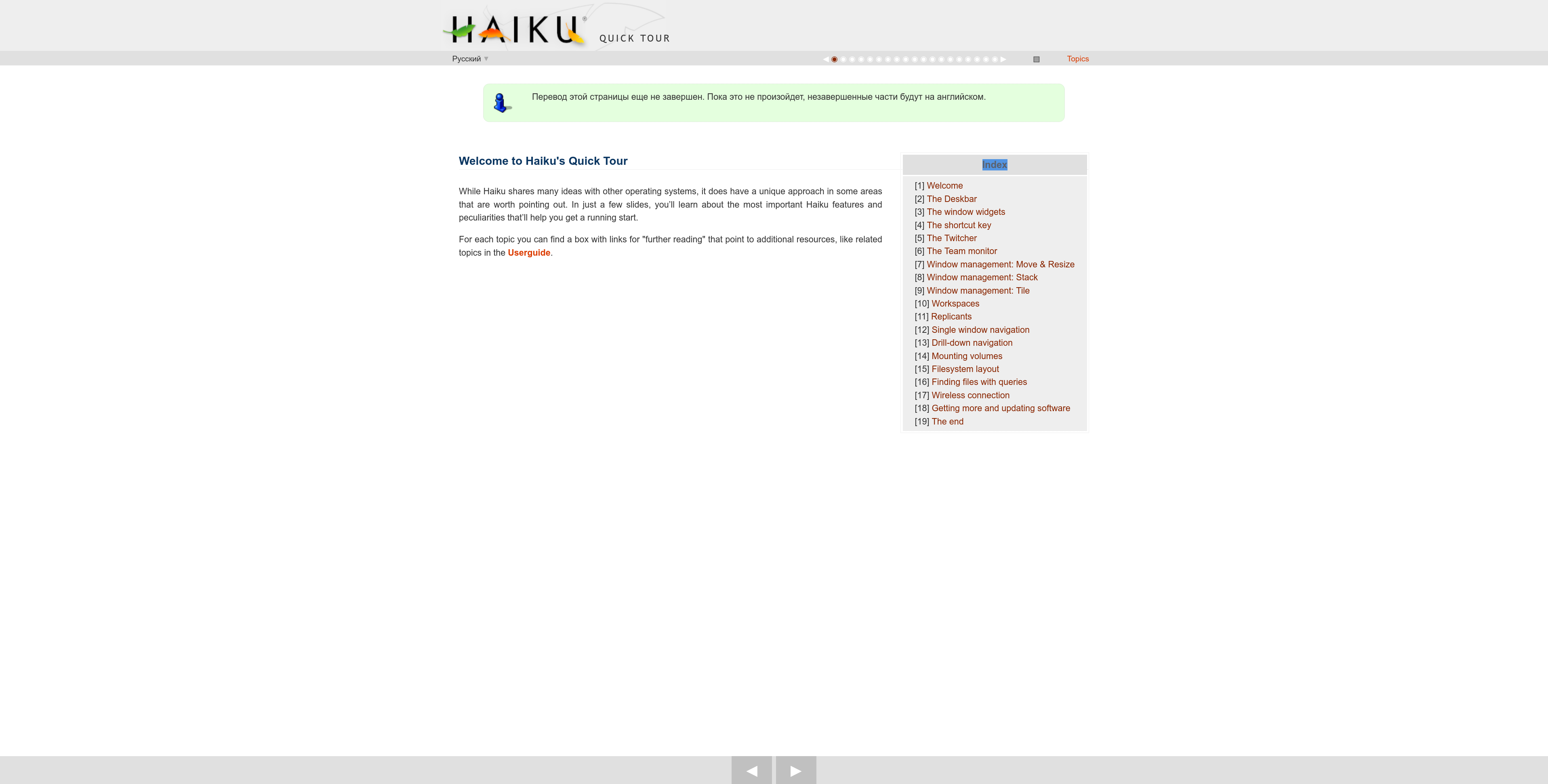
- Only the main page has index: after clicking on a link it disappears
- Navigation bar at the top of the page is tiny
- Symbol ▤ does not tell you anything
- Buttons at the bottom are far away and easy to miss
seems your window is a little bit too much maximized in a very big screen ![]()
27’ is not exactly a small screen, but it’s a pretty common screen size.
I remember when “Walter” was (jokingly) presented as the chosen name for the operating system and everyone fell in love with it myself included.
Those were the days, eh? ![]()
Looking for a different (better) Haiku logo font style:
![]()
![]()
Letters could be colored.
Font: Audiowide - Google Fonts
About this, during the first boot after install, it should autorun the Quick Tour, or any other “Tipster-like” app to make sure that the user will at least look at some pages of the guide and retain some concepts in it in their mind. (Subsequent boots should not autorun the Quick Tour, unless the user chooses to do that).
Tipster is a gold mine waiting to be integrated into the main system.
My ideal workflow for Tipster be have it within the system, and interactively have pop-ups displayed as the user navigates through the system and the applications.
This would be turned on via a checkbox in the Installer application, and would come unchecked by default. It would say something like “this is my first time with Haiku” or “I am just trying it out”, so that it would sound natural.
That could also work… very “high-tech” looking, in my opinion. ![]()
When Haiku is first installed/run, it should bring up local HTML page(s) of the “Quick Start Guide”; a generalized fast gloss-over of the basics of how to navigate Haiku. Any of the foundational aspects of Haiku that EVERY user needs to know, regardless of experience. Then, point the user to where that document is located on the desktop and they need to double-click on it, if they want to refer back to it. That simple.
I wasn’t with it just now. When I first started reading this comment I was imagining micro-payments (tips) for developers integrated throughout the OS. Then I realised you were referring to a different type of tips. ![]()
I’m personally not fond of this look. Reminds me of the Star Trek films font, which is fine in its own context but odd here.
If the logo was just the word haiku then it should be neither modern nor old-fashioned but in-between. One idea would be to have ‘haiku’ as the logo but have a Deskbar setting to let you choose from one of several fonts which would look masculine/feminine/modish/traditional etc… so you could make it more you. I can sense Steve Jobs rolling his eyes at this idea…
Well that is a bit much ![]()
Why revive this topic? It could have quietly died, finally, laid to rest.
In any case, We can think of putting the label „Menu“ On it. But I don‘t see anything more making sense.
Sure, just do nothing! So you cannot be wrong!
My teacher used to say that not doing my homework is wrong too! You clearly can’t please everyone ![]()
Other than wrinting “Menu” on the button, a “Hamburger” icon is another common pattern used in contemporary interface design for menus like this and would thus be recognized by many users.
But it might feel a bit like an anachronism inside the deliberately 90ies-style BeOS UI. If it’s put to the side next to a logo, it might also be mistaken for a drag handle.