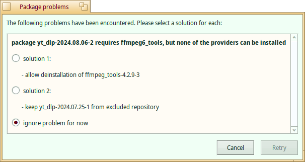
Here, we have a text using text panel colour on list background colour. If both are the same you end up with only controls…
Another place with same kind of bad colour combination is usage conditions.

Here, we have a text using text panel colour on list background colour. If both are the same you end up with only controls…
Another place with same kind of bad colour combination is usage conditions.
Mind making a ticket about such specific color problems? : )
I thought I did that long time ago but apparently I forgot. Will do.
Interesting finds,never noticed those.
I’ll have a look at fixing those tomorrow,since I have some experience working on the dark mode issues already.
Edit: Nevermind,other people were faster at this.Looking at the open pull requests,both issues are already fixed and waiting to get merged.
I have problems with usage conditions window.
Most of people are already just scrolling quickly to the end of these things when they are in their own language but if they are in another, you can bet they will. That can be improved by helping with HaikuDepotServer translations on PolyGlot site. Beware, that’s a huge task, especially web messages part.
Now, the real issue is that usage conditions is a long text (That’s expected for such things.) but, the window is way too small.
Since it’s window with a mini title bar, there’s no way to resize it. you can’t neither drag the corner nor push a maximise button. This is making the reading even more fastidious.
Let me know if anybody has made significant changes to the localizations there and I will do a transfer of those. At the moment this process has to be done manually.
BTW; I built a system in the first half of 2024 to handle transfer of applications’ localizations as well, but this has not been integrated into Polygot yet.
Have you got an open ticket about this?