Thought you meant the tabs of as in tabs of haiku itself ![]() little silly of me. Shouldn’t have rushed to reply just to defend mt point. However I dissagree with the idea that it isn’t the issue, not to avoid admitting defeat or something else pity, but because I still stand beside my point. Those are settings menu, you expect multiple sections it’s the same with most setting applications. Not with a software manager (for example those on Linux) they categorize them with clear buttons. Not that tabs are unheard of, Aurora store for example does utilize them but they are in your face and clearly pressable on basis of the text type. This isn’t as clear in HaikuDepot. My proposition will defy the design standard so it makes sense writing them of. However it should be made very obvious that “all applications” is clickable.
little silly of me. Shouldn’t have rushed to reply just to defend mt point. However I dissagree with the idea that it isn’t the issue, not to avoid admitting defeat or something else pity, but because I still stand beside my point. Those are settings menu, you expect multiple sections it’s the same with most setting applications. Not with a software manager (for example those on Linux) they categorize them with clear buttons. Not that tabs are unheard of, Aurora store for example does utilize them but they are in your face and clearly pressable on basis of the text type. This isn’t as clear in HaikuDepot. My proposition will defy the design standard so it makes sense writing them of. However it should be made very obvious that “all applications” is clickable.
No worries. ![]()
Just goes to show that everyone just needs to run (and develop) more native applications. The BTabView is a 1st class citizen in Haiku’s GUI and is used by many native apps. And rightly so. It allows “full-window” context switches with a mouse-click.
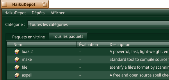
I think the tabs in HaikuDepot easily escape notice because there is a combobox right above it.
Whatever choice is made, between having two separate applications (app store and package manager) or a single one with more features (featured apps essential apps and all packages), it would be nice to have suggestions, on interesting applications, based on the packages installed by the user. So as to have suggestions relevant to the preferences of each individual user.
I have a stupid suggestion for users that don’t see the tabs:
what do you think if the last element of the featured apps list is nothing more than a very decorated and highlighted text like
“looking for more? click here”
and that clicked element will take you to the tab “all packages”
If done, it may be better labeled, “Go to ‘All packages’ tab”. Otherwise we’ll run the risk of people getting annoyed always having to scroll to the bottom of the Featured list, when they believe that’s how you do it. ![]()
Or we grab the users mouse pointer, move it to the “All package” tab and click. ![]()
BTW, if you’re using keyboard navigation, tabs are underlined when selected. Perhaps, it should be when selected by other means?
I think this is a UI “hack”, and we should instead revisit the existing UI and figure out why it is not readable. The search bar beeing affected by the tabs, but not beeing in or on the same level as the tabs is one example of poorly defined UI readability.
It’s not clear either if the category acts as a filter for the search or not. etc.
We should probably start by making the search work nicer, it is far more usefull than a naked all packages tab.
I think HaikuDepot already remembers to show “all packages” tab if I’ve been there last time.
This should be very fun to see in action ![]()
I agree! Anything else would use more intensive coding. ![]()
So far I never used categories (for example) maybe because I know what I need installed. But still (at every single new installation) I have to scroll down and look for my usual packages, because I don’t remember all the names, and sometime I don’t even remember that something in the list is useful to me. This can also be an improvement bound to the HaikuDepot account. (“Hey you already have installed %this_software on %that_machine, are you interested?”)
And for someone like Begasus, it would suggest to install a good half of Haikuports repo. ![]()
More seriously, it could be a nice addition. But it’s always the same problem. Where starts privacy and what people are willing to accept? Anyway, you will have to ask their consent and if they say no, back to square one.
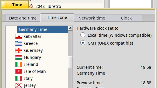
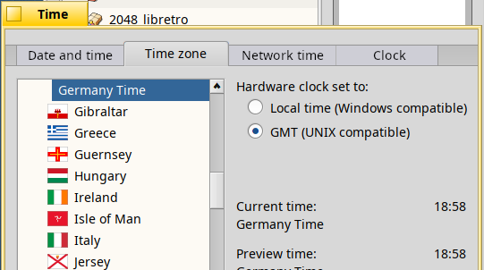
There’s a really thin darker column delimiting tabs when they are not selected. In humdinger’s screenshot above, if you look at Time window, you can see it between Network time and Clock and before first tab Date and Time. Depending of colour schemes, this is not really visible. Also non-selected tabs are of same colour than tabs background. Perhaps making them slightly lighter but still darker than selected tab would help?
So, I took that part of humdinger’s screenshot and made a mock-up. In addition of what I was mentioning above, I added an end to the Clock tab to increase visibility.
In addition or separately, we could have the tab title underlined on mouse over, like you can see it here in case of keyboard navigation.
That looks much better. One more tiny adjustment could be to change the color of the left and the right most vertical borders (i.e. before the first and after the last tab) from #B3B3B3 to #979797. That would emphasize where the tabs control starts and ends:
FWIW, I’m not of the opinion the existing UI is ‘not readable’. The search bar (and category menu) are in fact NOT affected by the tabs. They are not on the same level as the tabs on purpose, because they do the filtering no matter what tab is selected.
How can it not be? It’s exactly what can be expected: You set a category, and the list shows only packages of that category. You set a search term, and list is additionally filtered to only show the matching packages.
Even if there’s someone that can imagine some other behaviour, just picking a category and/or entering a search term shows them exactly what that does, and they won’t be flabbergasted the next time…
If you changed the fixed AND combination of the search terms to also allow e.g. OR and NOT, it IMO gets more complicated and less nice. Or did you think of something else that could be changed? I’m drawing a blank…
Can someone summarize the issues of HaikuDepot that they themselves are actually experiencing. Not guessing what someone else (maybe a non-Haiku-using Youtuber?) might seem to struggle with?
(Just pointing out that his is a general BTabView/Theme issue, not HaikuDepot specific.)
While I can imagine making the non-active tabs stand out over the darker tab bar could be a good idea, I think in this mockup it’s too much. The contrast to the actually active tab is too low.
Why improve things in one place when we could do it everywhere?
The goal of the mock-up was to quickly illustrate what I had in mind and I didn’t take time to the pick colour, my bad. As it is, if it convince me on the practical aspect, I don’t think that it looks as neat as what we have actually. So, there is definitely room for more tweaking.
Due to colour choices in some places, you can make very easily a colour scheme making HD and software updater unusable.
It looks okay to my eyes. The active tab is visually emphasized with a different shape and follows the background of the panel, so there’s no way for me to confuse which tab is currently active. But that might be just me, so I’d would love to hear what other people think about it, esp. the ones with UX/Design domain background.
That’s what I meant, that this is a general BTabView enhancement, not a HaikuDepot one as of this thread’s topic. Some argue that using tabs at all is an issue with HaikuDepot, on which I disagree.
Perhaps, we could drop the changelog tab. As it is, only few apps are using it.
Another solution would be to give it another use and to populate it automatically with the package changelog, if it could of some use for package maintainers. It would allow to know, why and when the package has been (re)built. Though, this is not necessary an information useful for simple users and I would rather see that as an optional panel, perhaps in developer mode.
Apparently, maintaining user-rating system is a really time consuming and, due to lack of ratings, not efficient. Perhaps we should drop stars and the panel associated. Anyway stars only existing in blue would be a problem for some colour schemes.
It would have different advantages. First, it would reduce apl chores. And second, it would free some place in the UI to implement Pulkomandy idea to have an single view for all sub packages (devel package, source package, debug info package). In turns, it would simplify all packages view, you would only have the main package visible. (Potential problem, do all packages have a main package?) We could use rating place to put an indicator of what sub packages are installed or not. As a bonus, Reducing the number of panels, would also reduce the number of gradients used, increasing readability and compatibility with colour schemes.
Of course, this implies that in the package view, there would be a way to install sub packages. Additional buttons, check boxes, some kind of selector, that needs to be determined.
As this is not something useful for a simple user, I would add a way to toggle developer view, in the menu or main bar.
Regarding searching: What would be the point of showing an empty “Featured packages” view? If someone does a search for a package which is in “all” but not “featured”, it doesn’t make any sense to not switch automatically to the “All” view in that case.
Maybe. On the face of it, of course, what’s the harm?
OTOH it takes a bit of control from you, as the app decides for you to change the tab.
Generally I prefer my applications a bit on the dumb side. It’s nicely predictable when you know you can set a category and/or search term and you know that this will filter the currently displayed list. No results? Apparently not in this list… (Maybe I just wanted to check if my app made the cut for this month’s “Featured applications”… ![]() )
)
If this smart-tab-switching were deemed worth implementing, I wouldn’t fight it.