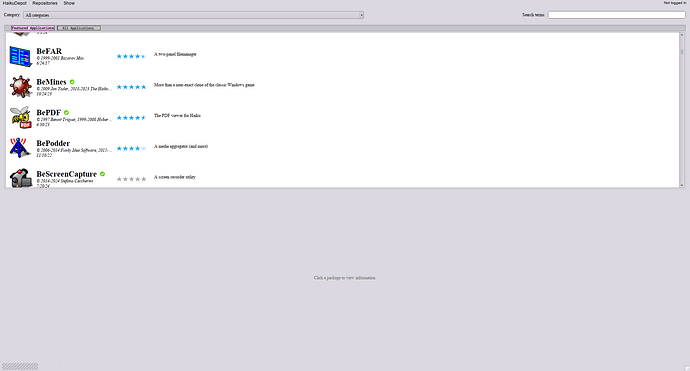
That where the different “prominence” values may come into play, that I wrote about to Michel in a PM. Currently only packages with a value of 1000 appear in the “Featured packages” tab. We could declare another value for the “Essentials”.
@apl, would that work. Could you add another tab for “Essential packages” after the in future rotating “Featured packages” tab?
The Featured packages show a green checkmark at the installed entries. The more compact list for all packages has the Status column “Available/Active”.
I was thinking more of a curated list rather than using a threshold which may conceal some underrated gems.
Assigning the “precedence” value is a manual process. It’s just a way to fillter into the different lists, like:
value == 1000 → Featured packages tab
value == 500 → Essential packages tab
all else → All packages tab
The current design with two tabs is already confusing and I think it should be removed. Ideally HaikuDepot would haâe a kind of “home page” which could have several things. Featured packages/editor’s picks, recent updates, popular packages, … (some of these could be manual and others automatically populated). Then, entering a search term would bring you to a separate search results list, and would always search in all packages. Displaying the entire list of all packages without any search filtering is not very useful, and searching in the featured list is also not very useful, I think it’s fine to lose these options and make the user interface more logical
I think both current options, searching through all packages, and through only featured, are not very usefull.
The “full” package list is needed if I am looking for some development package, or a library. But as a end user I pretty much always only want applications, and don’t care what libraries they need, and don’t want to search through them. (toggeling the installed and development things in the menu is hugely annoying for what basically ammounts to a filter on my search querry)
I think you need a way to search in the full list, but currently we also have a way to show the full list, without any filtering. This list is growing to several thousands packages, and is not a particularly enjoyable thing to read. I think we could go without it in the app, and people can go to the haikudepot website if they really want to go through it.
If we ant a full list of packages, it should at least be organized by categories, and not just a big flat list. This would also solve the “I only want to see applications” problem.
Regarding development packages: I would never show them in the list at all, and instead, on the main library package I would have a “Install” and a separate “Install development files” button (and likewise for debuginfo packages). Think of it that way: do the _devel and _debuginfo packages need a separate comment and rating section than the main one? I think not, and so they could be grouped together
Many java applications only support up to jre 8. But you are right, it probably should not be featured at all. Instead the OS should simply tell you that a java environment is needed when you try to launch a Java application.
I disagree a bit here, If i am on Haiku I don’t want to use a website for a usecase that the native application can do. That doesn’t mean we should keep the “naked” full list like it is now however.
Grouping _devel and _debuginfo onto the basepackages is a good idea as a first step.
There is appetite from time to time for undertaking a re-vamp of the UI of HaikuDepot and/or HDS. To be frank though, I really only have drip-feed time for Haiku unfortunately and barring the introduction of a generous UBI scheme, this is unlikely to change.
The recent work to implement integration interfaces for Polygot to manage packages’ localization was about 6 months of elapsed Haiku-time for me and the system has 10+ things like that which need doing such as OIDC & KeyCloak integration, Replacing the end of life web-UI framework, HaikuDepot’s lacklustre start-time performance and even just staying on top of library flux such as the recent SpringBoot 3 upgrade.
Although I have sympathy for @PulkoMandy 's suggestion in this thread, I can’t see re-working the UI as being something worthwhile getting into at the current point in time with the time resources available.
And I think it’s not fair to expect everything related to HaikuDepot has to be done exclusively by you. Your work keeping HaikuDepot up to date is already much appreciated, and it would be nice to have a bit more people looking into it.
I could work on the UI for what I suggested, but I have no idea about what changes could be needed on the backend side. And also I have quite a lot of things on my own TODO list as well.
I don’t mind and I am not complaining; this is a hobby after all!
My point is that there isn’t a lot of capacity amongst the contributors so we need to bear this in mind when considering if making a UI re-vamp to a working and usable (but not perfect) system component like HaikuDepot is going to be so interesting / worthwhile that it outweighs the interest / benefit of some other piece of the project.
Examples of other things that spring to mind include making the Installer work with UEFI, a Firefox port, fixing BDateTime, figuring out a path forward for a text engine. I’m sure there are many other interesting things.
Exactly; I can imagine your list is long.
I think if a major HaikuDepot / HDS UI overhaul were in consideration then it is probably worth thinking of something roughly along the lines you had suggested above. I would imagine this probably implies a re-write of the desktop application and an significant enhancement of the server component. While nice, I don’t see this as being worthwhile at this scale at this moment in time.
A good example of something we built that isn’t worthwhile is the package user-ratings system. We don’t need it at this scale. There’s barely more than a few ratings on even very popular packages and plenty of engineering effort has gone into that and still goes into maintaining it.
Does the project really need a more complex package “store” application? I would say probably not at this scale just right now.
The problem with ratings is that, from a simple user point of view, the account created for that has no other uses. A soon as we will have an unique account for this forum, reporting bugs and rating, numbers will climb. Yet another thing on someone todo list…
But then, it allows dreams like bug reporting in HD, you would select the package and click on bug report button. You would have a pre-filled form with system arch, hrev, wether or not it is real hardware and possibility to add files manually or automatically i.e syslog.txt. You can imagine also checking versions for eventual dependencies of the package. Of course, you would still have to describe your bug in a text field but when ready you would only have to click Send button.
It wouldn’t be magic and even as user, you would have to visit bug trackers once in a while but it would increase quality of reports that often are missing these intel.
Ok, enough. Landing…
Agreed, I was just wondering if the posible demand of another list of packages between 30 Favourites and 4000+ All packages would be relatively straight forward using the “precedence”.
Anyhow, I’m one of apparently few people who are not “confused” by an “All packages” tab alongside the “Favourite packages” tab. I manage to recognize and use tabs elsewhere, too, like Web+, Terminal, DiskUsage, Locale/Mail/Screensaver/Time/… prefs and dozens more. ![]()
If I search an app, I enter a search term. Not found among the “Featured”? Switch to “All packages”. Too many hits? Choose a category from the pop-up menu. Just interested in e.g. graphics apps? Choose “Graphics” from the category pop-up and see what’s all available.
[Can the mods move all the “HaikuDepot revamping” posts into a separate thread, please?]
Done, though this was a bit entangled. : D
The problem I’m seeing is that it isn’t clear if it’s clickable. It doesnt have any outline. Thus I’m proposing to turn the tabs into buttons utilizing the tab focus and unfocus colour. This way it can’t be missed that they’re clickable. Quick mock up but it can be better designed, it’s just that a tab that blurs into the background is bad design and contrasting buttons can’t be missed.
I agree on this. Whatever improvement or change we add to the UI, allow me a way to just see the plain list of packages.
If that were true, it’d be a system wide issue of tabs not being recognizable as tabs and would have to be fixed in general. I, however, doubt that.
That isn’t a problem because there is an actual outline on most, the one in HaikuDepots has none, which is why I propose the most obvious to see solution.
Perhaps we are mixing two software metaphors here.
Let’s say you install a popular Linux distro. If you just want to install apps as an end user, you have an app store with a curated list. There are different ones for different distros, but they all have a common theme: The user is presented with just the applications in given categories.
But if you are a power user / developer who needs to access libraries, development files and so on, you don’t use the app store. You fire up synaptic!
What I see in this discussion is that we are trying to shoehorn these different kinds of program into a single application. If we can agree that HaikuDepot is our equivalent of synaptic, the one that gives the power user everything, then there is a space for an easy-to-use program, a “Haiku App Store” that lets the regular user just say “Install LibreOffice” without having to know about the hundreds of dependencies involved. Well, I suppose the user would still have to click “Yes” to the pkgman prompt, but that’s normal. Meanwhile, HaikuDepot doesn’t need to be dumbed down.
If I can find some time, I’ll cook up a proof-of-concept.
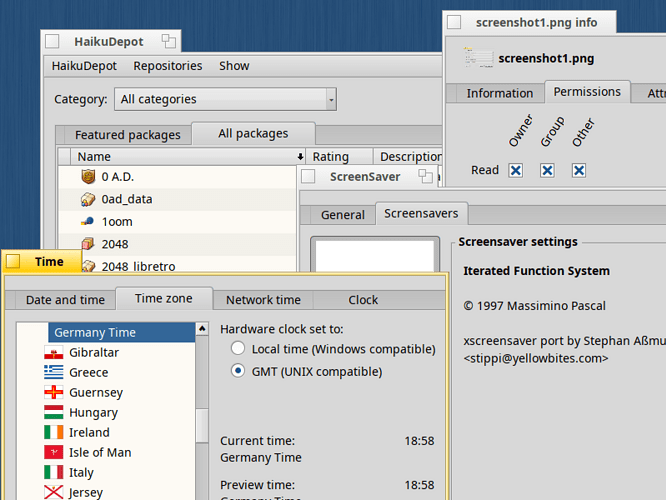
I don’t see outlines anywhere. Here are a bunch of tab using apps. HaikuDepot’s tabs - using the same Haiku API as the rest - looks identical:
Booting into Linux about once a month, this distinction always bugs me. I’d rather Haiku keeps the one-stop app HaikuDepot.
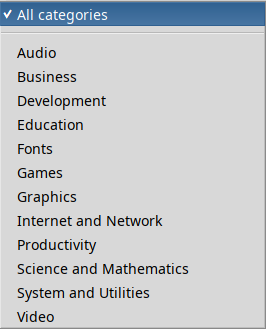
How about this. Here’s the current categories menu of HaikuDepot:
We could rename “All categories” to “All packages” which will keep showing every single available package (still being dependent on the “Show” menu’s devel and source package options).
With a separator above the different categories, we add an “All applications”. Choosing that, removes any possible ticks from the different categories and “All packages” and the list shows all packages with any category.
At HDS we already only assign categories for “end-user” applications. There are no categories for libraries etc.


