OK then, it might be possible to read this out as part of the logic in LocalPkgDataLoadProcess.cpp and populate it into the HaikuDepot application’s in-memory model.
I ment doing this task as a user, if i want to see the contents of a package but not download and activate it.
I wonder what it would look like if you move both “Search terms” and “Category” into the left pane (above the tabs). It looks like there’s plenty of space there…
Since now there’s a lot of vertical space, you could embed screenshots into descriptions instead of placing them sideways.
By the way, it would be nice to see a distribution of description lengths of packages.
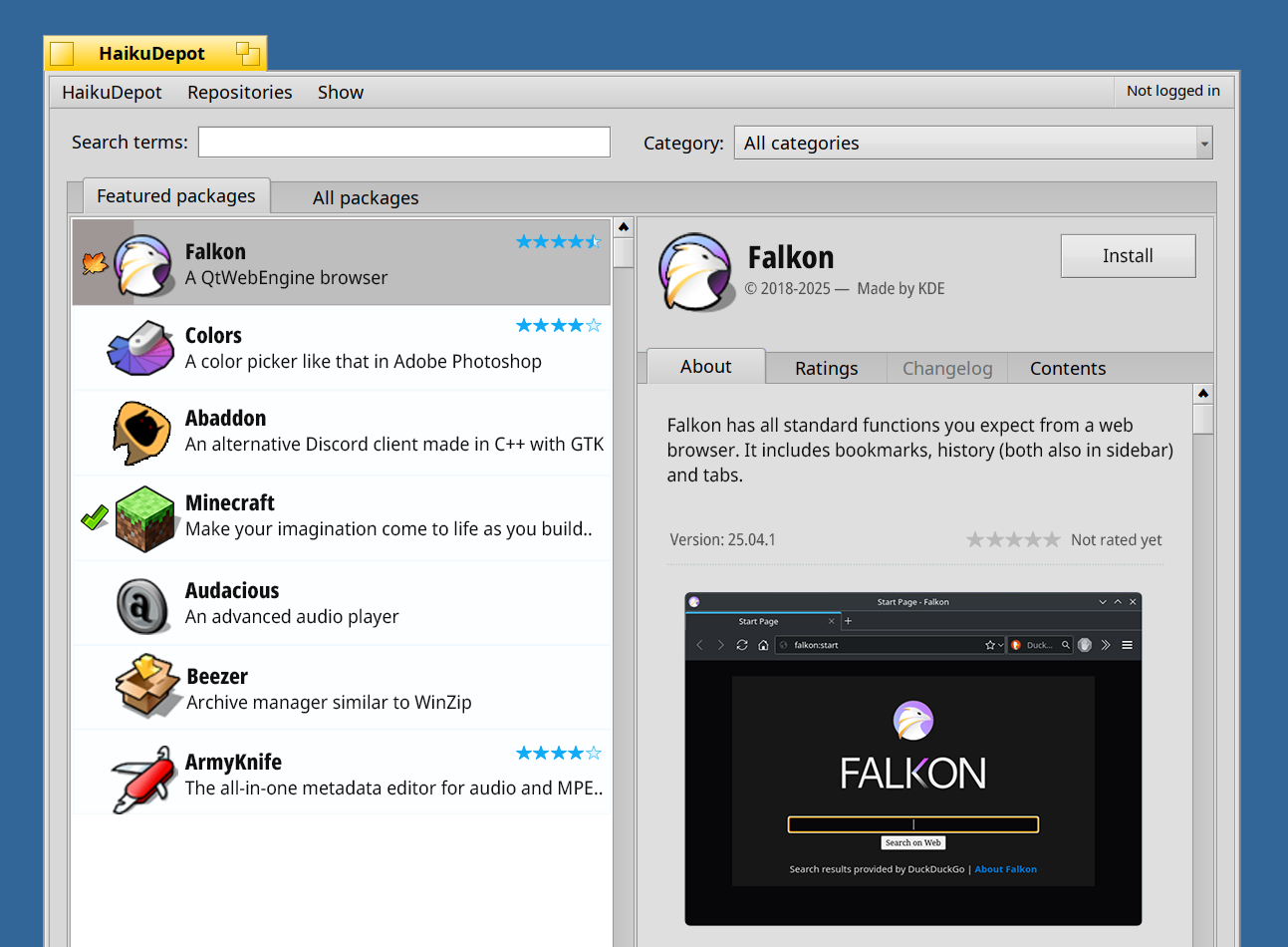
By the way, I want to thank you for this work. I really appreciate the improved HaikuDepot design. Even though I might appear to be too critical in this thread…
4 Likes
Thank you very much! I truly appreciate your message. @suhr you’re always constructive, and it’s clear that it all comes from a good place.
Also, it’s amazing to see it progress. Big props to nephele!
I find that view useful. I use it to be able to see those packages that are new, or were recently updated (sorting the view by Date).
Personally I don’t care much about the visual aspects of the redesign (is a matter of personal taste), but I am against removing functionality.
Thanks you for your efforts.
My .02 cents:
-
in the view part, the package name, version, release date and the “Install” button are what matter the most. Move the copyright / dev info into the about tab, these info matter far less.
-
regarding screenshot, i dunno if multiple screenshots are already supported, but the app re-design should be ready for it from scratch. In such case, may I suggest one main screenshot, and below it a row of other screenshots available, which on click replace the screenshot display above it? I’m not sure I’m clear.
-
the green check mark (= installed ?) and the haiku mark ( meaning = ? no so obvious. system builtin package? official package from haiku-os ?) on the left list are not visible enough to my taste. Mostly because it’s too close to the icon, which make the mark less visible as a seperate visual information.
Why not having a more explicit label “installed” below the rating stars ?
1 Like
@anon40228759 I have submitted my progress on gerrit, https://review.haiku-os.org/c/haiku/+/9584. This is obviously not close to finished 
I have noticed one fault in the layout, the old version had the Rating stars in the header section, the functionality to rate the package was also as a button there, so for the redesign the rating functionality needs to move into the ratings tab itself. (And the left aligned overview of vote distribution is a bit jarring like it is now with a more narrow tab)
I agree with phoudoin’s comment about the version beeing more important than the copyright line. That and adressing how we want to layout the screenshots, especially with longer descriptions have let me hold off on rebuilding the main about view quite yet.  More iterations required!
I’m very happy with the progress so far however.
4 Likes
Fantastic progress. Let’s go!
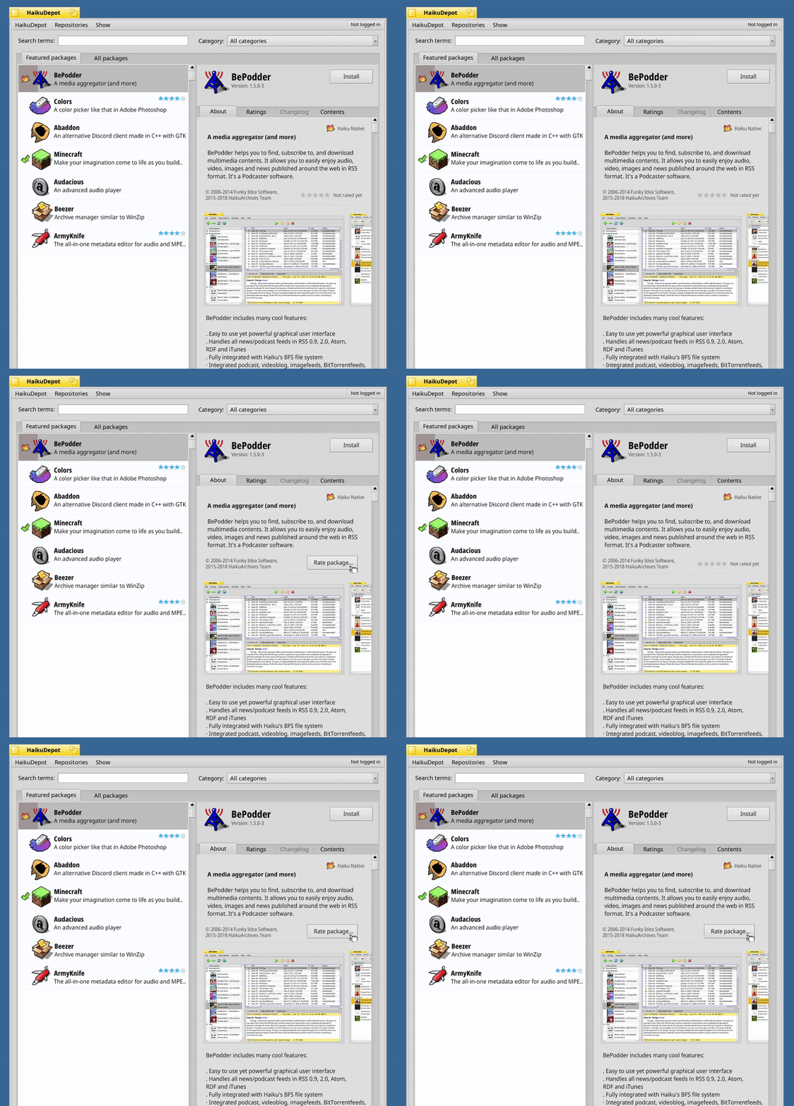
I agree with phoudoin’s comments, and thanks @phoudoin for sharing it. I’ve tried to incorporate them here:
• Package version shown below the name, with copyright moved further down
• Support for multiple screenshots
• Haiku Native and Installed indicators. We should have them clearly stated when previewing the package. “Installed/Haiku Native”
I believe the Haiku Native label should serve as a badge. It helps communicate that the package was built using Haiku’s APIs and follows its native look and feel
• For the rating system, we should keep both, like in the current HaikuDepot, hovering over the stars should let users rate directly from there or visit the Ratings tab
One thing about super long text/descriptions
Would it be possible to split it into two parts? I believe we could have a TL;DR with a character limit, followed by the full description for those with feature set descriptions
• The TL;DR would appear right below the package title and install button
• The full feature description would go below the screenshots
• New packages could adopt this format, and existing ones could hopefully be parsed to fit
Here we have it
2 Likes
I’m wondering what the point is off having the rating stars in about, before it was in the header. If we do not want it in the header anymore i think it should not be in about. It is visible in the list on the left already.
The current HaikuDepot has a white-on-green checkmark for “installed” and a yellow-on-blue leaf for “native”. It’s not yet in the exported Userguide, but here’s the screenshot showing those icons:
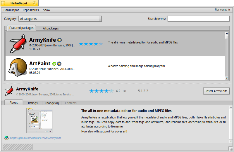
I think it’d be nice showing those two, one above the other, to the left of the app icon - both in the list to the left as well as in the details view on the right.
Or we show the first 5 or something lines, then add a “…More” that appears as a link (blue, underlined), which would expand the rest of the text.
WRT the screenshots:
For many applications, a meaningful screenshot will be larger than the available space. How about having only relatively small thumbnails - say 128x128px - and show those in one row. A click on a thumbnail opens the full version in a window, as is already the case with the current HaikuDepot.
3 Likes
I think there is enough space to move the rating stars/not rated yet below the package name and version lines.
Regarding the TL:DR; I think parsing the package description text should try to find if there is a paragraph break within (one line break, nothing/blank char(s), another line break before another text) and does the split by itself, automagically.
I also think that the about package initial paragraph should be limited to a maximum number of (rendered) lines (around 6/7 max) and “… more” mark should truncate it otherwise.
1 Like
Could the space allocated to left and right panels be layouted so that, when available, the right panel will get more width?
I mean the package list on the left doesn’t need that much space.
if the one-line package description text is long, just truncate it with a … at the end.
Maybe in features mode, as the item are bigger, the one line description could be wrapped on two lines in fact, if needed.
On the contrary, the right panel will make big benefit to have more width.
1 Like
That kind of text manipulation is possible, but a bit out of my depth. So… contributions welcome
Since you both would like the ratings to appear in the about tab I will concede there, and try to start implementing the new about tab in my next run.
1 Like
Oh, sorry, I didn’t realize you’re actually trying to code the proposed changes.
For a redesign prototype, don’t bother implement the text manipulation to, dynamical, split the package description text to better present it.
This is typically a change that can be implemented after the big redesign, as an about info layout optimization.
1 Like
Those one-line package descriptions are already about as short as you can make a statement in English without abbreviating words or resorting to some sort of tagging system.
I think it would be better to have an alternate view that only shows the icon, name, and maybe a category/short description while giving the right panel more space. That way you would retain the useful information without any extraneous descriptive text.
I.e.
For ‘Abaddon’ you have ‘An alternate Discord client made in C++ with GTK’ when it could be as simple ‘Discord client’ or ‘Discord client (alt)’. It’s interesting to know that it’s a C++ program using GTK, but that’s not particularly relevant to most users.
Tangentially, it would make sense to retain the tabs for the right-hand panel because having a scrollbar for each side seems a bit unwieldy to begin with and the vertical presentation offers a bit more room for content.
I agree on the C++ part. The end user doesn’t care about that.
But that it uses GTK does tell me that the program is going to need a ton of dependencies (QT is a bit cleaner in this regard) and that the UI will not quite match up with the native one.
I’m not saying that information about the graphics toolkit used by the program should be completely invisible (at least not at this juncture), only that it isn’t strictly necessary to write it in a one-line description.
You could just as easily have it on the left as another little icon/image (like the ‘haiku native’ one) or on the right as either part of the information above a screenshot. Putting it in the longer description would be okay (less visible), but it could also be part of a tag display.
So something like
Falkon [C++] [GTK]
or
Falkon
This is a description of the software…
[C++] [GTK]
1 Like