Before heading back to work from summer break, I wanted to finish this HaikuDepot design. It’s kinda odd to get excited about this warehouse forklift. Still, it’s the avenue where all new software is delivered to users.
I think it could benefit from a layout that better supports browsing multiple apps, with quicker access to comparisons and previews. All accessible with a quick vertical scroll.
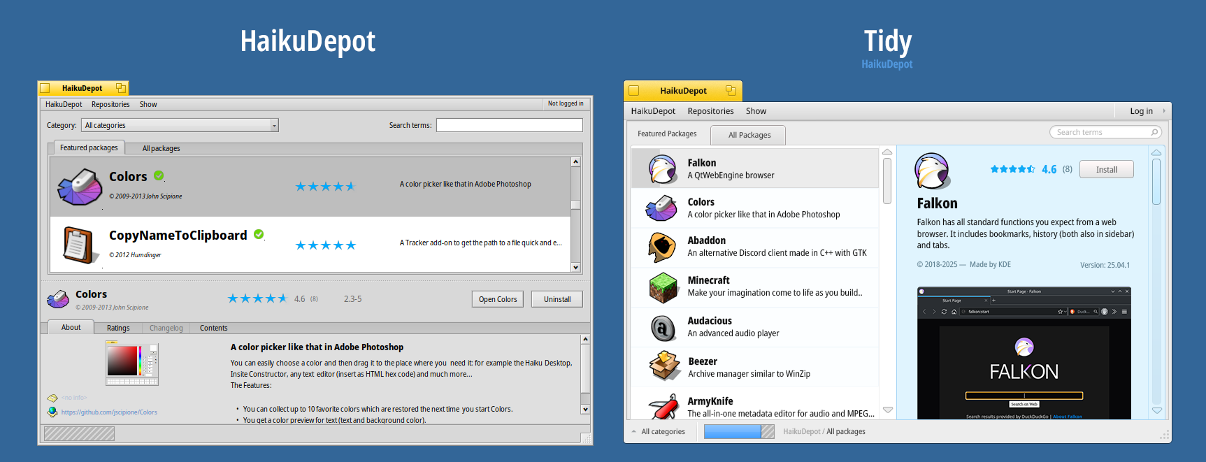
This builds on the same “tidy” design thinking we’ve been discussing here. The aim is to keep things clear, reduce clutter, and bring more focus to the app, so it’s easier to understand what each app offers at a glance.
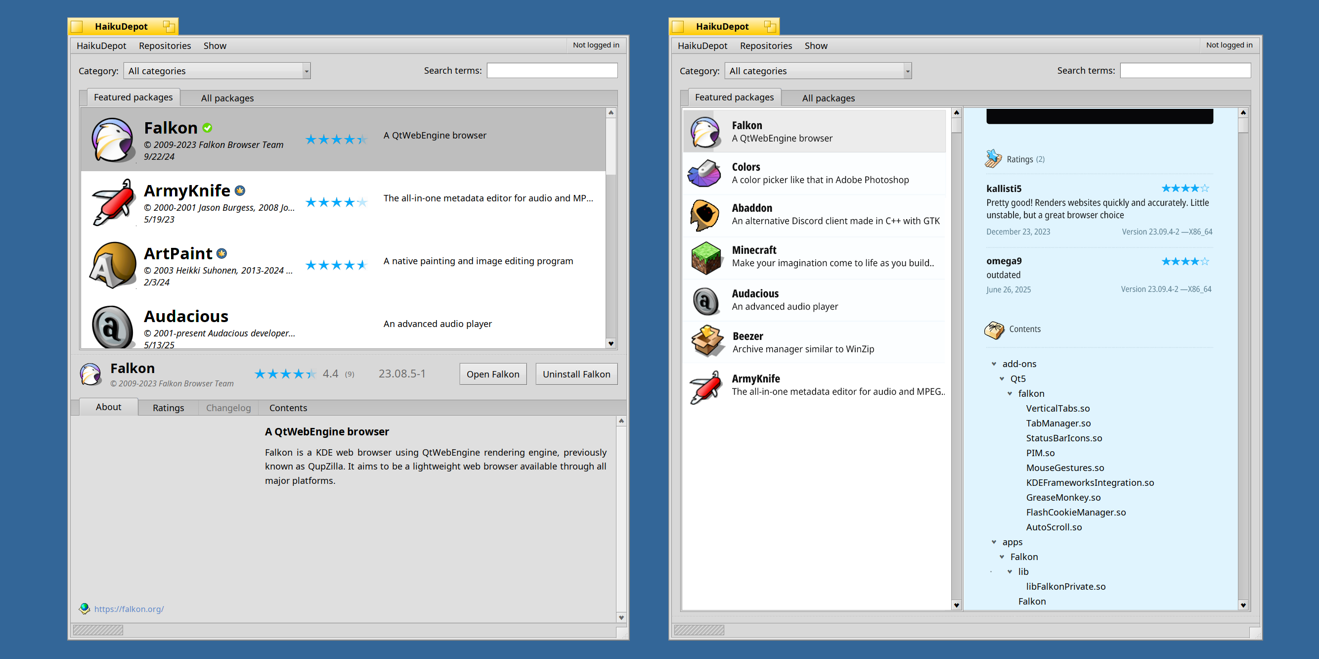
Sort the “Date” column in the “All packages” tab.
It’d be interesting to see how well the design works for the “All packages” tab, with its up to 8 columns.
This app is not our best success in terms of design indeed. It probably needs more than just UI design, a deeper rethinking of the user experience.
Especially the fact that currently the search bar will search only in the featured packages, and the fact that there is an “all packages” view, listing thousands of packages, that surely no one will want to read through without any filtering. That’s one place where, surely, things can be made sirpler and cleaner without compromising any use case or affordance.
I’d imagine it’s the first thing most users open after installing Haiku. Still, HaikuDepot makes getting software easier than hunting down random/dubious websites for packages.
I’m all for incremental improvements. If the new version adds more value than the last, we’re good!
It sort of does now. For the last nine months I’ve been maintaining the Featured Apps tab.
It’s not immediately obvious, because there is a permanent list of about 50 apps that we always want to put front and centre. But in-between that you will find apps that are new on the depot or have seen a significant update. This is updated weekly. How long a new/updated app spends on the Feutured tab depends on how quickly it is followed by newer ones. Once we get to about 75-80 entries in total, the list becomes unwieldy and I clean it up until only the permanent list is left.
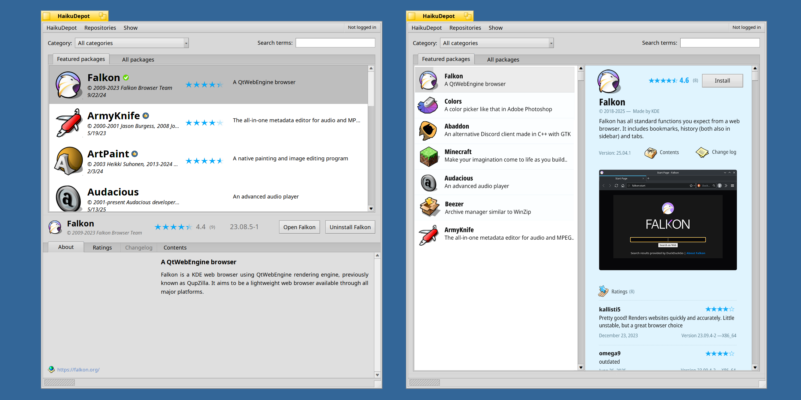
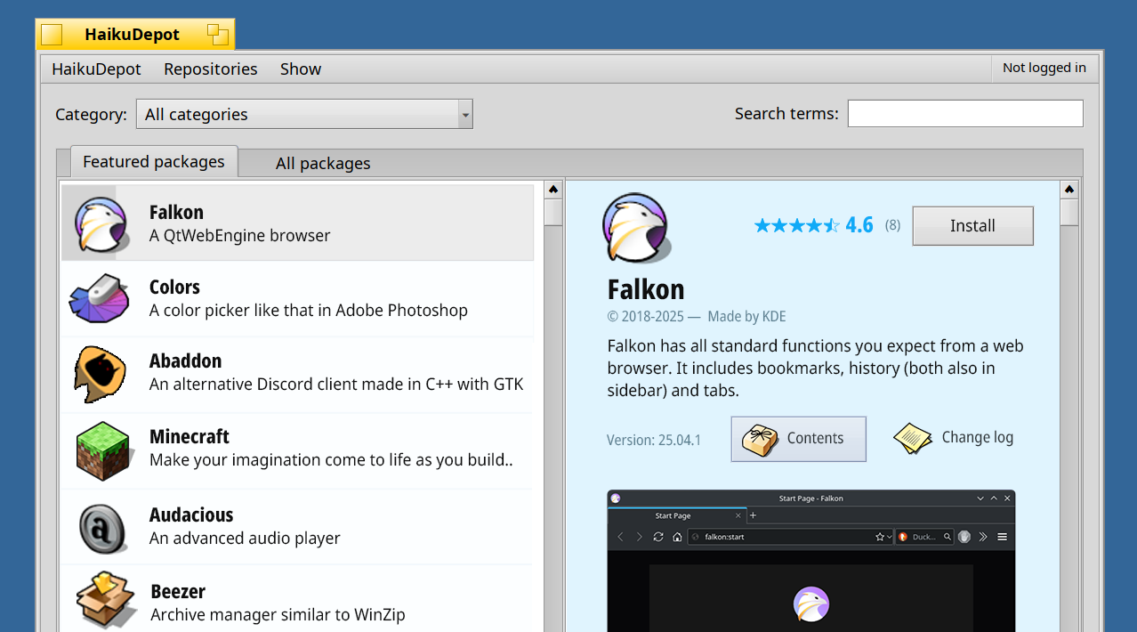
Here’s HaikuDepot with focused changes to improve usability. Easier app switching, quick comparisons, and better access to previews and ratings at a glance.
Sorting for “Date” is. So may be “Rating” when you’re looking for “the best” app in a category.
Also, it’s not just for sorting. Having a column list enables users to choose the info interesting to them by de/activating columns and present it in a very compact form. You don’t need to click an entry and scroll up and down to the info interesting to you; you see it for all listed packages at a glance.
Having About, Ratings, Changelog and Contents in tabs also avoids scrolling around, it’s always just one click at always the same screen position.
Agreed! These are quite useful when browsing by category and trying to find something recent or well-rated.
Sorting by Description or Version number feels a bit unpredictable to me. Do we want entries that just happen to start with “A” or a number showing up first?
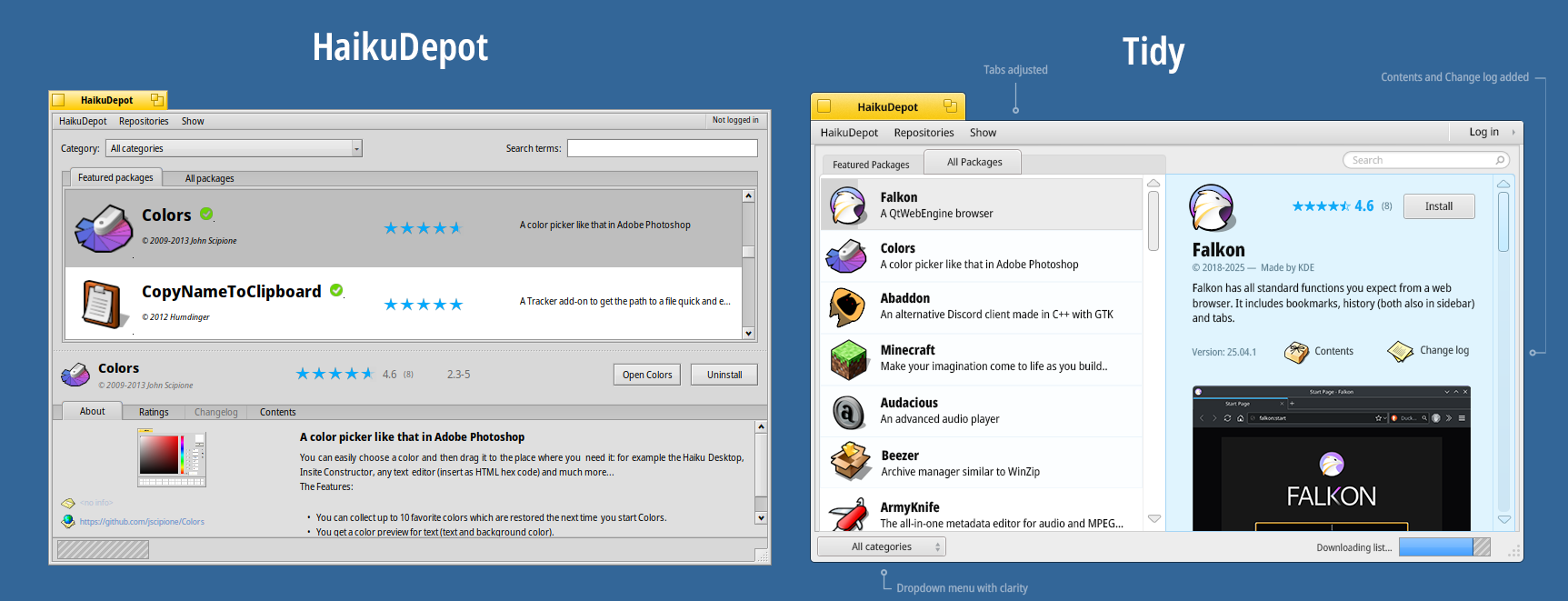
Yep! I kept that here, too. Ratings, contents, and the changelog buttons are all accessible once you select an app.
The buttons act like quick jump links that take you to specific sections.
The goal is to enable a continuous scroll through the information app, allowing you to browse and access all the necessary information in one place
I did not see them, despite you saying they are there. If those are buttons these should be buttons and not flat buttons.
Though tabs would still be preferable, they are great for when you have a known number of “content” views, while lists are great for an unknown number.