I think these need to use the default font. Currently, uses a slightly smaller and a bit grayed out font, so that’s not helping. I’ll fix that and post an update soon. But this is roughly how it would work, like the mail app
Install should still be the most prominent button. Changelog and Contents are nice to have, but they’re secondary.
They’ll get alpha-sorted as usual for a column list. Sorting columns is a standard feature; that doesn’t mean that it’s especially useful or often used for all columns. Most of the time, column lists are just a very convenient way to show tabled information.
Still, tabs have the advantage that you can quickly switch between “pages”. What happens if user click on your Changelog button? Do we jump to some position in the scroll view? How do we then switch to Contents, manually scroll to the top to click the button?
Also, your Falkon example has a nicely short description. When it’s longer, your buttons - including the vital Install - may move out of the visible scroll view.
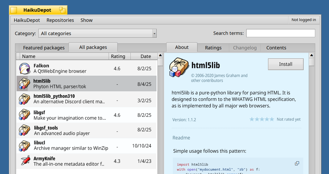
We want to see the rating on the left hand overview column so that it may be viewed at a glance for each package without having to select the item to see it.
I’m not sure how I feel about apps with no rating. Maybe they should have a tag or some kind of indicator? Without anything, it just feels a bit odd, like HaikuDepot failed to load those ratings
Here, we can see the ‘Not yet rated’ indicator on the list. It also appears when we select an app with no ratings.
This is missing the “open app + deinstall app” combo. I’m guessing those would be below each other? If the header is in all tabs it should be a bit smaller, i.e move the name and copyright right of the icon like in the list.
Though keep in mind that no tabview in haiku behaves like this, so it would be unusual and also “special” which already was a critizism you had against the original design.
I really like that i can switch between featured and all packages inside a category,
i quite like the UX of Haiku Depot, but then i am a longterm linux user
All packages view should be compact. It’s used to find a specific package by name, and you might need to look through a lot of names.
There’s one more problem with the new design compared to the old one, which I didn’t immediately realize. The search field is far away from the list of packages.
You may have heard about the law of proximity (one of gestalt principles): objects close to each other are perceived as a part of one group. In the old design the search bar was right above the list of packages, so it’s natural to expect that it would filter this list. In the new design, the search bar is far away, so it feels unrelated to the list of packages.


 (back to topic)