I would agree with you on that, the white isometric “H” with green Leaf Crossed Logo is perfect. It reminds me of the two white towers on the front of the BeBox Bezel with a palette of clear and fresh colors with green leaf defining light and natural character of Haiku
I think now is not free as another microkernel uses almost the same context but with an MCU
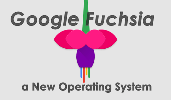
It reminds me that there is a new trend in design (both logo as graphical interface ) with new/renewed microkernel based OSes with a tendency to the characteristics that have been asked in this conversation : A flat aesthetic as Material design , combining the palette original colors of BeOS (Real Red+Thru Blue= Purple/Violet/Magenta) / Haiku (Ligth Blue + “Tab” Yellow = “Leaf” Green), and references to the fast, lightweight and realtime perfomance… I talk about Zephyr OS and Google Fuchsia.