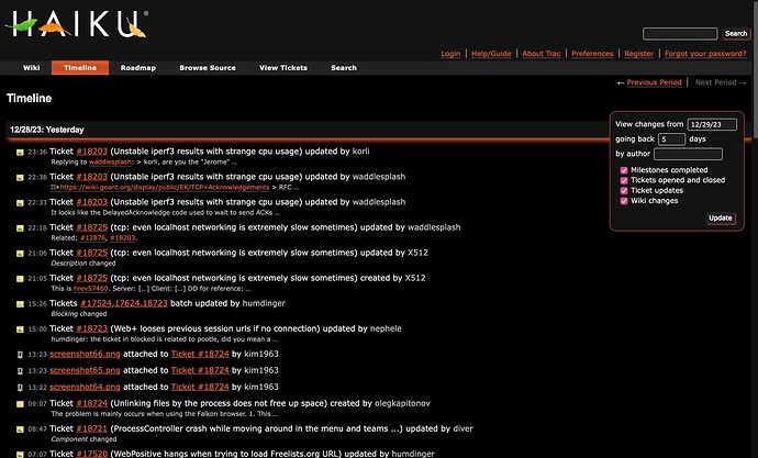
Where can I find those? So far I’ve only modified this css file for nielx to update in place.
I’m sorry but your never going to get good contrast with orange on black. Try green on black combination instead.
Green on black looks stupid.
Also, why complain about orange now after I’ve already made the userguide, and api guide in that style?
I don’t really want to go back and change all of those to green, especially when the proper contrast is only slightly lighter as win8linux already mentioned for the api guide.
I agree that it’s unfortunate that nobody has mentioned the orange and black problem until now, but Jscipione is correct. Black and orange are not a good combination; black and green are better.
People can go on all night about aesthetics and personal preferences, but legibility and avoidance of eye-strain are the core issues.
The reason that a combination of green and black seems old-fashioned is because it was used so much in the days of monochrome screens. And the reason it was used so much is because it was considered to be the best combination.
If going for legibility, then we should go for yellow on black ?
But I agree with @nephele, now that all the work was in orange, orange it stays. Also, the white page uses orange too, so we can keep some consistency.
In the days of monochrome monitors, before ‘paper white’, we had both green on black & orange on black, for sure, & I think there was also yellow on black too…
While I’d prefer using shades of green, it may not be a good idea to necessitate replacing all of the colours again. Also yellow shades are even more problematic with light backgrounds, since the base colour yellow itself has a high luminance. Darker yellow shades also don’t really look good IMO, unlike orange/brown shades.
However in general shades of red, green, and blue are easier to read for people since they happen to be common colours encountered in nature. Eyes evolved to see these colours primarily due to their prevalence (meat, plants, sky, etc.) in most natural environments. Yellow is also commonly found in nature, however mostly as a colour that tints everything due to sunlight.
Here is an example of how BlueFlatTheme patches the HTML using Jinja:
https://trac-hacks.org/browser/blueflattheme/trunk/blueflattheme/templates/blueflat_theme_jinja.html
This builds upon the Trac base html/jinja files that are found here: https://trac.edgewall.org/browser/trunk/trac/templates?order=name
It seems a good idea to do things similarly to BlueFlatTheme (using the ThemeManager), that limits modifying the core HTML templates of Trac, so that it is easy to update to new Trac versions later on.
Indeed, but green was most popular, and for a very good reason.
I have no complaints with orange, I just thought it might help to get the contrast ratio up to use green instead, that’s all. But if it looks bad I guess not.
Let me expand upon this.
The way I see it, there are 4 possible color choices: blue, green, orange, and yellow. Blue on black has issues with contrast until you get to a more cyan-y blue. With blue on black you run into a similar problem as orange on black, it’s hard to get a nice blue that has good contrast.
Green on black has good contrast but it has been deemed unsuitable.
Orange on black has similar issues to blue on black.
Yellow on black has good contrast as well.
So if blue is out, green is out, and you really it want it to be orange, make it an orange on the yellower side of orange.
blue was actually the other option proposed above, the previous website incarnation did have a light blue that I liked too. Increasing the orange brightness to lean more into yellow is fine to me aswell. Nothing set in stone still. ![]()
Is it possible to do something for the pink check boxes? They kind of jump to the eyes now.
They are not a thing, this is a macos native control rendering, pink is just my accent color.
