Haiku branding

Hi!

I’m working on the next dark mode, this time for trac. As this always touches the light mode too I wanted some opinions on what branding direction people like. especially for the colors.

This is intended as an opinion poll, I won’t bind myself to the results, So: I’d like to know what colors are preffered:

Since this forum software destroyed my poll the third time as i was trying to build it I’d like to hear comments about prefered styles, possible options would be (but are not limited too)

System defaults, that is whatever the User agent specifies for colors is used, and everything is derived from this

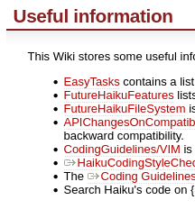
Blueish with orange highlights, like the main page

Orange with blue highlights, like the user guide and documentation
(Those two aren’t neccesarily exclusive)

Trac’s current colors, mostly red links

The default canvas and text color will follow the system when forced colors is active in any case (but this has to be implemented in our port, you can try it now on windows funniily enough)

I’m tending to system canvas and system text but styling the links for branding, and headers.

Let me know what you think!

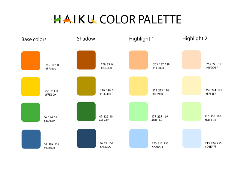
EDIT: as a bit of context many projects have a color pallete they derive their “branding” from
for example canonical’s ubuntu: https://design.ubuntu.com/brand/colour-palette
and red hat: Color - Red Hat brand standards

Such a color palette did exist for Haiku, but it was basically not used, the current defacto color pallette has been whatever I put on the dark mode, i’d like to develop a proper Haiku branding color palette to use for the future, including instructions on how to arrive at derivitive colors and such.

Regards

Edit2: personally, I’d obviously pick Pink with light blue :wink:

2 Likes

Where did you find that official color palette for Haiku and which colors does it contain?
I can’t find it anywhere.
In my opinion it’s best to use the colors from the officially recommended palette everywhere.
Otherwise,I’d prefer the colors from the main page,so that all Haiku pages look similar,with the main page being the one that decides the style for all others.
Having the user guide and documentation colors exactly in reverse of the main page is probably not the best idea either,but I think you’re only going to change the Trac style now?

As i said, there used to be one. It’s on some trac ticket, but it is old, not used, and doesn’t account for the dark mode. So not that usefull in any case.

I would work on the trac style now, yes. But i’ve changed all other styles i mentioned above, so I can change them again in the future to make the branding consistent, which is what this topic is about.

1 Like

Here are some visuals for the options Nephele presented:

Blueish with orange highlights Orange with blue highlights Trac’s current colors
Haiku's Blog-O-Sphere menu List of Haiku's applications in User Guide Useful information section of Trac's homepage

Thanks Zardshard. I vote for A, blueish with orange highlights.

I’d say, bright, but not overpowering, & be consistent throughout…if it’s already done, use the blue with orange highlights. :slight_smile:

I personally also like blue with orange highlights

I like either orange with blue highlights or Trac’s current colours. I think we should avoid the extensive use of blue in “dark mode” because it is considered detrimental to your circadian rhythms and aim for warm colours instead.

I didn’t think about dark mode. Maybe I should make some mockups of those as well

Just set the OS document color to dark and retake the screenshots, apart from trac they are already done : )

Personally I don’t care about that, for one that hasen’t been scientifically proven (basically only one study as evidence), and for another I use dark mode all the time, not to try and sleep : )

That’s probably true, proven by the fact that it’s a bit hidden away. The Icon Guidelines mention it though:

Colors are obviously a tough subject. At the moment, there is no color palette defined from which you should pick the dominant colors of your icon. This Haiku Color Palette does give some examples for inspiration though.

1 Like

Here are the visuals for dark mode:

Blue with orange highlights Orange with blue highlights
image image

Trac, as previously mentioned, does not have a dark theme

For the light mode, I like Blue with orange highlights.
For the dark mode… that orange is a bit too bright.
I’d prefer something more like this:
edited

2 Likes

I think following the userguide/doxygen/sphinx theme as closely as possible would work great.

The main site is (or should be) an advertising website, very colorful and trying to catch the eye. But that is unnecessary for the other pages, where a more quiet theme is nicer

3 Likes
blue with orange highlights orange with blue highlights
documentation page documentation page

I think blue with orange highlights works well for documentation pages as well.

1 Like

of those two I vastly prefer the second one, but then I do not use the light theme at all.

Nevertheless I would like to use the same color scheme for both modes, in part also to keep the css maintainable if someone else wants to take over at some point.

Fair enough, I can see how I might prefer the second one if I used dark mode as well :slightly_smiling_face:.

I was going to post an image of the WIP trac here, but apparently upoading 90kB in this day and age is just too much for my poor 12core intel i5 4k OLED laptop.
Opening the file dialog takes about 10 seconds, and then 20 more untill the file manager responds. Gosh, i never knew SSD’s were that slow!

Haiku on my Pentium M laptop is incredibly fast compared to this! sadly developing with gnome web is extremely sluggish slow and makes me want to slam my head into a wall. Maybe I’ll lend a macbook to develop this further. Or work on porting Haiku to this laptop before I develop this dark mode further

2 Likes

Personally i also would prefer blue with orange highlights. And for the dark theme there is a good practice to desaturate the bright colours a bit and use a light gray instead of white.

1 Like